Table of Contents >> Show >> Hide
- What Is Minster Green No. 224?
- Why This Dark Green Works So Well
- Understanding the Undertones
- Best Rooms for Minster Green No. 224
- Colors That Pair Beautifully With Minster Green
- Minster Green vs. Green Smoke vs. Calke Green
- How to Use It Without Regret
- Why Minster Green No. 224 Still Feels Relevant
- Living With Minster Green No. 224: The Experience
- Conclusion
Some paint colors politely sit in the background and do their job. Minster Green No. 224 is not one of them. This is the kind of green that strolls into a room wearing leather loafers, carrying a stack of old books, and somehow makes everything around it look more expensive. Rich without being flashy, traditional without feeling dusty, and moody without turning your home into a Victorian thunderstorm, Minster Green has the rare talent of feeling timeless and current at the same time.
If you have been hunting for a dark green paint that feels grounded, elegant, and genuinely livable, this shade deserves a serious look. Minster Green No. 224 has depth, but it is not a flat, one-note forest green. It carries complexity. It shifts with the light. It plays well with creamy whites, warm woods, stone, brass, black accents, and those dusty pinks that somehow make a room feel styled instead of simply painted. In other words, this is not just a color. It is a whole atmosphere in a can.
What Is Minster Green No. 224?
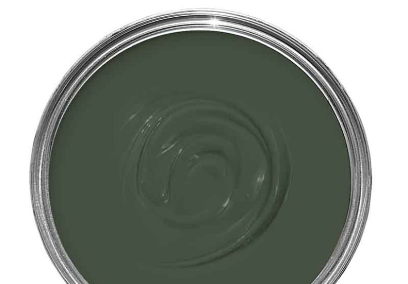
Minster Green No. 224 is a Farrow & Ball paint color known for its inviting, deep green character. It sits in that sweet spot between earthy and refined. It feels more obviously green than some smoky, gray-heavy shades, but it still has a softened, aged quality that keeps it from reading loud or synthetic. That balance is exactly why it catches the eye of homeowners, designers, and anyone who has ever looked at a plain beige wall and thought, “We can do better than this.”
What makes Minster Green especially interesting is that it is not simply dark; it is nuanced. It has a lived-in look, which is design-speak for “this room doesn’t feel like it was assembled by a robot with a credit card.” The color has a heritage quality, which makes it especially compelling in traditional interiors, older homes, and rooms where you want character. But here is the twist: used thoughtfully, it can look fantastic in newer homes too, especially when paired with clean lines and natural textures.
Minster Green is also an Archive color, which adds to its appeal. It has a slightly insider, design-savvy reputation. It is not the shade everyone’s cousin already used on their powder room vanity. That alone earns it points.
Why This Dark Green Works So Well
Green has become one of the most dependable color families in home design because it behaves like a neutral while still bringing personality. That is the magic trick. Unlike flat gray, which can sometimes feel chilly or tired, green pulls its power from nature. It feels familiar to the eye. It is calming, grounding, and flexible. Dark greens, especially, add drama without the severity of black and without the obviousness of navy.
Minster Green No. 224 succeeds because it is moody in a grown-up way. It does not shout for attention. It earns it. The color can make a room feel cocooning and intimate, but it can also look crisp and tailored when balanced with pale trim, polished hardware, and good lighting. That range is what makes it so useful. One day it can feel cozy and traditional; the next, paired with marble and brass, it can feel sharp and sophisticated.
Designers often talk about darker greens as “new neutrals,” and Minster Green makes a convincing case. It has enough depth to anchor a room, enough softness to stay inviting, and enough complexity to keep the look from going flat. Basically, it is a dark green with manners.
Understanding the Undertones
If you have ever painted a room green and ended up with something that looked weirdly neon, oddly swampy, or suspiciously like split pea soup, you already know undertones matter. A lot.
Minster Green No. 224 has an earthy, muted quality that helps it avoid those disasters. It leans into a traditional, natural green character rather than a bright botanical or jewel-tone direction. There is enough gray and age in the mix to keep it restrained, but not so much that it loses its identity. This is important, because some “safe” greens end up looking like indecisive grays. Minster Green does not have that problem. It knows it is green and is perfectly comfortable about it.
In rooms with cooler light, Minster Green can feel deeper, moodier, and more formal. In warmer or sunnier rooms, it opens up and shows more of its richness. That changing quality is a big part of the appeal. It is a color with range. Morning light may make it feel stately and soft, while evening light can push it toward something cozier and more dramatic. If you like paint colors that actually participate in the life of the room, that is good news.
Best Rooms for Minster Green No. 224
Living Rooms and Libraries
This is where Minster Green really gets to show off. In a living room, it creates a grounded, layered backdrop for art, wood furniture, warm metals, and upholstery in cream, camel, rust, or muted blue. In a library or reading room, it feels especially right at home. Add bookshelves, warm lamplight, and a leather chair, and suddenly the room starts acting like it has opinions about first editions.
Dining Rooms
Dark green is a brilliant choice for dining spaces because it adds intimacy without making the room feel airless. Minster Green brings formality, but not the stiff kind. It makes candlelight look better, wood tables look richer, and dinner parties feel a little more intentional. Even takeout looks more elegant against a wall color like this. That is not magic. That is paint.
Kitchens and Cabinetry
Green cabinetry continues to be popular for good reason, and Minster Green fits beautifully into that conversation. It offers a refreshing alternative to all-white kitchens while still feeling classic. Used on lower cabinets, a pantry, or an island, it adds depth and personality. Pair it with creamy countertops, unlacquered brass, bronze, or warm stone for a look that feels layered rather than trendy.
Bedrooms and Powder Rooms
If you want a bedroom that feels restful but not bland, Minster Green is a compelling choice. It can create a cocoon effect that feels calming, especially when paired with soft linens and warm neutrals. Powder rooms are another smart spot because smaller spaces often handle bold colors better than people expect. A shade like this can make a tiny room feel jewel-box elegant rather than forgotten.
Front Doors and Exterior Details
Minster Green also has the structure for exterior use when chosen in the right finish. On a front door, shutters, or garden-adjacent trim, it looks grounded and handsome. It feels especially strong on homes with brick, stone, creamy siding, or weathered wood. It does not fight the landscape. It joins it.
Colors That Pair Beautifully With Minster Green
The easiest way to make Minster Green sing is to pair it with colors and materials that support its depth instead of competing with it.
Creamy whites are the obvious first move, and for good reason. They soften the richness of the green and keep the overall palette welcoming. Warm off-whites feel especially good here because they prevent the room from tipping too cold or stark. If you want high contrast, crisp trim can work, but a softer white usually feels more elegant.
Dusty pinks, blushy plaster shades, and muted clay tones also pair beautifully with Minster Green. This combination works because the warmth in those pinkish neutrals plays against the green in a way that feels sophisticated, not sugary. It is less “nursery” and more “designer who owns linen napkins.”
For materials, think dark wood, oak, walnut, marble, honed stone, aged brass, bronze, and blackened metal. These textures help Minster Green feel rooted and intentional. Natural fibers such as wool, linen, jute, and velvet also work well because they echo the organic, layered mood the color already suggests.
Minster Green vs. Green Smoke vs. Calke Green
If you are deciding between Minster Green and other famous Farrow & Ball greens, the simplest way to think about it is this: Minster Green lands in a particularly satisfying middle zone.
Green Smoke has a softer, smokier personality and often reads a bit more muted and atmospheric. It is lovely, but it can lean cooler and gentler depending on the room. Calke Green has more age and heritage in its feel, but it can read dustier and softer. Minster Green pushes more clearly into green while still holding onto that beautifully weathered character. So if Green Smoke feels a bit too misty and Calke Green feels a bit too faded, Minster Green might be your Goldilocks choice.
That balance makes it especially useful for homeowners who want color with confidence but not color that starts bossing the furniture around.
How to Use It Without Regret
First, sample it. Always. Dark greens are famous for changing personality throughout the day, and Minster Green is no exception. What looks refined and earthy in one room can feel much darker in another if the natural light is limited. Test it on multiple walls and look at it in the morning, afternoon, and evening. Paint is a relationship; do not commit after one flattering text message.
Second, think about sheen and surface. On walls, a matte finish can make the color feel velvety and enveloping. On trim, cabinetry, or furniture, a slightly more durable finish can sharpen the color and give it a tailored edge. If you want the room to feel dramatic, color drenching can be incredibly effective. If you prefer balance, use the shade on cabinetry, millwork, or one feature wall instead.
Third, plan your lighting. Dark greens can absorb light, which is exactly why they feel cozy. But if a room is already dim, add layered lighting before you blame the paint. Sconces, table lamps, warm bulbs, and reflective accents can make all the difference.
Finally, embrace contrast. Minster Green looks best when it has company: creamy upholstery, pale art mats, natural wood, polished metal, stone, or soft textiles. Let it anchor the room, not swallow it.
Why Minster Green No. 224 Still Feels Relevant
Color trends come and go with the speed of an overcaffeinated algorithm, but deep, nature-based greens continue to hold their ground. That is because they solve a real design problem. People want homes that feel restful, personal, and layered. They want warmth without beige fatigue, drama without black-box severity, and sophistication without sterile minimalism. Minster Green delivers on all of that.
It also bridges styles unusually well. In a traditional room, it feels stately and established. In a cottage setting, it feels organic and comforting. In a modern interior, it becomes a moody counterpoint to clean lines and restrained decor. It has historical character, but it does not feel trapped in the past. That is a hard trick to pull off, and Minster Green handles it with impressive ease.
Living With Minster Green No. 224: The Experience
Living with Minster Green No. 224 is less like owning a trendy paint color and more like sharing a home with a very charming, slightly mysterious guest who always knows where the good lamp should go. At first, the shade reads as bold. You notice the depth immediately. But after a few days, something interesting happens: the drama softens, and what remains is comfort.
In the morning, the color can feel restrained and almost tailored, especially when daylight first hits the room. It has that cool, collected energy that makes coffee taste more serious and your kitchen or study feel just a little more pulled together than it did yesterday. By afternoon, Minster Green often starts to show more warmth and body. The room feels grounded, settled, and gently cocooned. Then evening rolls in, lamps come on, and this color really earns its reputation. It becomes intimate. Not dark in a gloomy way, but rich in a way that makes you want to stay put.
One of the best experiences of using Minster Green is how forgiving it is with natural materials. A walnut table looks richer. Oak feels more intentional. Brass hardware gains warmth. White dishes pop. Linen curtains soften the mood. Even a slightly mismatched collection of furniture can look more curated because the wall color acts like a unifying backdrop. It is the visual equivalent of a really good host.
Another reason people connect with colors like Minster Green is emotional. Bright colors tend to perform. Pale neutrals tend to disappear. But this kind of deep green does something else: it steadies a room. It can make a busy house feel calmer and a plain space feel layered. In a bedroom, that means more retreat and less “spare room with a bed.” In a dining room, it means actual atmosphere. In a hallway, it means even the pass-through spaces feel deliberate.
There is also a practical satisfaction in watching the color change with the weather. On sunny days, it can feel almost grand. On rainy afternoons, it looks wonderfully moody. During the holidays, it looks festive without trying. In spring and summer, it connects beautifully to anything green outside the windows. It is one of those rare colors that seems to understand the seasons.
And yes, there is a tiny learning curve. You do have to sample it. You do have to think about lighting. You do have to avoid pairing it with the wrong white or a cold, sterile gray that makes the room feel emotionally unavailable. But once you get the supporting cast right, Minster Green No. 224 rewards you with a space that feels thoughtful, personal, and deeply comfortable.
That is the real experience of this color. It does not just decorate a room. It changes the mood of how the room is lived in. Which, for a can of paint, is a pretty impressive résumé.
Conclusion
Minster Green No. 224 is the kind of paint color that proves dark green is not a passing obsession. It is a design staple with real staying power. If you want a shade that feels elegant, grounded, and full of personality without veering into showy territory, this one is a standout. It carries historical charm, modern versatility, and enough undertone complexity to keep a room interesting all day long.
Used on walls, cabinetry, millwork, or exterior accents, Minster Green has a quiet confidence that is hard to fake. It is refined without being stiff, cozy without being heavy, and dramatic without becoming theatrical. In short, it is exactly what many people hope for when they say they want a room with character. Minster Green does not just give you color. It gives you atmosphere.