Table of Contents >> Show >> Hide
- Why This Kiev Apartment Remodel Stands Out
- Lesson 1: Open Plan Works Best When Each Zone Has a Job
- Lesson 2: Borrow Light Wherever You Can
- Lesson 3: Storage Should Shape the Architecture
- Lesson 4: Minimalism Works Better When It Feels Personal
- Lesson 5: Geometry Creates Order
- Lesson 6: Honor the Building’s Character Without Getting Stuck in the Past
- Lesson 7: A Small Kitchen Can Still Feel Luxurious
- Lesson 8: Privacy Can Be Created Without Closing Everything Off
- Lesson 9: Scale Is the Secret Weapon
- Lesson 10: The Best Remodels Feel Calm, Not Crowded
- Real-Life Experiences and Practical Takeaways from Stylish Apartment Space Planning
- Conclusion
Some apartments are tiny. Some are awkward. Some look like the floor plan was sketched during a bumpy bus ride. And then there are the rare homes that prove smart planning can turn limited square footage into something elegant, personal, and deeply livable. Architect Emil Dervish’s stylish remodel in Kiev does exactly that.
This apartment has become a standout example of how thoughtful space planning can do more than solve practical problems. It can create atmosphere. It can shape daily routines. It can make a one-bedroom home feel generous without resorting to gimmicks like hiding your entire life inside one nervous ottoman.
What makes this remodel so compelling is not just its beauty, though it certainly has that covered. It is the way the apartment balances openness and privacy, storage and display, calm minimalism and lived-in character. In other words, it offers some of the best apartment space planning lessons anyone can steal for their own home, whether they live in a historic city apartment, a compact studio, or a rental with the charm of a beige shoebox.
Below, we break down the most valuable design takeaways from this Kiev apartment remodel and explain how to apply them in the real world.
Why This Kiev Apartment Remodel Stands Out
At first glance, the apartment feels serene and collected. But beneath that visual calm is a very disciplined spatial strategy. Dervish designed the home so that each zone flows naturally into the next while still serving a specific purpose. That is the magic trick of good apartment design: it should feel effortless even when every inch has clearly been negotiated like a high-stakes peace treaty.
The remodel uses an open-plan layout to combine living, kitchen, study, and dining functions in a way that feels coherent rather than chaotic. High ceilings help, of course, but height alone does not save a bad layout. What matters more is how the plan organizes circulation, light, storage, and sightlines. This apartment succeeds because it understands that space planning is not about squeezing more stuff in. It is about deciding what deserves room to breathe.
Lesson 1: Open Plan Works Best When Each Zone Has a Job
One of the strongest lessons from this apartment is that an open plan should not mean “everything happens everywhere.” That path leads to a sofa facing a desk facing a drying rack facing existential dread.
In Dervish’s remodel, the open living area includes separate but connected zones for lounging, dining, cooking, and working. The layout feels unified because each function has a logical place within the larger whole. This is a classic small-apartment principle: define zones without building hard walls unless you absolutely need them.
How to apply it
Use furniture, rugs, lighting, and ceiling emphasis to signal different activities. A small dining table tucked into an architectural niche instantly feels intentional. A desk aligned with existing walls or millwork looks integrated instead of temporary. A sofa floating just enough to define a living area can create order without killing openness.
When planning an apartment remodel, ask what each zone must accomplish daily. Sleep? Work? Entertain? Store books, cookware, sports gear, or a suspicious number of candles? Once those needs are clear, the layout can support them with purpose instead of guesswork.
Lesson 2: Borrow Light Wherever You Can
Natural light is premium real estate in any apartment. One of the smartest moves in this Kiev remodel is the use of a glass partition to bring daylight into a bathroom that would otherwise be windowless. That decision improves both function and mood without expanding the footprint by a single inch.
This is a major takeaway for apartment space planning: walls do not always need to be solid to be useful. Sometimes a partition can divide space while still allowing light to travel. In small homes, that matters enormously. Light expands perceived space, softens boundaries, and makes rooms feel healthier and more inviting.
How to apply it
Consider fluted glass, interior windows, transoms, steel-and-glass dividers, or partially open shelving instead of full opaque walls. If privacy is a concern, use textured glass or place transparent partitions where they separate secondary spaces rather than primary living zones.
Even simpler tricks can help. Mirrors opposite windows, lighter finishes, reflective surfaces, and carefully layered lighting all enhance the sense of openness. Good space planning does not stop at the floor plan. It also choreographs where the eye goes and where the light lands.
Lesson 3: Storage Should Shape the Architecture
Another reason this apartment feels refined is that storage is built into the design rather than treated as an afterthought. The project’s bookcase-and-wardrobe divider is especially clever because it does double duty. It separates private and public space while also providing real utility. That is peak small-space intelligence.
The kitchen also reinforces this lesson. Custom brass cabinetry and integrated storage elements make the room feel sculptural, but they also solve a practical problem: where to put the tools of everyday life without cluttering the visual field.
How to apply it
Think of storage as part of the room’s architecture. Built-ins, wall-to-wall shelving, under-bed drawers, storage benches, full-height wardrobes, and recessed niches often outperform a parade of random baskets and freestanding units. Storage works best when it is specific. A place for books is not the same as a place for coats. A place for cleaning supplies is not the same as a place for serving platters you use twice a year but emotionally refuse to release.
Apartment remodel ideas are often more successful when they ask not “How can I hide everything?” but “How can I give everything the right home?”
Lesson 4: Minimalism Works Better When It Feels Personal
Dervish’s design leans minimalist, but it does not feel cold. That is because the restraint in the architecture leaves room for the owner’s personality, art, and collected furnishings to take center stage. Vintage pieces, warm wood textures, off-white walls, and meaningful objects prevent the space from reading like a showroom that would fine you for sitting down.
This is an important lesson for stylish apartment design. Minimalism is not about erasing identity. It is about editing the background so the right elements can shine. In a small apartment, that approach is especially effective because too many competing features can make the home feel visually noisy.
How to apply it
Choose a calm material palette first, then layer in distinctive pieces with emotional or visual weight. A beloved armchair, original art, inherited piano, or vintage dining table can become the star when the surrounding architecture stays composed. The goal is not emptiness. The goal is clarity.
Lesson 5: Geometry Creates Order
The apartment’s clean lines and simple forms contribute to its sense of calm. Geometry is doing a lot of heavy lifting here. Straightforward shapes, aligned furniture, and well-composed volumes reduce visual confusion and help the apartment feel larger than it is.
Many small apartments feel cramped not because they are too small, but because they are too visually fragmented. When furniture is overscaled, oddly angled, or piled into rooms without regard for circulation, even generous square footage can feel stingy.
How to apply it
Keep major furniture pieces aligned with the architecture. Avoid unnecessary diagonals unless they solve a real problem. Let circulation routes remain clear. Use repeated shapes or materials to create rhythm. When the apartment has one strong visual language, the space feels intentional instead of improvised.
Lesson 6: Honor the Building’s Character Without Getting Stuck in the Past
Part of this remodel’s appeal comes from the way it respects the apartment’s historical setting while still feeling contemporary. The home channels the elegance of its older building and neighborhood, yet it does not become a period set. That balance is difficult to achieve and incredibly valuable.
Too many renovations swing to extremes. One strips every original feature until the place looks like an upscale dental office. The other clings so tightly to nostalgia that the home becomes impractical. Dervish’s project finds the sweet spot by mixing a clean modern framework with character-rich materials, architectural memory, and curated older pieces.
How to apply it
If you are remodeling an older apartment, study what gives it identity. Ceiling height, moldings, flooring, window proportions, niches, and wall thickness all matter. Preserve what is meaningful, then insert contemporary solutions where life actually demands them, such as storage, lighting, and improved layouts.
Lesson 7: A Small Kitchen Can Still Feel Luxurious
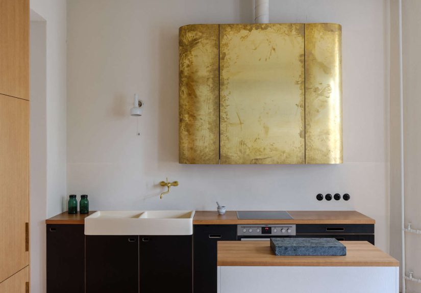
The kitchen in this apartment is a reminder that compact does not have to mean bland. Brass cabinetry, a carefully placed island, and custom detailing make the space feel integrated with the living area rather than pushed into a corner as punishment for existing.
Good kitchen planning in apartments often comes down to proportion and visibility. Because the kitchen is usually part of the main room, it needs to function efficiently while also contributing to the apartment’s overall look. In this remodel, storage and finish choices make the kitchen both practical and memorable.
How to apply it
Use a restrained materials palette, prioritize concealed storage, and make sure the kitchen relates visually to nearby living spaces. If you add an island, confirm it improves workflow instead of creating a daily obstacle course. And remember that one beautiful finish, like brass, wood, or stone, can carry a compact kitchen further than six trendy decisions fighting for attention.
Lesson 8: Privacy Can Be Created Without Closing Everything Off
Small apartments need privacy, but they rarely benefit from rigid compartmentalization. This Kiev remodel handles that tension beautifully. Rather than sealing every function behind thick walls, it creates degrees of separation. The result is a home that feels layered, not boxed in.
This is especially useful for one-bedroom apartments and studios, where privacy often depends on strategic boundaries rather than total enclosure. Bookcases, partial dividers, curtains, glass walls, and level changes can all define zones without sacrificing openness.
How to apply it
Decide where you truly need acoustic or visual privacy, then use the lightest intervention that solves the problem. Bedrooms and bathrooms may need more enclosure. Dining, work, and lounge areas often only need subtle zoning. The best apartment layouts understand that privacy is not binary. It is a spectrum.
Lesson 9: Scale Is the Secret Weapon
One reason the apartment feels composed is that the furnishings are scaled to the rooms. This sounds obvious, but it is where many apartment designs go wonderfully, dramatically wrong. Oversized sectionals, bulky coffee tables, deep cabinets, and giant armoires can eat up floor area and distort circulation.
In a well-planned apartment, every piece earns its footprint. That does not mean everything must be tiny. In fact, a few substantial pieces can ground a room. But their dimensions need to work with the architecture, not against it.
How to apply it
Measure before buying. Then measure again, because optimism has ruined many living rooms. Prioritize leggy furniture that reveals more floor, use wall-mounted elements where possible, and consider whether each piece offers one function or two. A storage ottoman, floating shelf desk, or bed with drawers may outperform a prettier but less useful alternative.
Lesson 10: The Best Remodels Feel Calm, Not Crowded
Perhaps the biggest lesson from Emil Dervish’s Kiev apartment remodel is emotional rather than technical. Great apartment planning creates calm. It makes home life smoother. It reduces friction. It gives people room to think, move, cook, read, host, rest, and simply exist without feeling like they are constantly negotiating with furniture.
That may be why this apartment resonates so strongly. It is stylish, yes, but its style grows out of function. The layout does not just photograph well. It supports daily life. And that is what the best interior design always does.
Real-Life Experiences and Practical Takeaways from Stylish Apartment Space Planning
Anyone who has ever lived in a compact apartment knows that square footage is only half the story. I have seen small homes feel expansive and large homes feel cramped, and the difference almost always comes down to planning. The most memorable apartment interiors are not the ones with the fanciest finishes. They are the ones where life seems to unfold easily.
That is exactly why the Emil Dervish remodel offers such useful inspiration. It reflects a truth many people learn the hard way: you do not need more space nearly as often as you need a better relationship with the space you already have. When the kitchen is in the wrong place, storage is generic, and the furniture floats around like it missed rehearsal, even a decent apartment can feel frustrating. But when zones are clear, light is borrowed intelligently, and each element has a reason to exist, daily life starts to feel lighter.
One of the most relatable experiences in apartment living is trying to make one room do the work of three. The living room becomes an office by day, dining room by evening, and guest room when relatives announce a surprise visit with the confidence of people who do not own air mattresses. In homes like that, thoughtful zoning becomes essential. A single rug can create a seating zone. A narrow console can define an entry sequence. A pendant centered over a table can tell your brain, “This is where meals happen,” even if the table is only five feet from the sofa.
Another common lesson is that clutter is often a planning problem, not a personality flaw. People blame themselves for having too much stuff, but often the issue is that the apartment does not provide the right kind of storage. A coat has nowhere near the entrance. The vacuum lives in a corner like a guilty secret. Pantry items migrate across countertops because the cabinets were never designed for actual cooking. Once storage is tailored to routines, the space becomes easier to maintain. Tidiness starts to feel less like a heroic act and more like the natural result of a smart layout.
There is also something deeply reassuring about apartments that let personal objects breathe. In well-planned homes, art, books, vintage furniture, and inherited pieces do not feel like clutter. They feel curated. That distinction matters. People want stylish interiors, but they also want homes that still look like their lives happened there. The best remodels make space for memory as well as function.
And then there is the emotional impact of light. Almost everyone responds to it. A bright bathroom feels cleaner. A sunlit kitchen feels more generous. A bedroom that borrows light through a glass partition or interior window can feel dramatically more open than one boxed in by opaque walls. Good apartment planning is not just technical. It is psychological. It changes the way space feels in the body.
So the lasting takeaway from this Kiev apartment is simple: style becomes stronger when planning becomes smarter. Start with movement, light, storage, and scale. Build in function. Edit with discipline. Then layer in warmth, history, and personality. Do that well, and even a modest apartment can feel polished, personal, and surprisingly luxurious.
Conclusion
Emil Dervish’s stylish remodel in Kiev is a masterclass in apartment space planning. It shows how open layouts can remain purposeful, how light can be redirected to transform dark corners, and how storage can become part of the architecture rather than a desperate afterthought. Most importantly, it proves that stylish apartment design is not about adding more. It is about arranging better.
Whether you are renovating a compact one-bedroom, refreshing a studio, or simply trying to make your apartment function like it was designed by someone who has met a human before, the lessons here are worth borrowing. Plan zones carefully. Respect light. Use multifunctional design. Let storage do real work. And make sure the finished home still has a pulse.