Table of Contents >> Show >> Hide
If you have ever walked into a room, spotted a giant red apple on the wall, and immediately thought, “Why is this somehow cooler than most people I know?” congratulations: you have probably met Enzo Mari’s La Mela. It is a poster, yes. It is also a lesson in design restraint, a masterclass in visual confidence, and proof that one apple can do more for a wall than a small army of beige abstract prints.
La Mela is one of those rare design objects that manages to feel playful, intellectual, and weirdly inevitable all at once. It is not flashy in the usual sense. There are no gradients, no dramatic shadows, no tortured symbolism begging to be decoded at 2 a.m. Instead, there is simply an apple made so decisively that it stops being fruit and starts becoming an idea. That transformation is exactly why the poster still matters today.
For design lovers, collectors, stylists, and plain old civilians who just want their homes to look smarter, Mari’s apple has become a kind of visual shorthand for taste with backbone. It is modern, but not chilly. Graphic, but not noisy. Familiar, but not boring. And perhaps most impressively, it does all of that without trying too hard. In the age of over-designed everything, that is practically a superpower.
The Backstory: What Exactly Is La Mela?
La Mela was designed by Enzo Mari for Danese Milano in 1963 and is widely recognized as part of his Serie della Natura, or Nature Series. That title sounds poetic, but the concept behind it is wonderfully disciplined. Mari took simple, recognizable subjects from the natural world and reduced them to bold visual essentials. An apple. A pear. Animals. Plants. Forms people already knew by heart, but rendered with such clarity that they became symbols rather than illustrations.
This distinction matters. Mari was not interested in making decorative fruit salad for the cultured classes. He was interested in stripping an object down until it communicated with total force. The poster is a two-color silkscreen, and that limited method is part of its magic. The image feels exacting, almost uncompromising. Every contour works. Every area of color earns its keep. Nothing is there for sympathy points.
The series also reflects Mari’s long-running interest in art multiples, or works that could circulate beyond the one-of-a-kind art object. That idea sounds normal now because we live in a world where design gets reproduced endlessly, but Mari approached it with unusual seriousness. He was not making “cheap copies” of art. He was testing whether a reproduced image could still hold dignity, intelligence, and formal power. La Mela is one of the clearest demonstrations that the answer was yes.
There is also a family thread running through this story. Mari developed parts of the visual language behind these prints in relation to earlier image-making experiments and children’s design projects, including work associated with his brother Elio. That connection helps explain why the poster feels both direct and deep. It has the legibility of something a child instantly understands, but the rigor of something a designer could spend a career chasing.
Why One Apple Became a Design Icon
On paper, the concept should not be this powerful. It is an apple. Humanity has seen a few. Grocery stores remain fully committed to the category. Yet Mari’s version keeps popping up in stylish interiors, design shops, and conversations among people who say things like “the line weight is doing a lot here” and somehow mean it.
The reason is simple: La Mela does not depict an apple so much as define one. Mari was famous for seeking what was essential in a form, and that attitude is all over this poster. The shape is bold without becoming clumsy. The stem is sparse but expressive. The silhouette is generous and recognizable from across the room. It is the visual equivalent of someone who speaks quietly but still runs the meeting.
Scale also plays a huge role. In larger editions, La Mela is not a timid accent piece. It occupies space with the authority of an object that knows exactly why it is in the room. That confidence changes the emotional temperature of an interior. A wall with La Mela does not feel “filled.” It feels declared.
Then there is the color. The red is not merely pretty. It carries symbolic weight without becoming sentimental. Red can suggest ripeness, appetite, warmth, temptation, warning, childhood memory, or pure graphic energy, depending on the context. Mari lets the color stay open enough to work in many environments, while the stripped-down form keeps it from tipping into kitsch. That balance is incredibly hard to achieve. Many posters want attention. La Mela earns it.
Enzo Mari’s Design Philosophy, in Apple Form
To understand why La Mela still resonates, it helps to understand Enzo Mari himself. He was not just a designer of attractive things. He was one of the most intellectually demanding voices in postwar Italian design: skeptical of empty styling, resistant to formal gimmicks, and intensely committed to the relationship between ethics and form.
Mari believed that good design was not about adding flourish until an object looked “special.” In fact, he often pushed in the opposite direction. He argued for necessity, clarity, and rigor. He cared about how things were made, who made them, what economic systems shaped them, and how form could resist becoming mere market fluff. Put more casually: he was not here for nonsense.
That is why La Mela feels so clean without feeling generic. It comes out of a worldview in which every visual decision must justify itself. The poster’s strength lies in subtraction. Mari cuts away the accidental so the essential can breathe. What remains is not thin or cold. It is concentrated.
This same attitude shows up elsewhere in his career, from calendars and containers to his famously radical DIY furniture project Autoprogettazione. Across different mediums, Mari kept returning to a few recurring principles: reduce what is unnecessary, dignify the user, respect intelligence, and never confuse novelty with quality. La Mela embodies all of those ideas in a format simple enough to hang over a sideboard.
There is something almost mischievous about that. Behind the cheerful apple is a deeply serious argument: a familiar everyday image can be transformed into a timeless sign if the designer thinks hard enough and edits ruthlessly enough. In other words, great design is not always born from exotic subject matter. Sometimes it begins in the produce aisle and ends in a museum-quality frame.
Why La Mela Works So Well in Interiors
One reason this poster has lasted is that it performs beautifully in actual rooms, not just in design history books. Plenty of celebrated works look amazing in theory and slightly bewildered above a sofa. La Mela is the opposite. It seems to understand interiors instinctively.
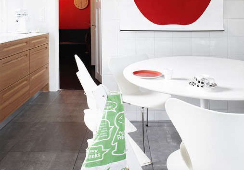
In a minimalist space, it provides a single bold gesture without breaking the calm. In a warm, eclectic room, it adds graphic structure and a clean focal point. In a kitchen or dining area, it can be witty without becoming theme decor. Nobody wants a kitchen that looks like a fruit-themed hostage situation. Mari’s apple avoids that fate because it is graphic design first and fruit second.
It also plays surprisingly well with wood, metal, plaster, books, ceramics, and textiles. Midcentury furniture loves it. So do contemporary pieces with strong geometry. Even traditional rooms can absorb it if the surrounding palette is thoughtful. The poster’s simplicity gives it range. It does not beg to match everything, but it rarely fights with the room either.
Best places to style La Mela
A dining room is the obvious candidate, and for good reason: the subject is food-adjacent, the color has appetite and warmth, and the scale reads beautifully above a console or banquette. But it also shines in studios, home offices, entryways, and kitchens where the architecture is restrained enough to let the image breathe.
How to frame it without ruining the vibe
Keep it simple. A thin black frame is a classic move. Natural wood can work if the rest of the room has warmth and texture. Too ornate, and the whole thing loses its crisp intelligence. La Mela does not need costume jewelry. It already knows who it is.
What the Poster Says About Taste Today
The continued appeal of La Mela says something interesting about contemporary taste. Even in a culture addicted to novelty, many people still crave objects with discipline. They want design that has an idea behind it. They want pieces that feel calm but not bland, iconic but not obvious, friendly but not childish. Mari’s poster meets all of those demands.
It also appeals to people who are tired of disposable visuals. Because the image is built on reduction rather than trend, it holds up. It does not rely on whatever color palette briefly colonized social media this month. It does not scream for attention in the frantic voice of an algorithm. It sits there, bold and composed, letting the viewer catch up.
Collectors appreciate it for obvious reasons, but you do not need to be a collector to understand its charm. The poster rewards looking, and it rewards living with. Over time, its simplicity becomes less simple. You start noticing the balance of the contour, the relationship between fullness and edge, the way the stem prevents the shape from becoming too symmetrical, the slight tension that makes the image feel alive rather than merely cute.
That is the hidden trick of many truly lasting designs: they arrive fast and stay interesting slowly. La Mela is instantly legible, but not instantly exhausted. It gives you the pleasure of recognition first, then the pleasure of understanding later.
Experience: What It Feels Like to Live With La Mela
Living with La Mela is a different experience from simply admiring it online. On a screen, it reads as an iconic design object: crisp, famous, photogenic, the sort of thing that makes people type “where did you get that?” under apartment photos. In person, though, it behaves more like a companion. That may sound dramatic for a poster featuring produce, but here we are.
First, there is the surprise of scale. When you live with a large-format version, the apple does not feel like a small decorative motif. It feels like a presence. You notice it from the corner of your eye while walking through the room. It anchors your morning coffee. It presides over dinner conversations. It becomes one of those household landmarks people use when giving directions: “Leave the book on the cabinet under the apple.” That is a lovely kind of success for design. It enters daily life so fully that it stops performing and starts belonging.
Then there is the emotional effect. Some wall art creates atmosphere through complexity. It asks you to decode mood, narrative, history, or symbolism. La Mela works differently. Its emotional power comes from certainty. The image is so distilled that it feels calming. It clears visual noise instead of adding to it. On days when everything is chaotic, there is something oddly reassuring about looking up and seeing a shape that has been thought through so completely.
At the same time, the poster is not sterile. The red gives it generosity. It warms a room, especially one filled with neutral materials or clean-lined furniture. In winter, it can make a space feel less severe. In summer, it feels juicy and graphic. Near natural wood, it looks grounded. Near white walls, it looks almost electric. Near books and ceramics, it suddenly seems scholarly and domestic at once, which is a very charming trick.
There is also a subtle social effect. Guests respond to it. Some recognize it immediately and launch into design history. Others just say, “That apple is amazing,” which is honestly also correct. The poster starts conversations without acting like a conversation piece. It has cultural weight, but it does not intimidate. That balance is rare. A lot of famous design objects make people feel like they should already know the answer. La Mela simply invites them in.
Perhaps the best experience of all is how the poster ages in your perception. At first, you may love it because it is bold and smart. Later, you begin to appreciate its restraint. Later still, you realize that what once felt like an image now feels more like a principle. It reminds you that clarity is memorable. That simplicity is not the absence of effort but its refinement. That an ordinary subject can become extraordinary when someone looks at it long enough, hard enough, and honestly enough.
And maybe that is why people keep returning to it. La Mela does not just decorate a wall. It models a way of seeing: remove the clutter, keep the meaning, trust the form. Not bad advice from an apple.
Final Take
Enzo Mari’s La Mela poster remains a benchmark because it achieves what so many designs promise and few deliver: immediacy without shallowness, accessibility without compromise, and beauty without excess. It is graphic enough for modernists, warm enough for real homes, and smart enough to keep rewarding attention year after year.
More than six decades after its original design, the poster still feels alive because it was never built on trend. It was built on thought. Mari took a familiar object, pushed it toward archetype, and created an image that sits somewhere between art print, design statement, and daily reminder that clarity is its own kind of luxury.
If you are hunting for the reason La Mela endures, the answer is hiding in plain sight. It is not just an apple. It is what happens when a designer refuses to settle for “an apple” and instead goes looking for the apple. And once you see that, it is very hard to unsee.
Note: This web-ready HTML has been cleaned to remove unnecessary publishing artifacts and citation placeholders.