Table of Contents >> Show >> Hide
- Why Candy Apple Red Works So Well in Fall
- How to Make Candy Apple Red Look Expensive, Not Overwhelming
- 1. Start Small With “Unexpected” Red Accessories
- 2. Wake Up the Kitchen and Dining Area
- 3. Layer It Through Textiles for a Softer Look
- 4. Let One Small Furniture Piece Steal the Show
- 5. Make the Entryway or Front Door More Memorable
- 6. Try a Controlled Paint Moment Instead of a Full Red Room
- Common Mistakes to Avoid With Candy Apple Red
- What People Often Experience After Adding Candy Apple Red at Home
- Final Thoughts
Every fall, the same decorating story tends to roll back into town wearing a plaid scarf: pumpkins, rust, cinnamon, brown, and a respectable amount of “cozy.” Lovely? Sure. Predictable? Also sure. But this year, there is a brighter, punchier, far more charismatic player stealing the spotlight: candy apple red.
This shade is not shy. It is glossy, juicy, nostalgic, and just dramatic enough to make a room feel awake. Unlike moodier wine reds or earthy brick tones, candy apple red has a cheerful energy that reads fresh rather than heavy. It can make a neutral room feel intentional, give a traditional space a playful twist, and add a little “yes, I do have personality” to minimalist interiors that have become a bit too beige for their own good.
The best part is that you do not need to turn your entire home into a Valentine’s Day display or a retro diner to make it work. In fact, candy apple red looks strongest when it is used with a little restraint. Think of it as the design equivalent of hot sauce: a few drops can wake up the whole meal, while a whole bottle may leave everyone sweating.
Below, you will find six smart, stylish ways to bring candy apple red into your home for fall, plus practical advice on where it works best, what colors pair with it beautifully, and how to keep the look sophisticated instead of chaotic. Bright red may be bold, but it is not reckless. Used well, it can be the exact accent your home has been waiting for.
Why Candy Apple Red Works So Well in Fall
Fall decorating usually leans into warmth, depth, and comfort. Candy apple red fits that mood, but it does so with more sparkle and energy than the usual burnt orange or muddy burgundy. It echoes the season without blending into the background. Apples, turning leaves, vintage thermoses, enamelware, wool blankets, berries, and glossy lacquered finishes all live somewhere in its visual family. That is why the color feels seasonal without looking theme-y.
It also plays especially well with the finishes and materials people already love in autumn interiors. Warm wood tones, aged brass, creamy whites, olive green, camel, chocolate brown, black accents, natural linen, and stone surfaces all help candy apple red feel grounded. Put it next to chrome and it leans modern. Pair it with antique brass and walnut, and suddenly it looks rich and collected. Set it against crisp white and it feels graphic and energetic. This is a surprisingly adaptable red.
Another reason the color works right now is simple: so many homes have been living under the reign of safe neutrals for years. Soft greige, oatmeal, warm white, taupe, and mushroom shades are still useful, but many rooms are begging for one fearless move. Candy apple red gives you exactly that. It adds contrast, rhythm, and focus. It can pull your eye across a room and make everything around it feel more considered.
How to Make Candy Apple Red Look Expensive, Not Overwhelming
Before jumping into the six ideas, it helps to know the basic rule of decorating with a bright red accent: repeat it with purpose, then stop. One lonely red object can look accidental. Twelve red objects can look like a department store in late November. The sweet spot is usually two to four moments of red in a room, spaced so the eye moves naturally.
Texture matters, too. Candy apple red looks polished in lacquer, ceramic, glass, velvet, painted wood, and glossy metal finishes. It can also work in textiles, but the shape and surrounding colors need to keep it from feeling too loud. A red stripe, piping detail, floral print, or geometric pattern often looks more elevated than a giant flat slab of bright red fabric.
If you are nervous, start with pieces that can leave the room as easily as they arrived. That way, you get all the thrill and none of the long-term panic.
1. Start Small With “Unexpected” Red Accessories
The easiest and smartest way to use candy apple red is through small decor pieces that bring a quick jolt of color to a calm room. A glossy picture frame, a ceramic bowl, a stack of red books, a candleholder, a lamp base, or even a tray on a coffee table can do the job. These accents feel deliberate, but they do not require commitment, power tools, or an emotional support blanket.
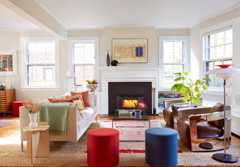
This approach works especially well in living rooms, bedrooms, and home offices where the base palette is neutral. Imagine a room filled with cream upholstery, light oak, black accents, and soft olive textiles. Add a red vase on a console and a red-edged art print nearby, and suddenly the room feels sharper, warmer, and more alive. It is a tiny design move that can create a surprisingly big shift.
When styling small accessories, try to vary the finish. Combine one glossy piece with something matte or textured nearby so the red does not feel flat. For example, pair a lacquered red bowl with a woven basket, or a shiny red candleholder with a linen runner. Contrast is what gives the color sophistication.
Best spots for small red accents:
- Coffee tables and bookshelves
- Entry consoles
- Nightstands
- Open kitchen shelving
- Bathroom counters with simple styling
2. Wake Up the Kitchen and Dining Area
If there is one place candy apple red earns its keep, it is anywhere food appears. Kitchens and dining spaces already have a natural relationship with red because the color suggests warmth, appetite, energy, and gathering. That is why red dishware, cookware, small appliances, bar stools, fruit bowls, and dining linens can look so right here.
You do not need red cabinets to make a statement. In fact, a few targeted moves usually look fresher. Try red counter stools in a mostly wood-and-white kitchen. Display red serving bowls on open shelves. Use a red table lamp in a breakfast nook. Bring in candy apple red with placemats, napkins, or a patterned tablecloth for an easy seasonal layer that can stay well beyond Thanksgiving.
Red is especially effective in kitchens with creamy cabinets, dark stone, butcher block, or brushed brass hardware. It also works beautifully in black-and-white kitchens that need a little pulse. A single red kettle or mixer may sound small, but in the right room it acts like punctuation. Suddenly the kitchen has a point of view.
If your dining space already includes wood furniture, candy apple red can keep the room from feeling too serious. It adds warmth without the heaviness of darker burgundy, and it feels more current than classic hunter green-and-red holiday decorating.
3. Layer It Through Textiles for a Softer Look
If hard finishes feel too bold, bring candy apple red in through fabric. This is one of the easiest ways to make the color feel cozy, lived-in, and seasonally appropriate. Throw pillows, a patterned blanket, a bench cushion, bedding accents, curtains with a red motif, or a runner with red details can all warm up a room without shouting over it.
The trick is to choose textiles that include some visual complexity. Red stripes, floral prints, plaids, embroidery, or woven patterns tend to feel richer than a huge block of plain bright red. They also help tie the color into the rest of the room. A pillow with candy apple red, brown, cream, and olive in the same pattern does more design work than a single flat red square ever could.
This is also where you can make candy apple red feel less seasonal and more timeless. In a bedroom, a lumbar pillow with red piping or a folded throw at the end of the bed can look refined rather than festive. In a living room, one patterned pillow on a neutral sofa often works better than four matching bright red pillows lined up like they are waiting for attendance to be taken.
Color pairings that make red textiles shine:
- Cream and camel for softness
- Olive and brown for fall richness
- Navy and red for crisp contrast
- Blush and red for a fashion-forward look
- Black and red for high drama
4. Let One Small Furniture Piece Steal the Show
Sometimes a room does not need more accessories. It needs one confident move. That is where a small furniture piece in candy apple red can change everything. An accent chair, side table, bar cart, stool, desk chair, or painted cabinet can become the room’s focal point without taking over the entire layout.
This works especially well in spaces that feel visually flat. A neutral living room with soft upholstery, pale walls, and light wood can drift into sameness if every piece is whispering. A red side table or sculptural chair breaks that up beautifully. It gives the room shape and tension. It says, “I did not accidentally buy this whole room in one sleepy afternoon.”
Red furniture also helps when you want to try a bold color without committing to red walls. Since the piece is movable, you can restyle around it as seasons or preferences change. In fall, it looks amazing with rust, olive, chocolate, and brass. In spring, it works with pale pink, denim blue, creamy white, and natural rattan. The same red piece can shift with your styling, which makes it more versatile than people assume.
Choose a shape that feels sculptural and clean. If the silhouette is elegant, the bright color reads modern and intentional. If the shape is clunky, bright red can tip into novelty pretty quickly.
5. Make the Entryway or Front Door More Memorable
If you want maximum impact with a single move, candy apple red at the entry is hard to beat. This can mean a front door, an interior entry bench, a narrow console, a mirror frame, or even a cluster of planters and accessories just inside the door. Entry zones are ideal for bold color because they are transitional spaces. People experience them quickly, which makes strong color feel exciting rather than exhausting.
A candy apple red front door can feel classic, cheerful, and dramatic all at once. It pops against white brick, dark siding, warm neutrals, and natural wood exteriors. It also pairs beautifully with fall porch styling such as mums, lanterns, baskets, ornamental cabbage, or muted pumpkins. The red brings life to all the earthy tones around it.
Inside the house, the entry is your chance to signal the mood of the whole home. A simple bench with a red cushion, a lacquered bowl for keys, or a red lamp on a console table makes the space feel warm and welcoming from the first step in. It is a tiny design handshake. Firm, stylish, and not weirdly sweaty.
6. Try a Controlled Paint Moment Instead of a Full Red Room
Yes, you can paint with candy apple red. No, you do not need to coat every wall and then live inside a giant cherry cough drop. The strongest use of this color in paint is often selective. Think a powder room vanity, the inside of built-ins, a pantry door, window trim, a stair runner wall, or a single accent wall in a space with plenty of natural light.
A controlled paint moment lets you enjoy the confidence of red without overwhelming the room. It also makes architectural details feel more intentional. Painting the inside of a bookshelf red, for example, can turn ordinary shelves into a feature. A red vanity in a powder room can make even a small, simple bathroom feel custom. Red trim on a mostly neutral wall can look crisp, creative, and surprisingly polished.
If you go this route, always sample first. Bright reds shift dramatically depending on natural light, bulb temperature, sheen, and surrounding materials. A shade that feels juicy and sophisticated in daylight can turn too harsh at night if the lighting is cool. Warm bulbs, soft neutrals, wood tones, and brass finishes usually help candy apple red look its best.
Common Mistakes to Avoid With Candy Apple Red
The biggest mistake is using the color everywhere at the same intensity. A room full of identical bright red pieces can feel flat and overly themed. Instead, vary the scale and finish. Use one larger statement and a couple of smaller supporting accents.
The second mistake is ignoring undertones. Candy apple red can lean warm, slightly orange, or cooler depending on the product and finish. Make sure it works with your existing woods, metals, and fabrics. If your room has lots of muddy earth tones, a super-blue red may feel disconnected. If your room is crisp black, white, and chrome, a warmer candy apple red may need a cleaner companion color to feel at home.
The third mistake is forgetting breathing room. Bold color looks better when it has contrast around it. Give the red some negative space. Let it pop against cream walls, pale upholstery, natural stone, or warm wood. That tension is what makes it exciting.
What People Often Experience After Adding Candy Apple Red at Home
One of the most interesting things about decorating with candy apple red is how often people are surprised by their own reaction to it once it is actually in the room. Before using it, many expect the color to feel too loud, too youthful, or too holiday-specific. In real life, the experience is usually more nuanced. What people often notice first is not that the room feels “red,” but that it feels more awake. Neutral spaces can sometimes be calming to the point of drowsiness. Add a few well-placed red accents, and the room suddenly has rhythm. The eye moves more naturally, and the space feels finished in a way it did not before.
Another common experience is that candy apple red changes with the time of day. In bright morning light, it can feel cheerful and crisp. By evening, especially under warm lamps, it takes on a deeper, cozier quality. That shift is part of its charm. It is not a one-note color. Homeowners who add it through ceramics, textiles, or painted furniture often find that the red becomes a bridge between seasons. In fall, it feels rich and harvest-inspired. During winter, it feels festive but still stylish. In spring, it reads fresh and energetic next to greenery and lighter fabrics. In summer, especially when paired with white and natural textures, it can even feel classic and slightly nautical rather than autumnal.
People also tend to discover that the color encourages more editing in a good way. Once a candy apple red object enters the room, clutter suddenly becomes more obvious. The boldness of the color creates visual hierarchy, which means every surrounding item has to earn its place. That can actually improve a room. A bookshelf styled with a few red accents often looks more curated because the decorator starts paying closer attention to proportion, spacing, and balance.
There is also a practical side to the experience. Bright red accents tend to be easier to move around than larger trend pieces in tricky colors. A red stool can migrate from the living room to the bedroom. A red tray can live in the kitchen in October and on a bar cart in December. A red throw pillow can bounce from a sofa to a bench to a reading chair without much fuss. So while the color seems daring at first, it often turns out to be one of the more flexible accents in the house.
Perhaps the most consistent experience, though, is emotional. Candy apple red brings a little boldness into everyday routines. It can make making coffee feel slightly more fun, walking into the entryway feel more welcoming, and a neutral room feel less anonymous. That may sound dramatic for a color, but homes are built from repeated small experiences. When one accent can add warmth, energy, memory, and personality all at once, it earns its place. Candy apple red is not just a trend move for fall. Used thoughtfully, it can become the detail that makes a home feel more alive year-round.
Final Thoughts
Candy apple red is having a moment, but it does not have to be a fleeting one in your home. Its appeal is bigger than trendiness. It brings warmth without dullness, nostalgia without fuss, and boldness without requiring a total design meltdown. That is a rare combination.
If you love the idea but feel cautious, begin with one small move: a bowl, a pillow, a lamp, a tray, or a piece of art. If that goes well, graduate to a stool, a front door, or a painted detail. The goal is not to force red into every room. The goal is to let it create one memorable spark in the places that need it most.
Fall is the perfect time to try it. The season already invites warmth, layering, and a little drama. Candy apple red simply shows up with better lighting and a stronger opinion. And frankly, your beige room might need that kind of friend.