Table of Contents >> Show >> Hide
- Meet Silhouette AF-655, Benjamin Moore’s 2026 Color of the Year
- Why Benjamin Moore’s 2026 Color Forecast Feels So Right
- The Full Benjamin Moore Color Trends 2026 Palette
- How to Use the 2026 Color Forecast in Real Rooms
- What the Forecast Says About 2026 Interior Design
- Who Should Try This Palette and Who Should Proceed Carefully
- The Experience of Living With Benjamin Moore’s 2026 Color Forecast
- Final Thoughts
Every year, paint brands try to convince us that one color is about to become the main character of our homes. Sometimes the pick feels bold. Sometimes it feels safe. And sometimes it feels like a color swatch put on a turtleneck and started charging consulting fees. Benjamin Moore’s 2026 color forecast lands in that sweet spot between stylish and sensible, and honestly, that is part of its charm.
The brand’s headline shade for 2026 is Silhouette AF-655, a rich espresso-brown with charcoal undertones that feels polished, moody, and surprisingly versatile. Around it sits a supporting cast of seven coordinating hues: Raindance, First Crush, Swiss Coffee, Batik, Narragansett Green, Southwest Pottery, and Sherwood Tan. Together, the palette reads like a well-dressed room: tailored, layered, calm, and quietly expensive-looking without necessarily requiring you to sell a kidney for new furniture.
If 2025 was about warming up color, Benjamin Moore’s 2026 color forecast is about refining it. This is not a palette chasing loud novelty. It is a palette chasing depth, comfort, and a grown-up sense of style. In other words, brown is no longer the awkward relative at the design reunion. Brown got a glow-up.
Meet Silhouette AF-655, Benjamin Moore’s 2026 Color of the Year
Silhouette is the kind of color that makes you stop mid-scroll and think, “Wait… do I suddenly want a dark brown hallway?” The answer, inconveniently for your weekend plans, may be yes.
Benjamin Moore describes Silhouette as a sophisticated blend of burnt umber and charcoal, and that combination matters. This is not a flat chocolate brown and it is not a harsh near-black. It sits in a very usable middle ground: deep enough to add drama, soft enough to feel livable, and warm enough to avoid the cold, industrial mood that some dark grays can create.
That balancing act is exactly why the shade works. Silhouette feels timeless rather than trendy, but it still looks fresh because the design world has been moving away from icy neutrals and toward richer, more grounded colors. Think quiet luxury, but for walls. Think classic tailoring, but without having to steam anything.
Benjamin Moore also links the forecast to fashion, especially the renewed appeal of suiting, craftsmanship, and beautifully made basics. That influence makes sense. Silhouette has the same energy as a perfectly cut blazer: structured, flattering, dependable, and a little smug about how good it looks in every light.
Why Benjamin Moore’s 2026 Color Forecast Feels So Right
1. It taps into the return of warm neutrals
For years, many homes were stuck in a loop of cool gray, bright white, and “we swear this room has personality.” That era is fading. Designers and homeowners alike are leaning into colors that feel warmer, softer, and more layered. Silhouette fits this mood beautifully because it behaves like a neutral, but with more substance and emotional range.
2. It makes brown feel elevated, not dated
Brown has had a rough reputation in interiors. Used badly, it can look muddy or old-fashioned. Used well, it feels elegant, cocooning, and deeply chic. Benjamin Moore’s 2026 palette clearly argues for the second version. Silhouette is proof that brown can be luxurious, architectural, and modern when it has the right undertones and the right companions.
3. It supports layered, realistic decorating
Not every homeowner wants a neon statement wall or a trend that expires before the paint fully cures. This forecast works because it encourages layering. The palette includes airy lights, earthy midtones, and dark anchors, giving people multiple entry points depending on their comfort level. You can go full dramatic library, or you can simply paint the trim, a powder room vanity, or the back of a bookshelf and call it a win.
The Full Benjamin Moore Color Trends 2026 Palette
Silhouette may be the star, but the supporting palette is what makes the forecast feel complete. Here is what each shade brings to the table.
Raindance 1572
A steely green softened by easy gray undertones, Raindance is calm without being sleepy. It works beautifully in bedrooms, mudrooms, and kitchens that want a quiet color moment without drifting into “seafoam from a beach rental brochure.”
First Crush CSP-310
This soft, blush-infused neutral adds a tender warmth that keeps the palette from becoming too serious. It is the shade that says, “Yes, the room is sophisticated, but it also knows how to flirt a little.” Try it in a dressing room, nursery, powder room, or anywhere you want subtle warmth.
Swiss Coffee OC-45
Swiss Coffee remains one of Benjamin Moore’s most dependable warm whites for a reason. It softens dark shades, keeps trim from feeling sterile, and helps the entire forecast breathe. If Silhouette is the velvet blazer, Swiss Coffee is the crisp shirt underneath.
Batik AF-610
Batik is a dusty blend of violet and rose, and it gives the 2026 palette a muted romantic streak. It is especially useful for people who want color but not candy color. Batik feels artistic, a little bohemian, and surprisingly flexible with wood tones and brass finishes.
Narragansett Green HC-157
This blackened teal brings depth and a sense of history. It is the most dramatic supporting shade in the palette after Silhouette itself, and it is ideal for cabinetry, libraries, dining rooms, or front doors that deserve a more interesting life.
Southwest Pottery 048
Earthy, kiln-fired, and rich with brown-red clay notes, Southwest Pottery adds warmth and an artisanal feel. It grounds the palette and plays especially well with plaster finishes, leather, woven textures, and natural wood.
Sherwood Tan 1054
Sherwood Tan is the kind of classic neutral that makes everything around it look more expensive. It offers warmth without heaviness, which makes it a smart bridge between deeper colors and lighter architectural elements.
How to Use the 2026 Color Forecast in Real Rooms
Entryways and hallways
Silhouette is a fantastic entry color because it instantly creates a sense of arrival. In a hallway with white trim and warm lighting, it looks tailored and welcoming instead of gloomy. Add a mirror, antique brass hooks, and a natural fiber runner, and the space suddenly looks like it has opinions.
Living rooms
For living rooms, the safest and smartest move is pairing Silhouette with Swiss Coffee on trim and ceiling. That contrast keeps the room balanced while letting the wall color do the heavy lifting. If painting every wall feels too dramatic, use Silhouette on built-ins or a fireplace surround and bring in Raindance or Batik through textiles and accessories.
Kitchens
Narragansett Green and Silhouette both have strong kitchen potential, especially on lower cabinets or islands. If you want the space to stay bright, use Swiss Coffee or First Crush on surrounding walls. Southwest Pottery also deserves attention in kitchens where terracotta, unlacquered brass, and handmade tile already live happily together.
Bedrooms
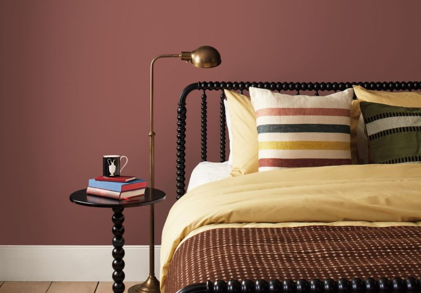
Bedrooms benefit from the softer side of the palette. Raindance, Batik, and Sherwood Tan all create restful, grounded environments. Silhouette can work too, especially behind a bed or in a room with generous natural light, where its moody depth feels cocooning rather than cave-like.
Small spaces
Counterintuitively, dark colors can look fantastic in small rooms. A powder room in Silhouette or Narragansett Green can feel jewel-box rich. A tiny home office in Sherwood Tan becomes calmer and more focused. The trick is commitment: half-measures make a space feel uncertain, while full color immersion makes it feel intentional.
What the Forecast Says About 2026 Interior Design
Benjamin Moore’s 2026 color forecast says a lot about where interiors are heading. The big message is that comfort and sophistication are no longer opposites. People want rooms that feel curated but not stiff, timeless but not boring, and warm without turning into a pumpkin-spice hallucination.
The palette also shows that designers are embracing contrast in a softer way. Instead of stark black-and-white schemes or aggressively trendy brights, we are seeing nuanced pairings: espresso with blush, blackened teal with creamy white, clay with tailored tan. These combinations feel richer because they are more layered.
There is also a broader cultural shift behind all this. Homeowners are craving materials and colors that feel enduring. Craftsmanship, tradition, and detail are back in the conversation. That does not mean everyone wants a formal house. It means people want homes that feel considered. A palette like this helps create that mood because it looks collected rather than accidental.
In that sense, Benjamin Moore’s 2026 trend forecast is not really about one “hot color.” It is about a decorating mindset: choose hues with depth, build rooms slowly, and let neutrals do more than sit there looking polite.
Who Should Try This Palette and Who Should Proceed Carefully
This forecast is a strong fit for anyone who likes warm neutrals, earthy colors, heritage-inspired interiors, tailored details, or moody rooms that still feel inviting. It is especially compelling if your home already has walnut, oak, brass, linen, leather, or stone, because those materials make the palette sing.
On the other hand, if you love ultra-bright whites, candy colors, or coastal palettes with a breezy blue-and-white attitude, Silhouette may feel a little formal at first. That does not mean the forecast is off-limits. It just means your easiest entry point may be Raindance, First Crush, or Swiss Coffee rather than the headline shade.
As always, lighting matters. Silhouette can read sumptuous in one room and heavier in another, depending on exposure and finish. Sample first. Admire second. Paint the whole foyer after. This order saves money and emotional damage.
The Experience of Living With Benjamin Moore’s 2026 Color Forecast
What makes this forecast especially interesting is not just how it looks in styled photos, but how it is likely to feel in everyday life. That is where Benjamin Moore’s 2026 palette really earns its keep.
Silhouette, for example, is not the kind of dark paint color that screams for attention every second of the day. In morning light, it can feel soft and grounded, almost velvety. By evening, especially under lamps or sconces, it becomes more enveloping and intimate. That changing personality is part of the appeal. It gives a room rhythm. You notice it differently at 8 a.m. than you do at 8 p.m., and that makes the space feel alive instead of static.
There is also a practical emotional quality to this palette. Homes today do a lot. They are places to work, rest, eat, entertain, decompress, doomscroll, and pretend we are finally going to organize that one drawer. A palette filled with earthy browns, warm whites, dusty pinks, muted greens, and clay tones supports that reality because it feels stable. None of these shades are frantic. None of them feel like they were chosen purely to shock your guests into complimenting your taste.
In real homes, Raindance would likely be the quiet overachiever: dependable, calming, and easy to pair with wood, black accents, or creamy textiles. First Crush could soften harsher architecture and make a space feel more flattering, especially in rooms that do not get the world’s greatest natural light. Swiss Coffee would do what it always does best: make everything around it look intentional. Batik would bring in a moodier romance without becoming sugary. Southwest Pottery would add warmth in a way that feels handmade and tactile. Sherwood Tan would be the glue that keeps bolder choices feeling connected.
And that is probably the most livable part of Benjamin Moore’s 2026 color forecast: it does not ask homeowners to become completely different people. It does not demand a maximalist makeover or a minimalist purge. It simply offers a richer way to think about color. You can adopt the trend in a single room, on one cabinet, on trim, or across an entire home. The forecast is flexible enough to feel aspirational and practical at the same time.
That balance is hard to pull off, but Benjamin Moore gets close here. The palette feels elevated without feeling inaccessible. It feels current without feeling flimsy. And most importantly, it feels like something people could actually live with for years, which is the whole point of a smart paint forecast in the first place.
Final Thoughts
Benjamin Moore’s 2026 color forecast is less about chasing a flashy moment and more about building a lasting mood. Silhouette AF-655 leads the story with richness and restraint, while the rest of the palette offers softness, contrast, and plenty of room for interpretation. The overall message is clear: 2026 is shaping up to be a year of warmer neutrals, earthy sophistication, and rooms that feel tailored rather than trendy.
So yes, Benjamin Moore just released its 2026 color forecast, and the biggest surprise is that the standout shade is not loud at all. It is dark, grounded, elegant, and confident enough not to shout. Honestly, that may be the chicest move of all.