Table of Contents >> Show >> Hide
- How to Choose the Right Bedroom Color Scheme
- Soft and Airy Bedroom Color Schemes
- Earthy and Cozy Bedroom Color Schemes
- Cool and Serene Bedroom Color Schemes
- Moody and Dramatic Bedroom Color Schemes
- Fresh, Playful, and Personality-Driven Bedroom Color Schemes
- Tips for Making Any Bedroom Color Scheme Look Better
- Final Thoughts
- Extra Experience and Real-World Inspiration
Your bedroom should feel like a reward, not a waiting room with a laundry pile in the corner pretending to be decor. The right bedroom color scheme can make the space feel calmer, cozier, brighter, moodier, or just plain more expensive than your budget had any business allowing. That is the magic of color: it can quietly do a lot of heavy lifting while your throw pillows take all the credit.
If you are choosing a palette for a primary bedroom, guest room, or small apartment sleep space, the best approach is not to chase every passing trend. Start with the mood you want, then consider how much natural light the room gets, whether the space faces north or south, and how bold you are willing to be before 7 a.m. A pale greige can feel serene in one room and slightly sad in another. A deep green can look luxurious by lamplight and dramatic in the best way, not the “why does this feel like a haunted hotel?” way.
Below, you will find 30 bedroom color schemes that range from soft and airy to rich and cocooning. Each one is designed to feel usable in real homes, not just in magazine spreads where no one has a charging cable in sight.
How to Choose the Right Bedroom Color Scheme
Before you commit to a palette, keep three things in mind. First, lighting changes everything. North-facing rooms often benefit from warmer undertones, while sunny rooms can handle cooler shades without feeling chilly. Second, think in layers. A great bedroom color scheme is not just wall paint; it includes bedding, drapery, rugs, wood tones, and metal finishes. Third, let contrast do some work. Even the softest room needs a little tension, whether that comes from black accents, warm wood, or a darker textile.
Soft and Airy Bedroom Color Schemes
1. Warm White + Sand Beige + Oatmeal
This palette is the quiet luxury of bedroom color schemes. Warm white walls create softness without feeling stark, while sand beige and oatmeal tones add gentle depth through upholstery, rugs, and bedding. It works beautifully in small bedrooms because it reflects light and keeps the room feeling open.
2. Cream + Taupe + Soft Black
If you want a neutral bedroom with a little backbone, this is your move. Cream keeps the room welcoming, taupe adds sophistication, and soft black gives the space some structure through lamp bases, frames, or a bench at the foot of the bed. It feels polished without trying too hard.
3. Pale Greige + Ivory + Linen
Pale greige is perfect for people who cannot commit to gray or beige and would like both to stop arguing. Layer it with ivory bedding and linen textures for a bedroom that feels calm, contemporary, and easy to decorate over time.
4. Misty Blue + Crisp White + Driftwood
This is a classic coastal-inspired bedroom color scheme that does not require seashell art or a decorative oar. Misty blue walls feel restful, crisp white keeps things clean, and driftwood tones warm up the palette so it does not feel too cold.
5. Blush Beige + White + Light Oak
Blush beige is one of those quietly flattering shades that makes a bedroom feel softer instantly. It has more personality than plain beige but stays neutral enough to live with long term. Pair it with white bedding and light oak furniture for an understated, romantic look.
6. Soft Sage + Cream + Natural Wood
Sage continues to earn its reputation as a bedroom hero. It feels connected to nature, calm without being sleepy, and fresh without becoming trendy in a way you regret next spring. Cream and natural wood keep it grounded and relaxed.
Earthy and Cozy Bedroom Color Schemes
7. Clay + Camel + Warm White
This earthy combination makes a bedroom feel sunbaked, cozy, and designer-approved. Clay walls or textiles bring warmth, camel adds richness, and warm white keeps it all breathable. It is especially strong in rooms that need a little emotional central heating.
8. Terracotta + Dusty Rose + Cream
Terracotta gives the room warmth, dusty rose softens the edges, and cream prevents the palette from getting too heavy. This scheme works well if you want a bedroom with personality that still feels restful rather than loud.
9. Mushroom + Walnut + Putty
Mushroom tones have become favorites for bedrooms because they sit beautifully between gray, brown, and taupe. Add walnut furniture and putty-colored bedding for a palette that feels timeless, grounded, and subtly upscale.
10. Cocoa Brown + Beige + Brass
Brown is back, and this palette proves why. Cocoa walls or accents create a cocooning feel, beige keeps the room soft, and brass lighting adds a warm glow. It is cozy in the same way a luxury hotel room is cozy: inviting, tailored, and slightly smug.
11. Olive Green + Cream + Cognac
Olive green brings depth without the intensity of a darker forest tone. Paired with cream and cognac leather accents, it creates a bedroom that feels collected and mature. This is a strong choice if you love earthy color schemes with a little masculine balance.
12. Butter Yellow + White + Light Gray
Butter yellow is gentler than bright lemon and far more livable in a bedroom. It brings warmth and optimism, especially in rooms with limited sunlight. White freshens it up, and light gray keeps it from tipping into nursery territory.
Cool and Serene Bedroom Color Schemes
13. Powder Blue + Dove Gray + White
This palette is soft, soothing, and easy to love. Powder blue creates a peaceful backdrop, dove gray adds sophistication, and white keeps the whole space airy. It is a reliable choice for anyone who wants classic bedroom paint colors that still feel current.
14. Seafoam Green + Ivory + Sandy Beige
Seafoam green works best when it is muted rather than minty. In this scheme, ivory and sandy beige give the color a more natural, grown-up feel. The result is a bedroom that feels breezy and light without reading as beach-theme overload.
15. Blue-Gray + White + Charcoal
If you like cooler tones but still want a bit of drama, blue-gray is a smart anchor. White brightens the palette, while charcoal details in pillows, lamps, or a patterned rug create contrast. It is crisp, tailored, and ideal for a modern bedroom.
16. Lavender Gray + Cream + Pewter
Lavender gray is a secret weapon for bedrooms because it reads as neutral with a whisper of color. Cream softens it, and pewter accents add a subtle sheen. This palette feels elegant, a little dreamy, and surprisingly versatile.
17. Haint Blue + White + Honey Wood
Haint blue has that airy, sky-tinted quality that instantly lifts a room. In a bedroom, it looks especially good with white trim and honey-toned wood furniture. The mood is relaxed, lightly nostalgic, and perfect for a guest room or cottage-inspired retreat.
18. Soft Teal + Warm Gray + Ivory
Soft teal brings enough color to wake up a bedroom without turning it into a peacock exhibit. Warm gray and ivory calm it down and make the palette feel balanced. This is a great choice if you want a cheerful bedroom that still supports sleep.
Moody and Dramatic Bedroom Color Schemes
19. Deep Navy + Off-White + Walnut
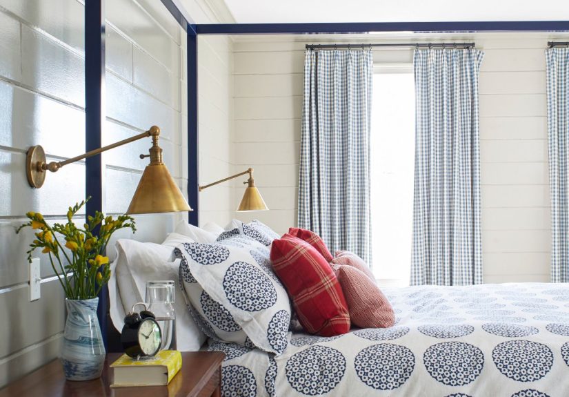
Few bedroom color schemes feel as timeless as deep navy and off-white. Navy creates instant depth and coziness, while off-white trims or bedding keep the room from feeling too dark. Walnut wood adds warmth and makes the whole thing feel richer.
20. Forest Green + Camel + Black
This palette feels bold, grounded, and slightly cinematic. Forest green walls pair beautifully with camel textiles and black metal accents. If you want your bedroom to feel cocooning but still stylish, this is an excellent way to go moody without losing warmth.
21. Charcoal + Greige + White Oak
Charcoal is a strong choice for a sophisticated bedroom, especially when softened with greige bedding and white oak furniture. The mix of dark and light materials keeps the palette balanced. It is modern, architectural, and very good at hiding visual clutter.
22. Aubergine + Mauve + Cream
This scheme is rich but still romantic. Aubergine brings drama, mauve softens the palette, and cream adds lift. The result is a bedroom with a boutique-hotel feel that works especially well with velvet, brass, or curved furniture.
23. Oxblood + Taupe + Antique Brass
For those who want a bedroom with confidence, oxblood delivers. Taupe prevents the color from feeling too intense, and antique brass adds warmth and old-world charm. Use this palette with restraint and strong textures for the best result.
24. Blackened Green + Stone + Walnut
Blackened green is ideal if you want something darker than sage but softer than black. Stone-colored bedding brightens the room, while walnut furniture keeps the scheme grounded. It feels luxurious, enveloping, and just mysterious enough.
Fresh, Playful, and Personality-Driven Bedroom Color Schemes
25. Dusty Peony + Grass Green + White
This color combination has energy, but it is controlled energy. Dusty peony keeps pink sophisticated, grass green adds lively contrast, and white gives the palette breathing room. It is a great way to make a bedroom feel fresh and personal.
26. Coral + Beige + Rattan
Coral can be beautiful in a bedroom when it leans muted rather than tropical punch. Beige softens the look, and rattan or woven textures keep it casual. This palette feels happy, warm, and perfect for anyone who wants a space with personality.
27. Mauve + Mushroom + Cream
Mauve is having a real moment, and in a bedroom it feels unexpectedly refined. Pair it with mushroom tones and cream to create a palette that is soft, modern, and slightly nostalgic in the best way. It is subtle color for people who do not do boring.
28. Emerald + Blush + Gold
Emerald green can be a lot, which is exactly why blush is such a smart partner. The softness of blush tempers the jewel tone, while gold accents add elegance. Use this combination if you want a glamorous bedroom that still feels curated rather than chaotic.
29. Periwinkle + White + Pale Wood
Periwinkle sits between blue and purple, which gives it a playful quality without making it childish. White lightens the look, and pale wood makes it feel Scandinavian and clean. This is a wonderful palette for bright, youthful bedrooms.
30. Peach + Warm White + Cocoa
Peach is friendlier than beige and warmer than blush, which makes it a surprisingly strong bedroom paint color. Paired with warm white and cocoa accents, it creates a room that feels soft, flattering, and just a little sun-kissed year-round.
Tips for Making Any Bedroom Color Scheme Look Better
- Test paint on multiple walls and check it in morning, afternoon, and lamplight.
- Match undertones across fabrics, rugs, paint, and wood finishes for a more cohesive look.
- Use darker shades in bedding, drapery, or an accent wall if full-room color feels risky.
- Choose eggshell or satin for many bedroom walls if you want a balance of softness and practicality.
- Bring in contrast with black, brass, or darker wood so the palette does not feel flat.
Final Thoughts
The best bedroom color schemes do more than look pretty in a photo. They shape how a room feels when you wake up, how it glows at night, and whether you actually want to spend time there beyond sleeping and folding exactly one shirt before giving up. Whether you gravitate toward creamy neutrals, earthy browns, serene blues, or moody greens, the smartest palette is the one that matches your light, your furniture, and your idea of comfort.
Start with one anchor color you genuinely love. Add supporting shades that balance its temperature and intensity. Then layer in texture until the room feels finished. That is when a bedroom stops being just a place for a bed and starts feeling like a retreat.
Extra Experience and Real-World Inspiration
One of the most useful things homeowners discover when choosing bedroom paint colors is that a beautiful paint chip is not the same thing as a beautiful room. A color that looks soft and elegant in the store can suddenly turn icy, yellow, flat, or oddly purple once it lands on four full walls. That is why the real experience of living with color matters just as much as the color itself. Many people start by saying they want a “neutral bedroom,” only to realize that neutral can mean creamy and warm, cool and modern, or earthy and cocooning. That small difference completely changes the final result.
Another common lesson is that bedding often decides whether a bedroom color scheme succeeds. A wall color might be technically lovely, but if it fights with your comforter, wood dresser, or window treatments, the room will always feel slightly off. Some of the most successful bedroom makeovers happen when the palette is built from a fabric, rug, or piece of art rather than from paint alone. In real life, that tends to create a more layered, less “freshly copied from a catalog” look.
Lighting also teaches people humility, fast. Bedrooms with limited natural light usually need warmth somewhere, whether that comes from paint, textiles, or wood tones. Meanwhile, bright south-facing rooms often benefit from a little restraint. Cool colors can stay crisp there, while very bright whites can become almost glaring by midday. This is why so many homeowners end up preferring warmer whites, greiges, muted greens, and soft clay tones once they test samples at home.
There is also the emotional side of bedroom color that people do not always expect. Deep green, navy, cocoa, and aubergine shades can feel surprisingly restful because they visually quiet the room, especially at night. Lighter palettes, on the other hand, can feel more uplifting in the morning and make a smaller bedroom seem less boxed in. Neither approach is better. It simply depends on whether you want your bedroom to feel airy and open or intimate and cocooning.
Perhaps the most consistent experience across real bedroom updates is this: the best rooms are rarely the ones with the boldest paint. They are the ones where the colors, textures, and finishes all agree with one another. A modest sage wall with cream bedding, oak furniture, and soft brass lighting can feel more memorable than a dramatic color used without balance. In other words, the room wins when the palette feels intentional. So if you are updating your bedroom, trust samples, trust lighting, and trust your instinct more than the latest flashy trend. The goal is not to impress a paint swatch. The goal is to create a bedroom that feels good every single day.