Table of Contents >> Show >> Hide
- What you’ll learn
- Fast setup: get better traces in 60 seconds
- Way 1: Vectorize a logo (without turning it into spaghetti)
- Way 2: Turn a hand-drawn sketch into clean vector line art
- Way 3: Create one-color graphics for vinyl cuts, stickers, and laser work
- Way 4: Convert handwriting into editable vector shapes
- Way 5: Make flat “screen-print friendly” art with limited colors
- Way 6: Build icons from rough raster references
- Way 7: Extract textures and convert them into scalable vector fills
- Way 8: Turn photos into stylized poster art (on purpose)
- Way 9: Clean up scanned diagrams, maps, and charts
- Way 10: Convert raster art into brushes, patterns, and reusable assets
- Common mistakes (and how to avoid them)
- When NOT to use Live Trace/Image Trace
- Extra: Real-world experiences & lessons people learn after using Live Trace a lot
- Conclusion
“Live Trace” might sound like a feature that should come with a stage manager and a spotlight, but it’s really Illustrator’s
classic auto-vectorizing superpower. In newer versions of Adobe Illustrator, Live Trace was modernized and renamed
Image Tracesame idea, better engine, fewer emotional breakdowns (usually).
If you’ve ever had a blurry logo, a scanned sketch, or a “my cousin made this in 2009” JPG that needed to become crisp vector art,
this guide is your shortcut. Below are ten practical, real-world ways to use Live Trace/Image Traceplus specific settings,
cleanup tricks, and examples so your traced art looks intentional… not like it fell down a staircase made of anchor points.
Fast setup: get better traces in 60 seconds
Before you trace anything, do two things that instantly improve results: start with the best source image and
pick the right tracing mode. Image Trace can’t invent clean edges out of a tiny, JPEG-crunched mystery blob.
Give it something decent, and it behaves like a professional. Give it garbage, and it proudly traces the garbage.
Quick pre-flight checklist
- Use higher resolution images when possible (especially for line art).
- Increase contrast before tracing sketches (Levels/Curves in Photoshop or any editor helps).
- Open the Image Trace panel: Window > Image Trace.
- Preview on, then start with a preset (don’t freestyle sliders immediately).
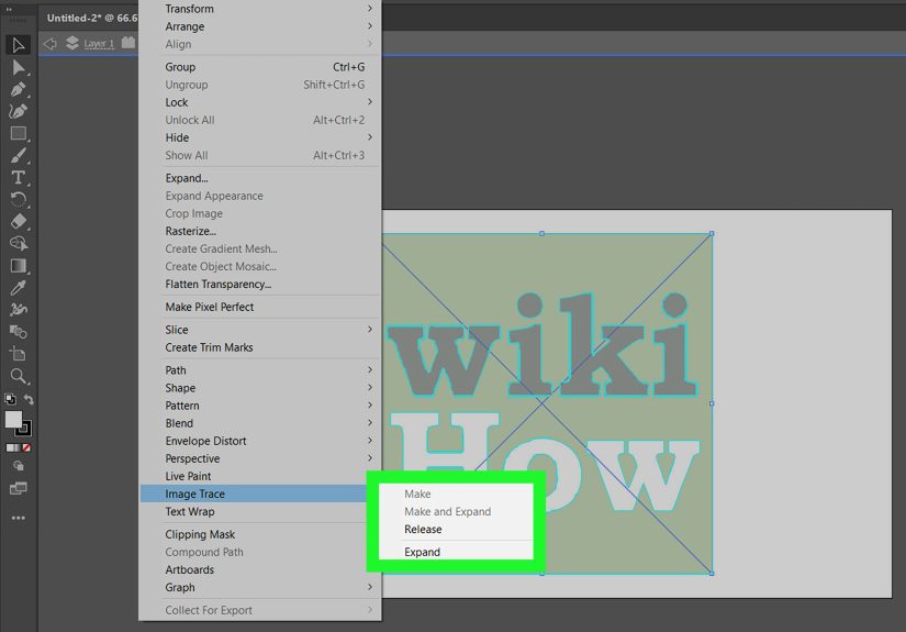
- Expand only when you’re happyExpand commits the trace into editable paths.
One more sanity-saving tip: after you Expand, use Object > Path > Simplify lightly and
clean with the Direct Selection tool. That’s how you keep your file from becoming a 200MB monument to regret.
Way 1: Vectorize a logo (without turning it into spaghetti)
Classic scenario: someone emails you a logo that’s 280 pixels wide and says, “Can you make it bigger for a billboard?”
Yes. You can. You’ll also briefly consider moving to the woods. But Image Trace can help.
Best for
Simple to moderately complex logos, especially flat color marks.
How to do it
- Place the logo: File > Place.
- Select it, then open Window > Image Trace.
- Pick a preset: Black and White Logo or 3 Colors / 6 Colors depending on the mark.
- Adjust Paths for accuracy vs smoothness, Corners for sharp angles, and Noise to ignore tiny junk.
- Click Expand, then Ungroup if needed.
- Clean: delete stray shapes, merge with Shape Builder, and Simplify gently.
Example settings (starting point)
- Flat logos: Mode: Color, Colors: 3–10, Noise: 10–25
- One-color logos: Mode: Black and White, Threshold: tune until edges look right
Pro move: if the logo background is white and you only want the mark, use Ignore White before you Expand.
Way 2: Turn a hand-drawn sketch into clean vector line art
Sketch-to-vector is where Live Trace feels like magicassuming your scan isn’t a moody, gray, shadowy photograph taken under a lamp
that’s auditioning for a horror film. Bright, even lighting and strong contrast make tracing dramatically cleaner.
Best for
Ink drawings, doodles, pencil sketches after contrast cleanup.
Workflow
- Scan or photograph your drawing.
- Boost contrast (so lines are dark and paper is light).
- In Illustrator, Image Trace preset: Line Art or Black and White Logo.
- Use Noise to eliminate speckles and paper grain.
- Enable Ignore White if you want just the strokes/shapes.
- Expand, then refine key areas with the Pen/Curvature tool.
Cleanup tip
If your trace looks “fuzzy,” reduce detail by increasing Noise slightly and lowering Paths a bit.
The goal is fewer points that you can controlnot a thousand tiny wobbles that control you.
Way 3: Create one-color graphics for vinyl cuts, stickers, and laser work
Cut machines and lasers usually want clean, closed vector shapes. Image Trace can convert a raster silhouette into cut-ready paths fast
but only if you trace for simple shapes and then confirm everything is closed.
Best for
Silhouettes, decals, stencils, simple badges, bold line art.
Settings to try
- Mode: Black and White
- Adjust Threshold until the silhouette is solid (no holes unless you want them)
- Noise: 10–50 depending on speckles
- Check Ignore White if you want only the black shape
After Expand
- Use Pathfinder > Unite to merge overlapping pieces.
- Object > Path > Simplify to reduce node count.
- Run a quick “zoom test” at 6400% to spot micro-bits you should delete.
Way 4: Convert handwriting into editable vector shapes
Hand-lettering is personal, charming, and slightly chaoticin the best way. Tracing handwriting lets you scale it for posters,
packaging, or branding while keeping that human feel.
Best for
Signatures, handwritten titles, chalk/brush lettering (with strong contrast).
How to do it
- Start with high-contrast handwriting (dark ink, clean paper).
- Preset: Black and White Logo or Sketched Art if you want texture.
- Increase Threshold until strokes look continuous.
- Use Noise to drop specks.
- Ignore White if you only want the lettering.
- Expand, then smooth just the worst bumps (don’t over-polish or it stops being handwriting).
If you want the stroke feel but fewer shapes, consider tracing as strokes (Line Art) when possiblecleanup can be easier than managing filled blobs.
Way 5: Make flat “screen-print friendly” art with limited colors
Screen printing and certain merch workflows love limited palettes: fewer inks, cleaner separations, less cost. Image Trace can reduce a full-color image
into a manageable number of flat vector colorsespecially if you prep the image first (posterize, reduce noise, boost contrast).
Best for
Posterized illustrations, bold graphics, simplified photos.
Workflow
- Prep the raster: reduce colors (posterize), remove noise, increase contrast.
- Image Trace Mode: Color, then choose a low number of Colors (start with 6–12).
- Expand.
- Use Recolor Artwork to lock into a brand palette if needed.
- Clean overlaps and tiny regions; simplify paths.
Practical example
Turning a photo of a coffee mug into a 6-color tee graphic: posterize the photo first, trace with 6 Colors, expand, then recolor to
your exact ink set. You’ll get bold shapes that separate cleanly instead of a million micro-gradients that no screen printer wants to see.
Way 6: Build icons from rough raster references
When you’re creating an icon set, you often start with a referencemaybe a sketch, maybe a screenshot, maybe a “temporary” PNG that becomes permanent
after three meetings. Image Trace can quickly give you a vector base, then you refine for consistency.
Best for
Simple UI icons, pictograms, signage symbols.
Process
- Trace in Black and White (or limited color).
- Expand and simplify.
- Rebuild geometry where it matters: perfect circles, consistent stroke weights, aligned corners.
- Snap to pixel grid if the icons will be used on screens.
Think of Image Trace as the scaffolding, not the finished building. Great icons are consistent; auto-tracing is… enthusiastic.
Way 7: Extract textures and convert them into scalable vector fills
Want a gritty ink texture or paper grain overlay that scales without blurring? Trace it. You can convert high-contrast texture scans into vectors,
then use them as masks, fills, or overlays in Illustrator.
Best for
Ink splatter, stamp textures, grunge overlays, halftone-ish patterns (flat, not photographic).
Steps
- Use a high-contrast texture image (black texture on white background works best).
- Preset: Black and White Logo or Sketched Art.
- Use Noise to control speckles (yes, some speckles are the pointpick your chaos).
- Check Ignore White so the background disappears.
- Expand and group the texture.
- Use as an Opacity Mask or clipping mask over artwork.
This is also a clean way to make “vector distressed” logosjust don’t overdo it unless your brand identity is “abandoned pirate theme park.”
Way 8: Turn photos into stylized poster art (on purpose)
Image Trace can produce surprisingly cool “posterized” results if you treat it like an effect, not a forensic reconstruction.
The key is embracing simplification: fewer colors, bigger shapes, and intentional cleanup afterward.
Best for
Pop-art portraits, bold editorial illustrations, social graphics.
How to get a good result
- Start with a high-contrast photo (increase contrast, reduce noise).
- Trace in Color with 8–16 colors depending on complexity.
- Expand and then manually merge/clean awkward regions (faces often need help).
- Consider adding your own vector shading shapes instead of tracing every gradient.
If your result looks like a stained-glass window designed by a confused robot, lower the color count and simplify.
“Less detail” is often what makes it look stylish.
Way 9: Clean up scanned diagrams, maps, and charts
Old documents, scanned maps, and screenshots of charts can be hard to reuse because raster text and lines get fuzzy. Tracing can convert lines into
crisp vectors so you can recolor, scale, and update layouts.
Best for
Diagrams, technical drawings, simple maps, flowcharts.
Recommended approach
- Trace the linework separately from the text (text often needs manual rebuilding).
- Use Black and White mode for line art.
- Consider a “strokes not fills” approach when possible for easier edits.
- Expand and then rebuild key lines with proper strokes and arrowheads.
Tracing is great for geometry and shapes. For type, you’ll usually get better results by retyping with a similar font
(and saving yourself from a future where every letter is its own weird polygon).
Way 10: Convert raster art into brushes, patterns, and reusable assets
One of the most underrated uses of Image Trace: turning hand-made marks into Illustrator assets. Trace a doodle once, and you can reuse it forever
as a brush, scatter element, or repeating pattern.
Ideas you can build
- Art brushes: Trace a brush stroke, Ignore White, Expand, then create a brush from the vector shape.
- Pattern swatches: Trace a motif, clean it, then Object > Pattern > Make.
- Scatter packs: Trace multiple doodles and save them as Symbols.
Mini example
If you draw a set of three ink strokes on paper, scan them, trace each as black shapes (Ignore White), then turn them into Art Brushes,
you’ll instantly have a custom “handmade underline” system for headings, posters, and social graphicswithout relying on generic brush packs.
Common mistakes (and how to avoid them)
Mistake 1: Tracing low-quality images and expecting miracles
Image Trace isn’t a CSI lab. If the input is blurry, artifacted, or tiny, the output will be too. Upscale responsibly, improve contrast,
and use cleaner source files when available.
Mistake 2: Slamming sliders to 0 or 100
Maxing out Paths/Corners often creates jagged, overfit results (every pixel becomes a “feature”). Use moderation, then manually refine the critical areas.
Mistake 3: Expanding too early
Expand is commitment. Preview and tweak until you like the trace, then Expand once. Otherwise, you’ll spend your day deleting artifacts you didn’t need.
When NOT to use Live Trace/Image Trace
Sometimes the fastest path is not tracing at all. If the design must be perfect (like a premium logo rebuild),
or the raster is a complex photo with subtle gradients, you’ll often get better results by manual vector drawing or a hybrid approach:
trace to get a base, then rebuild with clean geometry.
A good rule: if you need control, trace less and draw more. If you need speed, trace more and clean smart.
Extra: Real-world experiences & lessons people learn after using Live Trace a lot
If you ask designers what Live Trace/Image Trace feels like in real projects, you’ll hear a consistent theme:
it’s not a “finish button.” It’s a starting accelerator. The most successful workflow is usually:
trace quickly, then refine intentionally.
One common experience is the “anchor point shock.” The first time you Expand a trace on a detailed image, you zoom in and realize you’ve created an
entire ecosystem of points. It’s not unusual to see thousands of anchors where you expected a clean shape. The lesson that follows is practical:
optimize the trace before Expand (Noise and Paths are your best friends), and then simplify afterward. People who learn this early
tend to keep their files lighter, faster, and easier to editespecially if they’re sending artwork to teammates, printers, or clients who don’t enjoy
opening a single icon that weighs more than a family photo album.
Another real-world pattern: designers discover that image preparation is half the job. When the source is a sketch,
a tiny adjustmentlike boosting contrast or removing background shadowscan turn a messy trace into a clean one. Teams that build a quick “prep step”
into their process get better results with less cleanup. It becomes almost routine: clean the raster, then trace. People who skip prep often end up
fighting artifacts with manual edits, which is basically doing the hard work in the least satisfying way.
There’s also the moment where someone tries to trace type and expects it to become a real font. What usually happens is a pile of shapes that look
like letters from far away and like a ransom note up close. After one or two of these incidents, most designers adopt the practical habit:
trace shapes and linework, retype text. It’s faster, more editable, and the results look professionalespecially for diagrams,
packaging, and presentation graphics.
In production environmentsprinting, signage, or merchandisingpeople learn that limited color tracing is a strategy, not a restriction.
Tracing with 6–12 colors and then recoloring to a brand or ink palette can create bold, readable graphics that reproduce reliably. The “experience lesson”
is that the best print results usually come from simplifying on purpose, not trying to preserve every photographic detail.
This is especially true for screen printing, where flat shapes and clear separations are worth more than perfectly traced gradients.
Finally, after enough projects, users develop a good instinct for when to trace and when to draw. Image Trace shines when time is tight, when the artwork
is already high contrast, or when you’re building assets like textures, silhouettes, and rough concepts. But when brand precision matterslike a flagship logo,
a clean icon system, or a client who will scrutinize curves at 800% zoomexperienced designers often use tracing as a draft, then rebuild the final vector
with geometry they control. The biggest “real-world” takeaway is comforting: the goal isn’t to get a perfect trace. The goal is to get a
useful base quickly, then make deliberate design choices that turn it into professional vector art.