Table of Contents >> Show >> Hide
- Why Progress Bars Matter in User Onboarding
- The Core Psychology Behind Progress Bars
- How Progress Bars Influence User Behavior
- Types of Progress Indicators in Onboarding
- Best Practices for Designing Progress Bars in Onboarding
- Common Mistakes That Hurt Onboarding Performance
- Specific Examples of Progress Bars in Onboarding
- How to Measure Whether Your Progress Bar Works
- Experiences and Practical Lessons From Progress Bar Design
- Conclusion
Progress bars look simple: a thin line, a few steps, maybe a cheerful “80% complete” message. Yet in onboarding, that humble little bar can behave like a tiny behavioral scientist wearing sneakers. It tells users where they are, how far they have come, and whether the finish line is close enough to bother pursuing. In a world where users abandon apps faster than they abandon New Year’s resolutions, progress bars can make onboarding feel manageable, motivating, and surprisingly human.
At their best, progress bars reduce uncertainty, increase confidence, and turn a vague setup process into a visible journey. At their worst, they become decorative confetti: pretty, meaningless, and slightly suspicious. The difference lies in psychology. People do not simply respond to screens; they respond to perceived effort, reward, control, momentum, and trust. A well-designed onboarding progress bar works because it speaks directly to those mental triggers.
Why Progress Bars Matter in User Onboarding
User onboarding is the process that helps new users understand a product, complete important setup actions, and reach the first meaningful moment of value. For a budgeting app, that may mean connecting a bank account. For a project management tool, it may mean creating the first workspace. For a fitness app, it could be setting a goal and completing a first plan. The progress bar gives this journey shape.
Without visible progress, onboarding can feel like walking down a hotel hallway where every door looks the same and nobody told you your room number. Users wonder: How long will this take? Am I almost done? Is this worth it? Should I close the tab and make a sandwich? A progress indicator answers those questions before frustration grows.
Progress bars are especially useful when onboarding requires multiple steps: profile creation, preferences, permissions, integrations, tutorials, payment setup, or initial customization. They help users form a mental model of the process. Instead of seeing onboarding as one large task, users see it as a series of smaller, achievable steps.
The Core Psychology Behind Progress Bars
1. The Goal-Gradient Effect
The goal-gradient effect describes a simple behavioral pattern: people tend to increase effort as they get closer to a goal. Think about a coffee loyalty card. If you need ten stamps for a free drink and already have eight, you are more likely to buy another latte even if your bloodstream is already 40% espresso. The finish line pulls you forward.
In onboarding, a progress bar makes the finish line visible. “Step 4 of 5” feels different from “please continue.” The first message creates urgency and momentum; the second sounds like a polite hostage situation. When users see they are close to completion, they are more likely to continue because the remaining effort feels smaller than the progress already invested.
2. The Endowed Progress Effect
The endowed progress effect suggests that people are more motivated to complete a task when they feel they have already made progress. This is why some onboarding flows start users at 10%, 20%, or “profile started” after sign-up. The user has not merely arrived; they have begun.
This technique can be powerful, but it must be honest. If a user signs up and immediately sees “70% complete” before doing anything meaningful, the product may feel manipulative. But if account creation, email verification, or imported data genuinely completes part of the setup, showing that progress can make users feel rewarded instead of tricked.
3. Reduced Cognitive Load
Onboarding often fails because it asks users to think too much too soon. “Configure your dashboard, invite your team, choose your integrations, personalize your settings, complete your profile, and please enjoy our 19-slide product tour.” That is not onboarding. That is a digital obstacle course with fonts.
A progress bar reduces cognitive load by organizing the journey. It tells users what to focus on now and what comes later. When each step has one clear purpose, users do not need to hold the entire process in memory. They simply follow the path.
4. Perceived Control and Predictability
People tolerate effort better when they understand it. A progress bar gives users a sense of control because it turns hidden system logic into visible status. This is especially important when onboarding includes waiting states such as account setup, file import, AI personalization, identity verification, or data syncing.
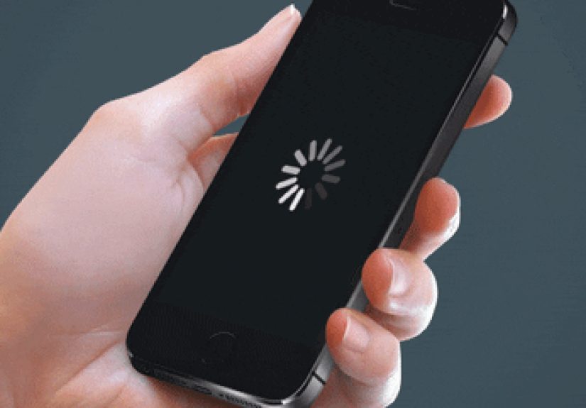
A determinate progress bar, such as “60% complete,” is usually better when the system can estimate completion accurately. An indeterminate indicator, such as a spinner or animated bar, is useful when the system knows something is happening but cannot calculate progress. The key is matching the indicator to reality. False precision damages trust.
How Progress Bars Influence User Behavior
They Increase Completion Rates
Progress bars can make users more likely to finish onboarding because they transform the process into a visible commitment. Once users complete several steps, quitting feels like wasting effort. This does not mean designers should trap users. It means the interface should make progress feel valuable and completion feel achievable.
For example, a SaaS onboarding checklist might show five tasks: create a workspace, invite a teammate, connect a calendar, set a goal, and publish the first project. Each completed task gives the user a small success signal. The bar fills. The checklist shrinks. The product feels less like software and more like a helpful coach saying, “Nice, keep going.”
They Reduce Abandonment During Long Flows
Long forms are dangerous. Every additional field is a tiny door through which motivation can escape. Progress bars help by showing users that the process is finite. If a mortgage application, insurance quote, job application, or healthcare intake form must be long, a progress indicator can prevent the user from feeling lost.
However, accuracy matters. If a progress bar says users are 90% done and then reveals a surprise step with 30 required fields, it creates what UX teams sometimes call “rage-click weather.” The user feels misled. A good progress bar should reflect actual effort, not merely the number of screens.
They Encourage the “Next Best Action”
Onboarding should not be a museum tour of every feature. New users do not need to admire the entire product architecture. They need to know what to do next. Progress bars work best when paired with clear calls to action: “Add your first project,” “Connect your store,” “Choose your goal,” or “Invite your first collaborator.”
This connects with behavior design: action happens when motivation, ability, and a prompt come together. A progress bar supports motivation, a simple step improves ability, and a clear button provides the prompt. When all three align, onboarding becomes easier to complete.
Types of Progress Indicators in Onboarding
Linear Progress Bars
Linear progress bars are ideal for flows with a clear beginning and end. They work well for account setup, profile completion, file uploads, and multi-step forms. Their strength is simplicity. A user can understand the state of progress in one glance.
Step Indicators
Step indicators show named stages such as “Account,” “Preferences,” “Import,” and “Finish.” They are useful when users need context, not just percentage. This format is common in checkout flows, application forms, and enterprise onboarding because it helps users understand the structure of the task.
Checklists
Checklists are especially effective for product onboarding because they combine progress tracking with action guidance. Unlike a fixed wizard, a checklist can let users complete tasks in a flexible order. This is useful when not every user has the same goal. A founder, marketer, developer, and customer support manager may all need different first steps inside the same product.
Profile Completion Meters
Profile completion meters are common in social networks, marketplaces, recruiting platforms, and professional tools. They encourage users to add details by showing that a richer profile is closer to completion. The best versions explain why each missing item matters. “Add a photo to build trust” is more persuasive than “Your profile is incomplete,” which sounds like a disappointed robot.
Best Practices for Designing Progress Bars in Onboarding
Make Progress Honest
Never use a progress bar as a magic trick. If the bar jumps quickly to 90% and then freezes, users feel betrayed. If the process has uncertain timing, use wording that sets expectations clearly: “Importing your contacts. This can take a minute.” Honesty reduces anxiety more than fake speed.
Keep Steps Small and Meaningful
Each onboarding step should represent a real action, not filler. “Watch our brand video” is rarely a necessary onboarding task. “Create your first invoice” probably is. The progress bar should reward actions that move users toward value.
Show the Benefit of Completion
A progress bar answers “how far?” but users also need “why continue?” Add microcopy that connects completion to value: “Complete setup to get personalized recommendations,” “Finish your profile so clients can find you,” or “Connect your calendar to avoid scheduling conflicts.”
Avoid Overwhelming Users with Too Many Steps
A progress bar with 17 steps can accidentally announce, “Welcome! Your afternoon now belongs to us.” If onboarding is complex, group tasks into stages or separate required setup from optional optimization. Users should reach value quickly, then continue improving later.
Celebrate Completion Without Being Weird About It
Completion deserves feedback. A simple success message, checkmark, animation, or next-step recommendation can reinforce accomplishment. But keep the celebration proportional. Launching confetti because someone selected a time zone may be a bit much, unless the time zone was emotionally complicated.
Common Mistakes That Hurt Onboarding Performance
Using Progress Bars for Decorative Purposes
A progress bar should communicate status. If it does not reflect real progress, it becomes visual noise. Users quickly learn to ignore interface elements that do not help them make decisions.
Counting Screens Instead of Effort
Five screens are not always equal. One screen may ask for a name. Another may require uploading documents, choosing permissions, and entering billing details. A good onboarding progress system should reflect effort, complexity, and user perception, not just page count.
Blocking Users from Exploring
Some products force users to finish onboarding before they can see anything useful. This can work for regulated or setup-heavy products, but it can also frustrate curious users. When possible, allow skipping, saving, or returning later. A progress bar should guide, not imprison.
Ignoring Mobile Constraints
On mobile, space is limited and attention is fragile. Progress indicators should be compact, readable, and accessible. Tiny labels, low contrast, or unclear step names can make the experience harder instead of easier.
Specific Examples of Progress Bars in Onboarding
A language learning app might use a progress bar during initial setup: choose a language, select a skill level, set a daily goal, and complete a first lesson. The bar creates momentum because users can see that the setup leads directly into learning.
A B2B analytics platform might use a checklist instead: connect data source, invite teammate, create dashboard, schedule report. Each task connects to activation. The progress bar is not just measuring setup; it is guiding the user toward the first useful business outcome.
An ecommerce checkout flow might use a step indicator: shipping, payment, review. Users understand where they are and what remains. This reduces uncertainty at a moment when trust is critical. Nobody wants to wonder if “Place Order” secretly means “now answer 12 more questions about your sock preferences.”
How to Measure Whether Your Progress Bar Works
Design teams should not assume a progress bar is effective just because it looks polished. Measure onboarding completion rate, step-by-step drop-off, time to activation, number of skipped steps, support tickets during onboarding, and return rate after partial completion. Qualitative feedback matters too. Session recordings, usability tests, and user interviews can reveal whether users understand the progress indicator or simply tolerate it.
A/B testing can compare different formats: percentage bar versus checklist, five-step wizard versus three grouped stages, optional checklist versus forced onboarding. The winning design is not always the prettiest. It is the one that helps users reach value with the least confusion and the most confidence.
Experiences and Practical Lessons From Progress Bar Design
In real onboarding projects, progress bars often reveal a bigger truth: users are not lazy; they are calculating. Every second, they estimate whether the next action is worth the effort. A progress bar can tip that calculation in your favor, but only when the product earns trust.
One common experience is that users respond better when the first step is extremely easy. For example, instead of asking new users to configure a full dashboard immediately, a product might begin with a simple question: “What are you trying to accomplish?” Once answered, the progress bar moves. That small movement matters. It gives users a sense of ownership. They have started shaping the product around their goal.
Another lesson is that labels matter as much as the bar itself. “Step 2 of 5” is useful, but “Step 2 of 5: Connect your calendar” is better. It reduces mystery. Users should never have to wonder what a step means. Clear labels make the journey feel shorter because the brain can categorize the work ahead.
Progress bars also work best when paired with immediate feedback. If a user completes a task and nothing visibly changes, the motivation boost disappears. A checkmark, filled segment, updated percentage, or short success message creates closure. The interface should say, in effect, “That counted.” Humans love knowing that effort counted. It is basically the emotional foundation of stickers, trophies, and finishing a to-do list with one item you already completed just so you can cross it off.
However, progress bars can backfire when they expose too much complexity too early. A new user who sees “1 of 12 steps completed” may feel defeated before they begin. In that case, grouping steps into phases can help: “Basic setup,” “Personalize,” and “Go live.” This makes the journey feel organized rather than endless.
It is also important to distinguish required progress from optional progress. A profile may be usable at 60% complete, while advanced setup can happen later. Communicating this prevents users from feeling blocked. For example: “Your account is ready. Complete the remaining steps to improve recommendations.” That message respects the user’s time while still encouraging deeper engagement.
The strongest onboarding progress bars do not merely show completion; they create confidence. They make users feel that the product is understandable, the task is achievable, and the reward is near. When that happens, progress bars stop being decoration and become part of the product’s behavioral engine.
Conclusion
The psychology behind progress bars is powerful because it connects visual design with human motivation. Progress indicators reduce uncertainty, create momentum, support goal-oriented behavior, and help users understand what comes next. In onboarding, that can mean the difference between a user who disappears after sign-up and a user who reaches the product’s first “aha” moment.
The best progress bars are honest, meaningful, accessible, and tied to real user value. They do not trick users into continuing; they help users believe continuing is worth it. That is the real impact of progress bars on user behavior: they turn effort into visible momentum, and visible momentum is one of the most persuasive forces in digital experience.