Table of Contents >> Show >> Hide
- What Tokai Is (and Why It Looks So Rich on the Wall)
- Meet the “Rose” Colorway: Not Just Pink, Not Just Sweet
- Where Tokai Rose Works Best (Room by Room)
- Styling a Large-Scale Repeat Without Feeling Overwhelmed
- Planning & Ordering: The Part Where People Either Feel Smart or Feel Sorry
- Installation & Care: Keeping the Pretty Things Pretty
- Is Tokai Rose Worth It?
- Real-World Experiences With Robert Kime’s Tokai Wallpaper – Rose (Extra Notes)
- Conclusion
Some wallpapers whisper. Others politely clear their throat and ask everyone in the room to sit up straight.
Robert Kime’s Tokai Wallpaper in Rose is the second kindconfident, collected, and just eccentric
enough to make your walls feel like they’ve been to at least three countries and one very good flea market.
If you’re looking for a wallcovering that feels “designer” without screaming “I just discovered interiors on the internet
yesterday,” Tokai Rose is a compelling pick. It’s a large-scale pattern with a soft, romantic colorway that can swing
from cozy to dramatic depending on what you pair it withand how brave you feel about committing to a repeat that
does not believe in being subtle.
What Tokai Is (and Why It Looks So Rich on the Wall)
Developed from a velvet panel: texture, translated
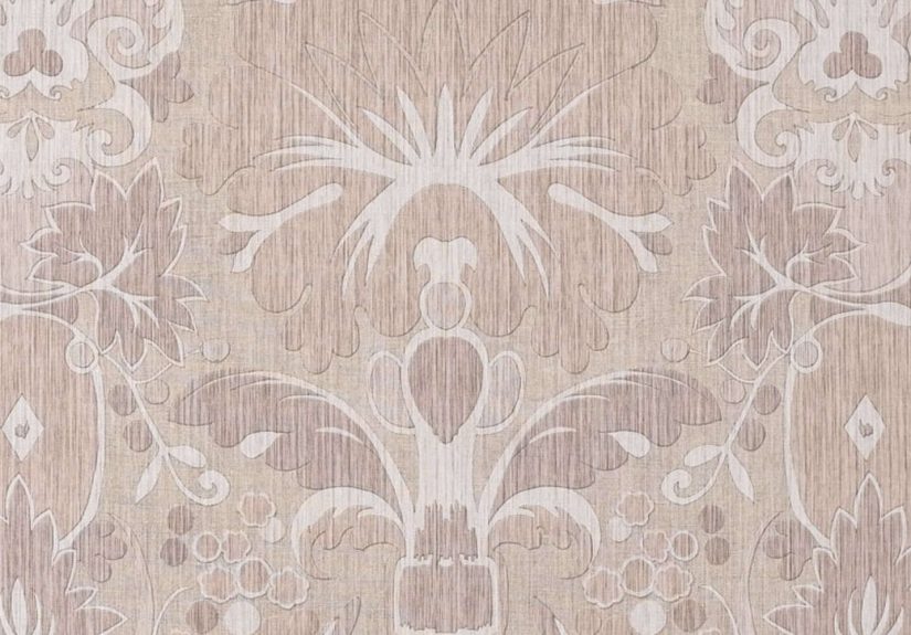
Tokai was developed from a velvet panel, which helps explain its slightly plush, dimensional vibe even though
it’s paper on the wall. Designs that originate in textiles often carry a sense of depthlike the pattern has a “nap”
or a soft shadoweven when the surface is flat. The result is a motif that feels layered and storied, not crisp and
computer-perfect.
Quick specs that matter in real life
Tokai is a large-scale wallpaper with a generous repeat, which is both the magic and the math problem.
Here are the headline measurements commonly listed for this design:
- Roll width: 52 cm (about 20.5 inches)
- Roll length: 10 m (about 11 yards)
- Pattern repeat: 140 cm (about 55.1 inches)
Translation: Tokai Rose is meant to be seen from across the room. It’s not a tiny ditsy print that politely disappears
behind your furniture. It’s more like wall art that happens to come on a roll.
Paper notes: lovely, but not a “toddler with a marker” surface
Robert Kime wallpapers are often described as printed on high quality non-coated paper, and the brand advises that
dye batches can vary slightlymeaning it’s smart to request a stock sample before ordering and to make sure your rolls
come from the same batch for one room. Also, professional installation is commonly recommended (especially when the
repeat is big enough to have its own personality).
Meet the “Rose” Colorway: Not Just Pink, Not Just Sweet
“Rose” can mean a lot of things: ballerina slipper, antique blush, dusty petal, or “this looked neutral at 2 p.m. and
now it’s definitely pink at 7 p.m.” Tokai Rose tends to read as softly warm and romantic rather than
neon or candy-like, which makes it surprisingly flexible.
Color pairings that make Tokai Rose look expensive (instead of accidental)
- Warm whites and creams: keep it airy and classic, especially with natural textures (linen, oak, rattan).
- Deep greens: olive, moss, or a moody pine turns Rose into a “grown-up floral” moment.
- Inky blues and near-black: makes the pattern feel dramaticgreat for libraries, dining rooms, or “I host cocktails” energy.
- Soft browns and putty neutrals: grounds the sweetness and brings out the antique, collected feeling.
- Brass, aged bronze, and warm wood: pulls the palette toward heritage rather than pastel.
If you’re nervous about pink, think of Tokai Rose less as “pink wallpaper” and more as “a warm, rosy undertone that
flatters everything.” Like good lighting, but for your walls.
Where Tokai Rose Works Best (Room by Room)
Powder rooms: the jewel-box effect
Small rooms are where big patterns get to be fearless. Designers often treat powder rooms like jewelry: tiny space,
maximum sparkle. Tokai Rose can look incredible in a compact bath with a vintage mirror, a sculptural sconce, and paint
on the trim pulled from the wallpaper’s deeper tones. Bonus: guests are trapped long enough to admire it.
Bedrooms: soft drama without the chaos
In bedrooms, Tokai Rose can be the perfect “statement without shouting.” Consider a single wall behind the headboard,
or a reading nook wall that becomes a cozy backdrop. If you’re working with 10-foot ceilings, large-scale prints often
feel calmer than tiny repeats, which can look visually busy from bed-height.
Entryways and hallways: instant personality
Entryways are basically your home’s handshake. Tokai Rose gives a confident first impressionespecially in a hallway
where the repeat can unfurl as you walk. Pair it with a runner, an antique console, and one “found object” (a bowl, a
lamp, a framed sketch) so it looks curated rather than showroom-perfect.
Dining rooms: romance that can handle candlelight
Rose tones glow at night. In dining spaces, Tokai Rose can feel warm and flatteringparticularly with dimmable lighting,
natural wood, and classic silhouettes. If you want to lean in: paint the ceiling a softer tone pulled from the paper,
then add linen drapery and a chandelier that’s slightly too dramatic (in a good way).
Styling a Large-Scale Repeat Without Feeling Overwhelmed
Scale is your friendif you let it do the work
A big motif can actually be easier to live with than a tiny, hyper-repetitive print. Why? Your eye reads it as a “scene”
rather than visual static. That said, the wall needs breathing room: let one or two hero pieces shine (a bed, a sofa,
an antique cabinet) and keep the rest quieter.
Accent wall vs. all walls vs. pattern-drenching
- Accent wall: best if you’re testing the waters, budgeting carefully, or want the pattern as a focal point.
- All four walls: best when the room is calm in furniture and finishes; it creates an immersive, cocooning look.
- Pattern-drenching: wallpaper plus coordinating textiles (drapery, bedding, upholstery). Gorgeous when done thoughtfully, chaotic when done in a rush.
A simple rule: if your furniture already has a lot to say (tufting, carving, bold fabric), go accent wall. If your
furniture is quieter, you can wrap the room and let Tokai Rose be the main character.
Trim, paint, and the “make it look intentional” trick
Want Tokai Rose to feel integrated? Pull one color from the wallpaper and use it on surrounding elementstrim, a ceiling,
or even a nearby door. It’s the difference between “pretty wallpaper” and “the room has a point of view.”
Mixing patterns (without summoning design chaos)
Tokai Rose plays well with:
- Stripes: classic, calming, and good at organizing a room visually.
- Small geometrics: as long as they share a warm undertone.
- Textured solids: linen, grasscloth-like textures, or woven looks that read as “pattern, but quietly.”
Keep at least one “quiet” layer in the mix. If everything is patterned, your room stops being charming and starts being
an obstacle course for the eyes.
Planning & Ordering: The Part Where People Either Feel Smart or Feel Sorry
Measuring basics that prevent the dreaded “one-roll short” moment
- Measure the width of each wall you plan to cover and add them together.
- Measure the wall height (use the highest point if ceilings vary).
- Don’t subtract doors and windows when estimatingmost pros recommend leaving them in your math because waste and matching eat into your total anyway.
- Account for repeat: large repeats typically increase waste because you’ll trim to align the pattern.
- Order extra (often 10–15%) if you’re doing a big repeat, complex corners, or you simply want to sleep at night.
Why the repeat matters more than you think
With a repeat around 140 cm, you’re not just buying coverageyou’re buying alignment. If you want the pattern to match
perfectly at seams, you’ll likely sacrifice more paper at the top and bottom of each drop. Some installers can reduce
waste by planning the layout carefully, but the safest assumption is: a large-scale repeat needs a little extra wallpaper.
Batch, minimums, and samples (the grown-up logistics)
For premium wallpapers, it’s common advice to keep rolls from the same dye lot for consistent color. Many trade
retailers also encourage ordering samples first, especially because lighting can shift how “Rose” reads in your space.
Some listings note an 11-yard roll and may require a minimum of two rollsso it’s worth planning your coverage before
you fall in love with just one wall.
Installation & Care: Keeping the Pretty Things Pretty
Surface prep is the unsexy secret
Wallpaper looks best on smooth, properly prepped walls. Any bumps, flaky paint, or texture will showespecially when a
pattern is large enough to create long sightlines. If your walls have heavy texture, a skim coat or lining paper can be
the difference between “bespoke” and “why does my wallpaper look like it’s hiking?”
Start where mistakes hide
Installers often start in a less noticeable corner because the final seam is the one place the pattern may not match
perfectly. In other words: begin where the room won’t hold a grudge against you later.
Cleaning and durability
A high-end paper wallpaper typically appreciates gentle treatment: soft dusting, careful spot-cleaning as recommended
by the supplier, and avoiding high-splash zones unless the product is rated for it. If you’re putting Tokai Rose in a
bathroom, good ventilation is not optionalit’s the difference between “romantic” and “peeling.”
Is Tokai Rose Worth It?
Tokai Rose is for people who want their home to feel layered and personal. You’re paying for a design that looks like
it comes from a deep archivebecause it doesand for the kind of pattern that makes a room feel finished without adding
more furniture. If you love the look but fear commitment, start with an accent wall or a small room. If you already know
you’re a “full wallpaper person,” go ahead and wrap the room and live your best life.
Real-World Experiences With Robert Kime’s Tokai Wallpaper – Rose (Extra Notes)
People who choose Tokai Rose often describe the experience in two phases: the swoon (when you first see
it) and the planning (when you realize it has a 140 cm repeat and you suddenly respect math more than
you did last week).
The swoon usually happens with a sample. In daylight, Tokai Rose can read soft and warmalmost like a dusty antique
textile. Then evening rolls in, lamps turn on, and the same paper can feel richer and more dramatic. That lighting shift
is why experienced decorators tape samples to multiple walls and check them at different hours. A wallpaper labeled
“Rose” is basically a mood ring, and your bulbs are the ones in charge.
Next comes the layout conversation. With a large-scale repeat, homeowners and designers often plan “hero views”: the wall
you see when you enter, the panel behind a bed, the stretch of hallway that gets the best light. The pattern’s scale can
look calmer when it has room to breathe, so some people intentionally keep that wall lighter on art and heavier on
texturethink a simple linen headboard, a vintage rug, and one great lamprather than a gallery wall competing for
attention.
Ordering is where the practical lessons show up. Many shoppers report that luxury wallcoverings can come with minimums
(often two rolls) and that buying “just enough” is risky. Between trimming for pattern alignment, leveling the first drop,
and navigating corners that are never as square as your builder promised, people tend to be happiest when they order a
bit more. The relief of having an extra roll is realespecially if you ever want to patch a damaged section later or
wallpaper a closet door for a sneaky matching moment.
Installation itself is often described as “worth hiring out,” particularly for paper wallpapers and large repeats.
The first panel has to be perfectly plumb, and pattern matching rewards patience. When the installer gets it right, the
seams all but disappear, and Tokai Rose looks like it was painted onto the wall. When it’s rushed, the eye catches a
mismatch from across the room, and suddenly that beautiful pattern becomes the only thing anyone can see (including you,
forever).
After it’s up, the daily experience tends to be surprisingly cozy. Tokai Rose can make even new construction feel older
and more lived-inespecially when paired with antiques, warm woods, and slightly imperfect objects that look collected
rather than purchased as a set. People who worry it will feel too “pink” often find it reads as warm and flattering,
more like a rosy neutral than a sugary pastel. And yes, guests notice it. It’s the kind of wallpaper that sparks the
classic line: “Okay… where did you get this?”
Finally, there’s the leftover-paper joy. Offcuts from Tokai Rose often get used in unexpectedly satisfying ways: lining
drawers, wrapping the back of a bookcase, framing a panel like art, or papering the inside of a closet for a private
little “bonus room” effect. In other words, the experience doesn’t end when the last seam is smoothedit keeps paying
dividends in small, charming details that make a home feel thoughtfully finished.
Conclusion
Robert Kime’s Tokai Wallpaper – Rose is a masterclass in romantic, collected style: bold enough to feel
special, soft enough to live with, and detailed enough to make a plain room feel like it has a history. If you plan
carefullysample first, measure honestly, and respect the repeatTokai Rose can turn a wall into a signature.
And if anyone asks whether you “did it for the aesthetic,” you can say yes… but also for the joy of having the prettiest
wall in the neighborhood.