Table of Contents >> Show >> Hide
- What “Geometry” Actually Means in a Finnish Home
- Why Finland Makes Geometry Feel Cozy Instead of Cold
- The Finnish Geometry Playbook You Can Steal
- Room-by-Room: How to Apply the Lesson
- Materials That Make Geometry Feel Warm
- Common Mistakes (and How to Avoid Them)
- A 5-Minute “Geometry Audit” Checklist
- Real-World Experiences: Living With Finnish-Inspired Geometry (Extra )
- Conclusion: The Takeaway From Finland
Geometry gets a bad reputation. Somewhere around the time you met the word “hypotenuse,” geometry started to feel like a pop quiz in a fluorescent-lit classroom. But Finland has a different take: geometry as comfort. Geometry as calm. Geometry as the secret sauce that makes a home look crisp, modern, and still totally human (not like a showroom where you’re afraid to exhale).
Remodelista’s “A Lesson in Geometry from Finland” spotlights Helsinki-based designer Suki Vento (of Varpunen) and the way she and her husband refreshed their homekeeping the playful geometric spirit, but editing it into something quieter, sharper, and more grown-up. The result is a masterclass in how lines, grids, and simple shapes can make even a small space feel intentional. Think: clean white drawers and tidy tile lines, balanced by tactile materials and little pops of personality.
This article breaks down what makes that Finnish approach workand how you can borrow the logic without moving to Helsinki, learning a new language, or pretending you “only drink coffee from a handmade ceramic mug” (though you absolutely can).
What “Geometry” Actually Means in a Finnish Home
When Remodelista calls it a “lesson in geometry,” it’s not talking about turning your dining table into a protractor station. It’s about how a home can be organized by clear shapes and repeatable structurethen softened by materials, light, and lived-in details.
1) The Grid: Where Calm Starts
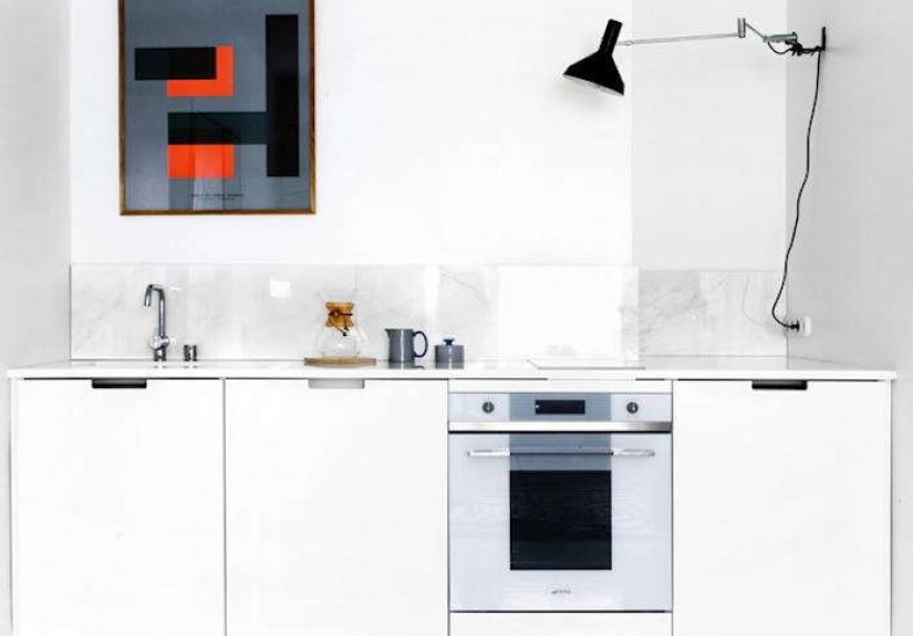
In the featured Helsinki kitchen, the geometry is obvious in the best way: a clean run of minimalist drawers, crisp edges, and tile that reads like graph paper (but prettier). When your base layer is a gridcabinet fronts, tile seams, shelf spacingyour eye relaxes because it knows where to land.
Try it at home: pick one “grid moment” per room. That can be a tiled backsplash with consistent joints, a shelving system with evenly spaced uprights, or a gallery wall aligned to a single invisible rectangle.
2) The “One Bold Shape” Rule
Finnish interiors often feel restrained, but not boring. One trick is a single confident graphic moment: a bold poster with strong typography, a sharply outlined mirror, a lamp with a clear silhouette. In the Remodelista feature, a graphic poster above the counter acts like a visual anchorone strong rectangle that says, “Yes, I live here, and I have opinions.”
Try it at home: choose one hero graphic per room. One. Not twelve. (Your walls don’t need to look like they got into a fight with a sticker machine.)
3) Softening the Math With Texture
Here’s the part people miss: Finland doesn’t do “hard minimalism” like it’s a dare. The geometry is balanced with texturelinen, wood, leather, glass, baskets, textiles, and a few organic shapes (like branches in a vase) that break up all the straight lines.
Try it at home: for every strong line, add one soft surface. Think: tile + linen towel, shelf grid + woven basket, crisp cabinetry + warm wood stool.
Why Finland Makes Geometry Feel Cozy Instead of Cold
Finnish design has deep roots in modernism, but with a human-friendly twist. A big influence is Alvar Aalto, whose work is often described as modern yet warmusing natural materials, thoughtful light, and forms that support everyday life. The Finnish version of “modern” isn’t just “less stuff.” It’s “less stuff, but smarter.”
That mindset shows up everywhere:
- Light awareness: In northern climates, light is precious, so spaces are designed to reflect and distribute it.
- Function first (but make it beautiful): Storage isn’t hidden like a shameful secretit becomes part of the visual rhythm.
- Material honesty: Wood looks like wood. Stone looks like stone. Metal looks like metal. No one’s trying to cosplay as Carrara marble with plastic.
Even when Finnish design leans geometric, it’s typically grounded by tactile choiceslike birch, wool, linen, leather, and ceramics. That’s why it feels livable rather than clinical.
The Finnish Geometry Playbook You Can Steal
If you want the “A Lesson in Geometry from Finland” vibe, don’t start with shopping. Start with structure. Geometry is a plan, not a product haul.
Step 1: Choose Your “Shape Family”
Pick two or three shapes that will dominate the room. For example:
- Rectangles + circles (classic modern: shelves, frames, round mirror)
- Squares + lines (grid-forward: tile, checked textiles, modular storage)
- Triangles + stripes (graphic energy: wall art, patterned rug, angular lamp)
Once you choose, repeat them gently across the room. The repetition is what makes it feel cohesive.
Step 2: Use Negative Space Like It Pays Rent
Finnish rooms often feel “clean” because they leave space around objects. That breathing room makes everyday items look curatedeven if you’re just storing soap and a brush.
Rule of thumb: leave at least 30–40% of any shelf surface visually open. Your stuff will look more intentional immediately.
Step 3: Keep the Palette Tight, Then Add One “Metal Moment”
A restrained palette makes geometry pop. Whites, grays, warm neutrals, and soft woods do the heavy lifting. Then one small metallic accentcopper, brass, chromeadds sparkle without chaos. In the Remodelista feature, even a humble scrubber becomes a tiny design flex.
Step 4: Make Storage Part of the Design
One of the most charming ideas from the Finland feature is how storage can look graphic: sacks, baskets, and containers that feel like design objects, not clutter. When storage repeats a color or shape, it stops feeling like “stuff” and starts feeling like “pattern.”
Room-by-Room: How to Apply the Lesson
The Kitchen: Tiny Space, Big Geometry
The featured home shows a compact kitchen that still feels polished. The trick is using clean cabinet lines and a consistent surface treatment (tile or stone) so the room reads as one composed rectangle rather than a jumble of parts.
- Keep cabinet fronts simple: flat panels, minimal hardware, or discreet pulls.
- Let the backsplash do the talking: subtle stone, marble, or clean tile lines.
- Add one graphic element: a poster or print with strong type or simple shapes.
- Upgrade one functional object: a well-designed faucet, a beautiful brush, a single standout utensil.
Practical example: If your counters feel chaotic, move 80% of items into drawers. Then leave only a tray with the daily essentials. Suddenly your kitchen looks like it has a plan (because it does).
The Bathroom: Spa Energy Through Repetition
A Finnish-inspired bath doesn’t need a renovation. It needs rhythm: matching containers, neutral baskets, and fewer competing labels. When everything repeats a color family, the geometry of the room (mirrors, tile, countertop edges) becomes the star.
- Decant soaps into matching bottles (instant calm).
- Use baskets or bins that share a shape and tone.
- Hang towels so folds create clean rectangles (yes, folding is design).
The Kids’ Space: Display, Don’t Dump
One of the most realistic details from the Remodelista story is how everyday life (toys, books, textiles) can still look intentional. Shelving systems with clean lines turn “kid stuff” into a tidy pattern instead of a floor-based crisis.
- Use shelves with repeating spacing (the grid effect).
- Group toys by color or material (wood together, bright plastics together).
- Keep a “rotation bin” so only some toys are out at once.
Bonus: this doesn’t just look betterit makes cleanup faster, which is basically modern luxury.
The Living Area: Stacks, Straps, and Visual Order
Even small styling choices can feel geometric. Stacking magazines into a clean rectangle and securing them with a strap is a simple way to make “stuff” look designed. Grouping vases, books, or objects into clusters of three also creates structure without rigidity.
- Stack books horizontally to form rectangles.
- Use one tray to “frame” loose items into a single shape.
- Mix one round object into a mostly-rectangular setup to soften it.
Materials That Make Geometry Feel Warm
If you copy the lines but ignore the materials, you’ll end up with a home that looks like it’s waiting for its first personality to arrive. The Finland lesson works because the geometry is paired with tactile choices.
Winning combinations
- White + wood: crisp structure plus warmth (classic Nordic move).
- Stone + linen: cool surface, soft textile.
- Leather + paper: a strap, a handle, a detail that feels handmade.
- Glass + greenery: clean shapes with organic life.
When in doubt, choose materials that look better with age. Finnish-inspired homes aren’t about perfection; they’re about patina with purpose.
Common Mistakes (and How to Avoid Them)
Mistake 1: Too Many Patterns Fighting for Attention
Geometry looks best when it has contrastone or two patterns, not a whole pattern parade. Keep patterned textiles to a couple of key pieces and let solid colors do the rest.
Mistake 2: Ignoring Scale
A tiny checker pattern on everything can feel busy. A huge graphic print in a small room can feel like it’s yelling. Match pattern size to the size of the surface: big wall = bigger shapes; small towel = smaller pattern.
Mistake 3: Forgetting Lighting
Geometry needs shadows to read well. If your lighting is harsh or dim, your clean lines won’t feel intentionalthey’ll feel accidental. Add layered light: one overhead, one task light, one soft lamp. Your room will instantly look more “designed.”
Mistake 4: Treating Minimalism as a Personality Test
You don’t have to live like a monk to enjoy geometric calm. The goal is not “own nothing.” The goal is “own fewer things that work harder.”
A 5-Minute “Geometry Audit” Checklist
- Do I have one clear grid? (tile lines, shelves, cabinet fronts, paneling)
- Do I have one hero graphic? (poster, mirror, bold lamp)
- Is there breathing room? (open surfaces, uncluttered shelves)
- Do materials add warmth? (wood, linen, wool, leather, ceramic)
- Does storage look intentional? (matching containers, grouped baskets)
Real-World Experiences: Living With Finnish-Inspired Geometry (Extra )
To make this feel practical (and not like an abstract design theory lecture), here are a few real-life-style scenarios that show what tends to happen when people apply the “geometry from Finland” approach at home. No magic, no marble castlesjust the kind of changes that quietly improve daily life.
Experience 1: The Small Kitchen That Suddenly Felt Bigger
A common complaint with small kitchens isn’t just lack of spaceit’s visual noise. One homeowner swapped mismatched countertop clutter (three jars, two cutting boards, four random bottles) for a single tray and one graphic print above the work area. Then they moved everything else into drawers. The kitchen didn’t physically expand, but it felt wider because the eye had fewer stops. The grid of cabinet fronts and tile lines became the “background texture,” while the poster became the “foreground anchor.” The funniest part? Guests started asking if the kitchen had been remodeled. It hadn’t. It had been edited.
Experience 2: The Bathroom That Stopped Looking Messy (Even When It Wasn’t Perfect)
Bathrooms are where geometry goes to dieusually under a pile of labels and half-used bottles. Another simple win: switching to two matching dispensers (soap and lotion), placing cotton items in one neutral container, and limiting the counter to one small dish plus a hand towel folded into a clean rectangle. The room still functioned the same, but the surface stopped looking “accidental.” The geometry worked like a visual reset button: straight towel edge, round dish, rectangular tray. Even when life got busy, the bathroom held its shape.
Experience 3: The Kids’ Room That Became Easier to Maintain
In kid spaces, the biggest difference often comes from giving objects a repeatable “home.” A family installed simple shelves with consistent spacing and created zones: books in one rectangle, toys in another, art supplies in a third. They also introduced rotationonly a portion of toys stayed out. The geometry did something sneaky: it taught the room how to tidy itself. Kids don’t need to understand “design language” to understand that blocks go in the left bin and cars go on the middle shelf. Clean lines become a routine, not a rule.
Experience 4: The Living Room That Looked Curated Without Feeling Precious
People worry that a geometric, Nordic-inspired look means you can’t relax. The opposite tends to happen. When the main shapes are clearsofa rectangle, rug rectangle, coffee table rectangleyour “mess” has fewer ways to spread. A throw blanket draped over one arm reads like texture, not chaos. A stack of magazines strapped together reads like a design choice, not procrastination. The room becomes forgiving because the underlying structure is strong. You can live in it, and it still looks like you meant it.
That’s the real lesson: geometry isn’t about being strict. It’s about creating a framework that makes everyday life look a little more elegantwithout requiring you to become someone who alphabetizes their spices for fun (unless you do, in which case, please adopt me).
Conclusion: The Takeaway From Finland
“A Lesson in Geometry from Finland” isn’t about copying one perfect kitchen or chasing a specific shopping list. It’s about learning how structure makes a home feel calm: grids, repeated shapes, a tight palette, and storage that looks intentional. Then you soften the math with the good stuffwood, textiles, light, and a few objects that show you have a personality.
If you start with one roomone grid, one hero graphic, one edited surfaceyou’ll feel the difference immediately. And once you see how geometry can make a space feel both modern and warm, you’ll never look at a simple tile line the same way again.