Table of Contents >> Show >> Hide
- Why Trim Color Dates a Home Faster Than Wall Color
- 6 Trim Colors That Are Quietly Dating Your Home
- 1) Yellowed Cream (a.k.a. “Nicotine Chic”)
- 2) Pinky Beige / Almond Trim (the Builder-Grade Time Capsule)
- 3) Icy Blue-White (“Printer Paper White”)
- 4) Cool Gray Trim (“Millennial Gray’s Side Quest”)
- 5) High-Gloss Jet Black Everywhere (the “Pinterest Noir” Phase)
- 6) Orange-Toned Honey Oak / Red-Mahogany Stain (the “Golden Era” That Won’t Quit)
- How to Update Trim Color Like a Pro (Without Losing Your Mind)
- Quick Cheat Sheet: Trim Color Pairings That Rarely Regret Themselves
- FAQ: Trim Color Questions People Google at 1:00 a.m.
- Conclusion: Let Your Trim Flirt With the Present
- Real-World Trim Color Experiences (and What They Teach You)
- Experience #1: The “Why Does My White Trim Look Like Butter?” Mystery
- Experience #2: When Cool Gray Trim Turns a Cozy Room Into a Dentist Office
- Experience #3: The High-Gloss Black Trim Phase (a Love Story With Fingerprints)
- Experience #4: Orange Oak Trim Doesn’t Always Need PaintSometimes It Needs a Supporting Cast
- Experience #5: The Underrated WinColor-Drenched Trim That Looks Designer-Level
Trim is the eyeliner of your house. When it’s right, everything looks awake, polished, and expensive. When it’s wrong, your gorgeous walls suddenly look… tired. Like they stayed out too late with a backsplash from 2007.
The tricky part? Most “dated” trim colors aren’t loud about it. They don’t kick down your front door wearing a “HELLO I’M FROM 1998” sash. They just whisper itevery time light hits your baseboards. This guide breaks down the most common outdated trim colors that can age a home, why they do it, and what to use insteadwithout turning your renovation budget into a true-crime documentary.
Why Trim Color Dates a Home Faster Than Wall Color
Walls are forgiving. You can repaint them in a weekend and pretend you never owned “Foggy Dolphin Gray.” Trim is different: it’s everywheredoors, casing, crown, baseboardsso your eye reads it as the home’s permanent “setting.” If the trim feels off, the whole house feels off.
Trim also reflects light differently because it’s usually painted in a higher sheen (satin, semi-gloss, or gloss). That shine amplifies undertonesyellow, pink, blue, greenand undertones are where dated vibes love to hide.
6 Trim Colors That Are Quietly Dating Your Home
1) Yellowed Cream (a.k.a. “Nicotine Chic”)
This is the off-white that used to be white. Over timeespecially with older finishestrim can warm up, yellow out, and start looking like it’s been steeped in chamomile tea for a decade.
Why it dates a home: Yellowed trim makes everything around it look dingier by comparisonwhite walls look gray, bright kitchens look a little… cafeteria. It also reads “older paint technology,” even if the rest of the room is modern.
Try instead: A modern warm white that still feels clean. Look for whites described as “soft,” “balanced,” or “warm without going buttery.” Popular directions include creamy-but-not-yellow whites for traditional homes, or neutral whites that won’t fight your floors.
- Best for: homes with warm wood floors, beige stone, brass, warm lighting
- Avoid: super-bright “base white” shades that make warm trim look more yellow
2) Pinky Beige / Almond Trim (the Builder-Grade Time Capsule)
If you’ve ever looked at trim and thought, “Is that… skin-toned?”welcome. Almond and pink-beige trim was a go-to in late-’90s through early-’00s builds because it felt “soft” and hid scuffs. It also pairs beautifully with… nothing in 2026.
Why it dates a home: It can make rooms feel flat and dusty. Next to modern whites, it reads as dingy; next to modern colors, it reads as oddly rosy. It’s the trim equivalent of a landline phone.
Try instead: “Dirty neutrals” (think putty, mushroom, warm greige) or a neutral white with a subtle warmth. The goal is depth without pink.
- Design move: Pair updated trim with warmer, layered neutrals and textured materials (linen, oak, stone) for an intentionally cozy look.
3) Icy Blue-White (“Printer Paper White”)
This one surprises people. Bright, cool whites can look stunningin the right house. But when a cool, blue-leaning white trim is slapped onto a warm interior (warm floors, warm counters, warm bulbs), it can feel sterile. Like your living room is about to ask you to take a number and wait.
Why it dates a home: Not because cool white is “old,” but because it screams a specific era of design choices when used everywhere without considering undertones. It can also make nearby whites and creams look yellow or “dirty,” even if they’re not.
Try instead: If you love a crisp look, choose a neutral bright whiteone that reads clean without going blue. Or, if your home is warm-toned, shift your trim slightly warmer so it blends instead of scolding your floors.
- Quick test: Hold a bright sheet of white paper next to your trim. If the trim looks creamy or yellow by comparison, you’re living in the “yellowed cream” zone. If the trim looks bluish compared to a warmer wall, you’re in the “printer paper” zone.
4) Cool Gray Trim (“Millennial Gray’s Side Quest”)
Gray walls had a moment. Then gray floors had a moment. Then gray cabinets tried to have a moment and got politely escorted out. Somewhere in there, people started painting trim gray tooeither to “modernize” woodwork or to match gray walls.
Why it dates a home: Cool gray trim can feel one-note and chilly, especially now that design is shifting toward warmer, earthier palettes. It reads “renovation circa mid-2010s,” particularly when paired with cool white walls and brushed nickel everything.
Try instead: Keep the idea (contrast) but update the tone:
- Warm greige trim if you want soft definition without stark lines.
- Neutral white trim if you want it to disappear and let architecture speak.
- Color-drenched trim (same color as walls, slightly different sheen) for a modern, high-end look.
5) High-Gloss Jet Black Everywhere (the “Pinterest Noir” Phase)
Black trim can be gorgeous. It can also be… a lot. If your entire home has shiny black doors, glossy black baseboards, and dramatic black window casing, congratulations: your trim has become the main character, and it’s auditioning for a reboot of a moody detective series.
Why it dates a home: Ultra high-contrast trends are the quickest to timestamp a house. High-gloss black also highlights every bump, fingerprint, and speck of dust like it’s getting paid per flaw.
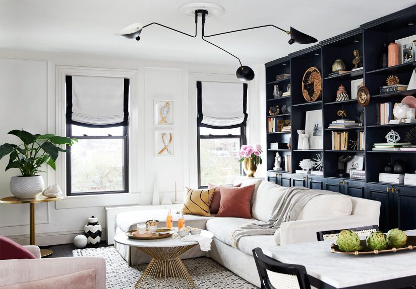
Try instead: Keep black as an accent, not a lifestyle. Choose a softer black (charcoal/soft black) and a more forgiving sheen (often satin). Use it where it feels intentionalfront door, a single dramatic room, built-ins and let the rest breathe.
6) Orange-Toned Honey Oak / Red-Mahogany Stain (the “Golden Era” That Won’t Quit)
This is technically not “paint,” but it is absolutely a trim colorand it’s one of the biggest quiet daters in older homes and early-’00s builds. That orange glow (or red-toned mahogany) can overpower modern finishes.
Why it dates a home: Strong orange/red undertones can clash with today’s more muted, natural palettes. They also reflect warm light onto walls, subtly shifting your wall color and making “perfect neutrals” feel off.
Try instead: You have options, and none of them require pretending the trim doesn’t exist:
- Embrace it: Pair with warm whites, soft putty neutrals, earthy greens, and aged brass so it feels classic, not accidental.
- Tone it down: Re-stain toward a more neutral brown or use products that reduce orange/red pull.
- Paint it: If the wood is not historically significant and you want a clean reset, paint can modernize fast.
How to Update Trim Color Like a Pro (Without Losing Your Mind)
Step 1: Match undertones, not vibes
“Warm” and “cool” aren’t aesthetic opinions; they’re undertone realities. Warm walls usually want warm-leaning trim. Cool walls usually want crisper, cooler trim. When undertones fight, your trim starts dating your home loudly.
Step 2: Pick a sheen that flatters your house
Trim is commonly painted in satin or semi-gloss because it’s durable and cleanableespecially for doors, baseboards, and anything touched by humans, pets, or rogue vacuum cleaners. Higher sheen = more reflection = more visible surface imperfections. If your trim has texture, dents, or a century of “character,” satin can be more forgiving than full semi-gloss.
Step 3: Sample the trim color in real lighting
Paint chips lie. Morning light lies differently than afternoon light. And warm LED bulbs can turn a “clean white” into “vanilla pudding” by night. Test a sample on a few trim spots: one bright area, one shadowy area, and one near a big color influencer (like a wood floor or countertop).
Step 4: Decide whether you want trim to disappear or frame
- Disappear: Use a trim color close to wall color (or the same color with a different sheen).
- Frame: Use a higher-contrast trim color (often a cleaner white) to outline doors and windows.
- Feature: Use a bolder trim color selectively (library room, dining room, built-ins).
Quick Cheat Sheet: Trim Color Pairings That Rarely Regret Themselves
Warm homes (oak floors, cream stone, brass, warm bulbs)
- Soft warm white trim + warm off-white walls
- Putty/greige walls + neutral warm white trim
- Earthy green walls + creamy trim for a classic, grounded look
Cool/modern homes (concrete, cool stone, black metal, cooler light)
- Crisp neutral white trim + clean light walls
- Mineral blues/blue-grays + bright neutral trim (not icy-blue trim)
- Monochrome drench (same color walls/trim) for a gallery feel
Older/character homes (craftsman, colonial, vintage details)
- Soft white trim (not stark) to honor original millwork
- Muted heritage colors on walls + warm trim for depth
- Selective dark trim (library/dining) with a lower sheen for drama
FAQ: Trim Color Questions People Google at 1:00 a.m.
Is white trim always timeless?
White trim is classic, but “white” is not one color. The wrong white can look yellow, blue, gray, or just plain confused. The timeless part is choosing a white that plays nicely with your walls, floors, and lightnot choosing the brightest can of white within sprinting distance.
Should ceilings match trim?
Often, yesespecially if you want a clean, continuous look. But if your ceilings read darker because of low light or shadows, you can choose a ceiling white that’s slightly brighter or slightly different in undertone. The goal is harmony, not strict matching for matching’s sake.
Can I paint trim a color (not white)?
Absolutely. Colored trim can be sophisticated and architectural, especially in rooms with strong millwork. Just be intentional: pick a color that complements your palette, and choose a sheen that won’t spotlight every brush mark.
Conclusion: Let Your Trim Flirt With the Present
“Dated” isn’t a moral failing. It’s just a message. Your trim is telling a storysometimes a charming one, sometimes a “we bought this in bulk in 2003” one. If your home feels a little older than you want, trim is one of the highest-impact, lowest-square-footage updates you can make.
Pick trim colors that respect your home’s fixed elements (floors, stone, cabinets), match undertones, and use sheen strategically. Then sit back and enjoy the weirdly satisfying moment when your whole house looks more expensive… because your baseboards stopped time traveling.
Real-World Trim Color Experiences (and What They Teach You)
If trim color choices were purely logical, none of us would have ever painted anything “eggshell” and then argued about what kind of egg. In real homes, trim decisions happen under pressure: you’re trying to finish before guests arrive, your partner is holding a paint chip like it’s a courtroom exhibit, and the lighting in the hallway is giving every white paint color a totally different personality.
Experience #1: The “Why Does My White Trim Look Like Butter?” Mystery
A super common scenario: a homeowner updates wall paint to a modern, clean neutralthen suddenly notices the trim looks yellow. The trim didn’t necessarily change overnight; the context did. Crisp wall colors (and cooler LEDs) make warm or older trim read more yellow. The fix is rarely “paint everything stark white.” More often, it’s choosing a trim white that’s clean but still warm enough to blend with the home’s fixed finishesespecially warm wood floors and beige stone. The lesson: walls can “expose” trim undertones, so pick trim with the new wall color in mind, not the old one.
Experience #2: When Cool Gray Trim Turns a Cozy Room Into a Dentist Office
People tried gray trim for good reasons: it felt modern, it contrasted nicely with white walls, and it looked great in a perfectly staged photo. But in everyday lifewarm lamps, warm floors, warm textilescool gray trim can feel disconnected. It’s like wearing a winter coat to a beach bonfire. Homeowners who keep the contrast but shift the undertone (warmer greige, softer taupe, or neutral white) usually get the “fresh” look they wanted without the chill. The lesson: contrast is fine; icy undertones everywhere are not.
Experience #3: The High-Gloss Black Trim Phase (a Love Story With Fingerprints)
Black trim can be jaw-droppinguntil you realize your hallway gets touched. A lot. Glossy black on doors and casing becomes a highlight reel of fingerprints, pet nose smudges, and whatever mystery mark appears after you leave the room for nine seconds. The people happiest with black trim typically do one of two things: (1) they use it in a limited, intentional way (a single room, built-ins, an accent door), or (2) they choose a softer black/charcoal in a satin finish for a velvety look that hides daily life better. The lesson: the bolder the trim, the more it needs to be planned like a focal pointbecause it will behave like one.
Experience #4: Orange Oak Trim Doesn’t Always Need PaintSometimes It Needs a Supporting Cast
Not everyone wants to paint woodwork, and not every house should. But orange-toned trim often feels dated because it’s paired with the wrong teammates: cool gray walls, icy white ceilings, and chrome fixtures that make the wood look even more orange. When homeowners pivot to warmer whites, earthy greens, soft putty neutrals, and aged metals, that same trim suddenly reads “warm and classic” instead of “honey oak explosion.” The lesson: you can modernize the room around the trimand sometimes that’s the most elegant solution.
Experience #5: The Underrated WinColor-Drenched Trim That Looks Designer-Level
One of the most reliable “wow, this looks expensive” updates is painting trim the same color as the walls (often with a slight sheen change). It reduces visual clutter, makes low ceilings feel taller, and turns basic builder trim into something that looks intentional. Homeowners who try it usually discover a weird truth: once trim stops outlining every wall like a coloring book, the room feels calmer and more architectural. The lesson: modern trim doesn’t always mean brighter trimit can also mean quieter trim.
The big takeaway from all of these experiences is simple: trim color isn’t just “a detail.” It’s a framework your whole home sits inside. When that framework matches your light, your undertones, and your style, everything looks fresherwithout you changing a single piece of furniture.