Table of Contents >> Show >> Hide
- How to Choose the Right Home Office Paint Color
- 15 Best Home Office Paint Colors to Revamp Your Workspace
- 1. Sherwin-Williams Alabaster SW 7008
- 2. Benjamin Moore Ballet White OC-9
- 3. Behr Swiss Coffee 12
- 4. Benjamin Moore Revere Pewter HC-172
- 5. Benjamin Moore Nimbus Gray 2131-50
- 6. Sherwin-Williams Granite Peak SW 6250
- 7. Benjamin Moore Gentleman's Gray 2062-20
- 8. Benjamin Moore Slate Teal 2058-20
- 9. Sherwin-Williams Evergreen Fog SW 9130
- 10. Benjamin Moore Cushing Green HC-125
- 11. Sherwin-Williams Soft Sage SW 9647
- 12. Behr Hidden Gem N430-6A
- 13. Sherwin-Williams Pink Shadow SW 0070
- 14. Behr Imagination P550-1
- 15. Benjamin Moore Onyx 2133-10
- Best Color Families for Different Work Styles
- How to Test Paint Before You Commit
- Experiences Homeowners Often Have After Repainting Their Home Office
- Final Thoughts
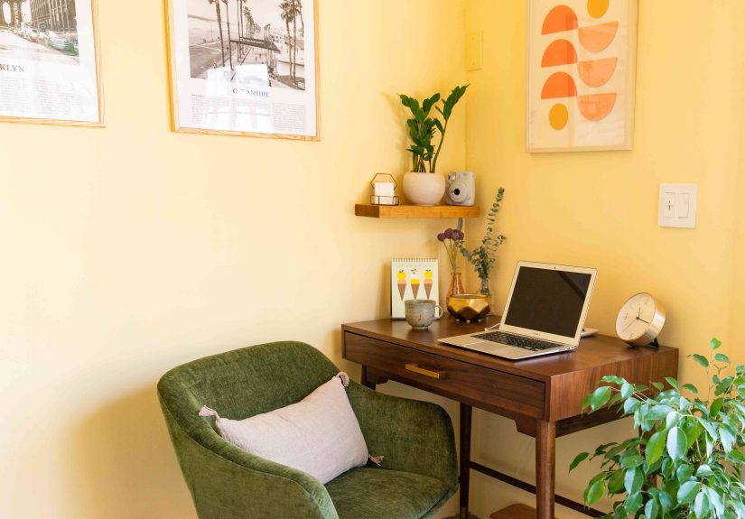
If your home office currently looks like a beige apology with a laptop in it, a paint refresh can do more than make the room prettier. The right wall color can make your workspace feel calmer, brighter, cozier, sharper, or just a whole lot less like the place where old Amazon boxes go to retire. In other words, choosing the best home office paint colors is not just a design decision. It is a productivity decision wearing stylish pants.
These days, the best office paint ideas lean away from harsh, sterile shades and toward colors that feel grounded, easy on the eyes, and flexible enough for real life. You know, real life: video calls, spreadsheets, creative work, ring-light selfies you pretend are “camera tests,” and the occasional snack break that somehow becomes a full lunch. Whether you want a serene backdrop for focused work or a color with a little more personality, the shades below can help revamp your workspace without turning it into a chaotic rainbow experiment.
How to Choose the Right Home Office Paint Color
Before you fall in love with a color online and commit like it is your soulmate, think about how you actually use the room. If your day is packed with meetings, writing, budgeting, or detail-heavy computer work, softer greens, blue-grays, and warm neutrals usually create the least visual drama. If your office doubles as a creative studio, content room, or brainstorming zone, you can get away with more personality, especially in muted teals, blush tones, or soft lavender.
Also pay attention to light. A north-facing office can make cool tones feel cooler, while a sunny room can handle darker or moodier shades without feeling cave-like. In a windowless workspace, lighter hues are usually your best friends because they help bounce around the limited light you have. And yes, sample first. Paint is basically the world’s most dramatic shape-shifter. What looks like “soft sage” at 10 a.m. can turn into “mysterious swamp whisper” at 7 p.m.
15 Best Home Office Paint Colors to Revamp Your Workspace
1. Sherwin-Williams Alabaster SW 7008
Alabaster is the warm white that understands the assignment. It brightens a room without looking clinical, which is exactly what you want in a home office that needs to feel fresh but not fluorescent. This shade works beautifully if you want a clean backdrop for bookshelves, framed art, wood desks, or colorful office accessories. If your workspace is small, dark, or full of visual clutter, Alabaster helps everything breathe again.
2. Benjamin Moore Ballet White OC-9
Ballet White is for people who want white walls but secretly do not trust white walls. It has enough creamy warmth to feel soft and lived-in, making it a smart choice for a cozy office with traditional furniture, natural oak, or linen textures. It is especially nice if you want your workspace to feel polished but still relaxed, like you have your life together even if your tabs say otherwise.
3. Behr Swiss Coffee 12
Swiss Coffee remains a favorite for a reason. This warm white has a creamy base that keeps a home office from feeling stark or chilly. It pairs well with black accents, medium wood tones, woven baskets, and brass desk lamps. If your goal is to create a space that looks brighter on video calls and feels welcoming in person, Swiss Coffee is an easy, dependable win.
4. Benjamin Moore Revere Pewter HC-172
Revere Pewter is the classic greige that refuses to go out of style, and honestly, good for it. In a home office, it creates a balanced backdrop that feels calm, adaptable, and wonderfully unfussy. This is the color to pick when you want something neutral but richer than basic beige. It works with modern décor, farmhouse pieces, tailored built-ins, and the random office chair you bought during a panic scroll at midnight.
5. Benjamin Moore Nimbus Gray 2131-50
Nimbus Gray offers the magic trick of being both soothing and useful. It is a soft blue-gray that feels airy without fading into the background completely. This makes it a great pick for a home office where you want calm energy and a little personality. It also pairs nicely with white trim and matte black accents, giving your workspace a crisp, thoughtful look without trying too hard.
6. Sherwin-Williams Granite Peak SW 6250
Granite Peak is a deep blue-gray that adds seriousness in the best way. It is ideal for a dedicated office where you want focus, sophistication, and a bit of drama. In a well-lit room, it can make the walls feel like a cocoon, which is wonderful for concentration. Think of it as the paint version of putting your phone on Do Not Disturb and actually meaning it.
7. Benjamin Moore Gentleman’s Gray 2062-20
Gentleman’s Gray is a moody blue-teal that brings richness and restraint at the same time. If you want a darker office that still feels elegant rather than gloomy, this is a brilliant option. It works especially well behind a desk on a Zoom background wall, where it gives the room depth and polish. Pair it with lighter trim, warm metals, and soft lighting so the space feels intentional, not cave-adjacent.
8. Benjamin Moore Slate Teal 2058-20
Slate Teal is the shade for people who want color but not chaos. It is dramatic, yes, but still grounded enough for a productive workspace. This color is especially effective in creative offices where you want a little visual stimulation without the jittery effect of brighter shades. It looks fantastic with natural wood, camel leather, and creamy whites, creating an office that feels both stylish and deeply personal.
9. Sherwin-Williams Evergreen Fog SW 9130
Evergreen Fog sits in that sweet spot between green, gray, and blue, which is why so many homeowners and designers keep coming back to it. In a home office, it feels calm, modern, and quietly smart. It is one of those colors that can help the room feel restful without becoming sleepy. If you spend long hours staring at screens, this muted green-gray can make the whole space feel gentler on the eyes.
10. Benjamin Moore Cushing Green HC-125
Cushing Green is a deep, balanced green that feels refined and slightly historic, in the best possible way. It brings gravitas to a home office without looking stuffy. This is an excellent choice for offices with built-in shelving, dark wood furniture, vintage rugs, or lots of books. If you want your workspace to whisper “capable adult” instead of scream “temporary setup in the corner,” Cushing Green is ready.
11. Sherwin-Williams Soft Sage SW 9647
Soft Sage is light, earthy, and incredibly easy to live with. This is a lovely option for a smaller office or one with mixed lighting, because it gives the room color without weighing it down. Soft Sage works especially well if you want a fresh, natural palette with plants, white oak, or woven textures. It feels peaceful but still awake, which is more than many of us can say before the first coffee.
12. Behr Hidden Gem N430-6A
Hidden Gem is a smoky jade that feels sophisticated and current without being trendy in a blink-and-you-miss-it way. It has more depth than pale sage and more softness than a bold emerald, making it a strong choice for a home office that needs personality. If you want your workspace to feel elevated, creative, and slightly luxurious, this color delivers without acting like it needs applause.
13. Sherwin-Williams Pink Shadow SW 0070
Pink Shadow proves that blush can absolutely belong in a home office. This is not bubblegum, and it is not trying to be cute. It is a hazy, muted neutral with warmth that flatters skin tones and softens hard office lines. If your workspace doubles as a content-creation corner or you simply want something warmer than beige, Pink Shadow offers a surprisingly grown-up option that still feels fresh and inviting.
14. Behr Imagination P550-1
Imagination is a pale lavender with a cool, airy quality that can spark creativity without overwhelming the room. It is especially good in studios, craft offices, writing spaces, or home offices where brainstorming matters as much as focus. Used well, it feels light and imaginative rather than overly sweet. Pair it with white trim, pale woods, and minimal décor so the color remains inspiring instead of overly decorative.
15. Benjamin Moore Onyx 2133-10
Onyx is the boldest pick on this list, but it earns its place. A deep black can make a bright office feel crisp, modern, and unexpectedly calming when used thoughtfully. It is best in rooms with decent natural light or as an accent wall behind shelving or a desk. The result can look incredibly chic and focused. Basically, it is the color equivalent of wearing black to a meeting and suddenly feeling 14% more competent.
Best Color Families for Different Work Styles
If you want a quick shortcut, here it is. Warm whites and soft greiges are ideal for flexibility, especially if your office shares space with a guest room or den. Muted greens are strong contenders for screen-heavy jobs because they feel natural and relaxing. Blue-grays and teals are great if you want a polished, focused atmosphere. And deeper shades like charcoal, ink, forest green, or black work best when you want a cocooning room with a little drama, especially if the space gets good daylight.
One smart strategy is to match the mood of the room to the type of work you do most often. Analytical work usually benefits from calm, restrained colors. Creative work can handle more saturated or expressive shades. If you split your time between both, a middle-ground color like Evergreen Fog, Nimbus Gray, or Revere Pewter often makes the most sense.
How to Test Paint Before You Commit
Paint samples are not optional. They are your last line of defense against a full weekend of regret. Test your top contenders on at least two walls and check them in morning light, afternoon light, and lamplight. Also look at the color behind your monitor and on camera if you take a lot of video calls. A paint shade that looks dreamy in a staged photo might look muddy, icy, or oddly peachy in your actual room. The goal is not just to find a beautiful color. It is to find a beautiful color that behaves itself.
Experiences Homeowners Often Have After Repainting Their Home Office
One of the most common experiences people describe after repainting a home office is that the room suddenly starts pulling its weight. Before the update, the space may have been technically functional, but not exactly inspiring. Maybe it felt too dark in the morning, too bland in the afternoon, or too chaotic once the workday started. After painting, even without buying all new furniture, the room often feels more intentional. That can change how people use it. They sit down faster, stay focused longer, and feel less tempted to migrate to the kitchen table with their laptop and a trail of chargers.
Another thing people notice is how strongly paint changes the “temperature” of a workspace. A harsh white can make the room feel sterile, while a warmer white or greige can soften the entire experience of being there. Similarly, muted greens and blue-grays often make a room feel quieter, even though paint obviously does not have magical noise-canceling powers. What changes is visual tension. When the walls stop fighting for attention, the whole office can feel more settled. That is especially helpful in small spaces where every object is visible and there is not much room to hide clutter.
People also tend to discover that their favorite color in theory is not always their favorite color in practice. Someone may swear they want a bold navy or dramatic black, then realize they prefer that look in inspiration photos more than in a room where they work eight hours a day. Others assume they need a neutral, then end up loving a muted green or smoky teal because it gives the room character without becoming distracting. That is why sampling matters so much. The best home office paint color is not the one that wins on a Pinterest board. It is the one that still looks good during a rainy Tuesday deadline spiral.
There is also the emotional side of repainting. A fresh color can create a small but real boundary between home life and work life, which matters when both happen under the same roof. Even if your office is just a converted spare room or a desk tucked into a bedroom, the right color helps signal that this area has a purpose. It can make the room feel less temporary and more supportive. And sometimes, that is the whole game: building a space that supports your routine instead of draining it. A better wall color will not answer your emails, organize your calendar, or stop your group chat from going off at the worst possible moment. But it can make the room feel calmer, smarter, and more like a place where good work happens.
Final Thoughts
The best home office paint colors are the ones that match both your space and your working style. If you want timeless and flexible, lean into warm whites and greiges. If you want calm with character, muted greens and soft blue-grays are excellent choices. If you want a little drama, deeper teals, forest greens, and blacks can look incredibly chic when the lighting is right. Above all, choose a shade that makes you want to sit down and get things done. Because a great workspace should not just look good. It should quietly help you do your best work, even on the days when your to-do list looks like it was written by a chaos goblin.