Table of Contents >> Show >> Hide
- What You Need Before You Start
- Method 1: Create a 3D Box Manually with Shape Layers
- Method 2: Create a 3D Box Mockup with Perspective Warp or Vanishing Point
- Which Method Should You Use?
- Common Mistakes to Avoid
- Practical Example: Designing a Simple Product Box
- Experience Notes: What Actually Makes a Photoshop 3D Box Look Good
- Conclusion
Creating a 3D box in Adobe Photoshop sounds like the kind of thing that requires secret designer powers, a giant drawing tablet, and possibly a tiny wizard living inside your computer. Good news: it does not. With a few basic tools, a little perspective, and some smart use of shadows, you can build a clean, realistic 3D box directly in Photoshop without opening a dedicated 3D program.
Whether you are designing packaging, making a product mockup, building a digital scene, or simply trying to make a flat rectangle look like it has eaten its vegetables and gained depth, Photoshop gives you several practical ways to do it. In this guide, you will learn two simple methods: building a 3D box manually with shape layers and creating a more realistic box mockup with Perspective Warp or Vanishing Point.
The first method is perfect for beginners because it teaches the core idea behind 3D illusion: front face, side face, top face, light, shadow, and perspective. The second method is better for mockups, labels, packaging previews, and designs that need to wrap around a box naturally. Both methods are flexible, editable, and friendly to designers who enjoy pressing Ctrl+Z as a lifestyle choice.
What You Need Before You Start
Before creating a 3D box in Photoshop, open a new document with enough space to work. A canvas size of 1600 x 1200 pixels is a comfortable starting point for practice. If you are designing a product mockup for the web, use RGB color mode. If the final design is for print packaging, start with the correct print dimensions, CMYK workflow, and proper resolution.
You will mainly use the Rectangle Tool, Move Tool, Free Transform, Perspective Warp, Smart Objects, layer styles, gradients, and shadows. Do not worry if that list sounds like a buffet menu at a graphic design restaurant. Each tool has a specific job, and once you understand the process, the workflow becomes surprisingly simple.
Method 1: Create a 3D Box Manually with Shape Layers
This method builds a box from three visible faces: the front, the side, and the top. It is the easiest way to understand how a 3D box works in Photoshop because you are constructing the illusion piece by piece. Think of it as digital cardboard, except nobody gets tape stuck to their sleeve.
Step 1: Create the Front Face
Select the Rectangle Tool from the toolbar. In the options bar, set the tool mode to Shape. Draw a rectangle in the center of your canvas. This will become the front face of the box. Choose a medium color, such as blue, gray, beige, or any brand color you want to use.
Name this layer “Front Face” in the Layers panel. Naming layers may feel boring, but future-you will be grateful when your document contains twenty layers and none of them are called “Rectangle 47 copy final final maybe.”
Step 2: Duplicate the Front Face for the Side Panel
Duplicate the front face layer by pressing Ctrl+J on Windows or Command+J on Mac. Rename the copy “Side Face.” With the Side Face layer selected, press Ctrl+T or Command+T to activate Free Transform.
Right-click inside the transform box and choose Distort or Perspective. Drag the right-side corners slightly upward and inward to create the side plane of the box. The goal is to make this panel look like it is extending backward in space. Move the layer so its left edge connects perfectly with the right edge of the front face.
Change the side panel color to a slightly darker version of the front face. This creates the impression that less light is hitting the side. A realistic 3D box depends heavily on value changes. In plain English: one side needs to be lighter, one side needs to be darker, and the whole thing needs to stop looking like a pancake.
Step 3: Create the Top Face
Duplicate the front face again and rename the new layer “Top Face.” Use Free Transform and Distort to reshape it into a top panel. Pull the top corners backward so the panel connects to the top edge of the front face and the upper edge of the side face.
Make the top face slightly lighter than the front face if your light source is coming from above. If your imaginary light source is coming from the left, brighten the left-facing surfaces and darken the right-facing surfaces. Consistent lighting is what makes the box feel believable.
Step 4: Align the Edges Carefully
Zoom in and inspect the corners. The front, side, and top faces should meet cleanly. If you see tiny gaps, use the Move Tool or Free Transform to adjust the corners. Small alignment mistakes can make a 3D box look wobbly, like it was assembled by a raccoon with a glue stick.
Use Photoshop guides if necessary. Drag guides from the rulers to help line up major edges. You can also turn on snapping from the View menu to make alignment easier.
Step 5: Add Gradients for Depth
Flat colors work for a simple icon-style box, but gradients add realism. Select each face and apply a subtle gradient through the Fill options or by adding a Gradient Overlay in Layer Style. Keep the gradient gentle. A small shift from light to dark is usually more professional than a dramatic shine that screams “early 2000s button design.”
For the front face, use a soft vertical gradient. For the side face, use a darker gradient that fades slightly toward the back edge. For the top face, use a lighter gradient, especially near the front edge where light would naturally hit.
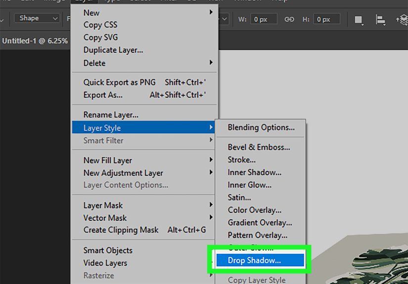
Step 6: Add a Shadow Under the Box
Create a new layer beneath all box layers and name it “Ground Shadow.” Select the Ellipse Tool or use a soft round brush to create a dark oval under the box. Apply Gaussian Blur and lower the opacity until the shadow looks natural.
A good shadow anchors the box to the canvas. Without it, the box may look like it is floating in design space, waiting for a UFO to pick it up. Keep the shadow soft and wider than the base of the box.
Step 7: Group and Save Your Box
Select the front, side, top, and shadow layers, then press Ctrl+G or Command+G to group them. Name the group “3D Box.” You can now move, resize, duplicate, or reuse the box in other projects.
This manual method is excellent for icons, simple product illustrations, educational graphics, website banners, and quick visual concepts. It also teaches the most important lesson in Photoshop 3D illusion: depth is created by perspective, contrast, and shadow.
Method 2: Create a 3D Box Mockup with Perspective Warp or Vanishing Point
The second method is ideal when you already have a box image, package photo, or flat label design that needs to look realistic on a box. Instead of building every side manually, you use Photoshop’s perspective tools to place artwork onto different planes.
This method is especially useful for packaging design, eBook covers, software boxes, subscription box previews, cosmetic packaging, and product mockups. It gives your design a polished presentation without requiring a full 3D rendering workflow.
Step 1: Prepare Your Box Base
Start with a clean image of a blank box, or create a simple three-sided box using Method 1. If you are using a photo, make sure the front, side, and top faces are visible. The clearer the edges are, the easier it will be to match the perspective.
If your box photo has distracting background elements, remove them or place the box on a simple background. A clean background helps the final mockup look more professional.
Step 2: Convert Your Artwork to a Smart Object
Place your label, logo, pattern, or cover design into the Photoshop file. Right-click the artwork layer and choose Convert to Smart Object. This is one of the best habits you can develop in Photoshop because Smart Objects allow you to transform and edit artwork without permanently damaging the original layer.
Smart Objects are especially useful for mockups. If you later want to replace the design, you can edit the Smart Object and update the artwork while keeping the perspective effect intact.
Step 3: Use Perspective Warp for the Front Face
Select the Smart Object layer and go to Edit > Perspective Warp. Draw a perspective grid over the front face of the box. Adjust the grid corners so they match the corners of the box surface.
After defining the plane, switch to Warp mode and drag the corners until the artwork fits the face correctly. Press Enter or Return to apply the transformation. The design should now appear attached to the front surface instead of floating above it.
Step 4: Repeat for the Side and Top Panels
Duplicate your Smart Object layer for the side panel. Use Perspective Warp again to match the side face of the box. Because the side is angled away from the viewer, the artwork should appear narrower and slightly darker.
Repeat the process for the top face if your design needs to wrap across the top. For packaging, this is where small details like patterns, brand colors, or continuation lines can make the mockup look realistic.
Step 5: Try Vanishing Point for Complex Perspective
For more advanced mockups, use Filter > Vanishing Point. This tool lets you define perspective planes and paste artwork into those planes so the design conforms to the angle. It is especially helpful when working with boxes, walls, floors, book covers, or packaging surfaces that share a clear vanishing point.
Inside the Vanishing Point dialog, use the Create Plane Tool to click the four corners of one box face. Once the grid looks correct, extend or connect additional planes for other sides. Paste your artwork into the plane and move it into position. Photoshop will preserve the perspective, making the artwork feel attached to the surface.
Step 6: Blend the Artwork with the Box
Realistic mockups require more than correct perspective. The artwork also needs to inherit the lighting, shadows, and texture of the box. Lower the opacity slightly if needed, experiment with blend modes such as Multiply or Overlay, and use layer masks to hide any artwork that spills beyond the box edges.
You can also add a subtle noise texture or paper grain to the artwork so it does not look too digitally perfect. Real boxes have tiny imperfections. Photoshop realism often lives in those small details.
Step 7: Add Highlights and Edge Shadows
Create new layers above your artwork and paint soft highlights along edges that catch light. Then paint subtle shadows along folds, corners, and lower edges. Use a soft brush with low opacity. Build the effect gradually rather than painting one heavy shadow that looks like the box had a dramatic argument with a flashlight.
For sharper edges, use selections or clipping masks. A thin shadow where the side face meets the front face can instantly improve depth. A small highlight along the top edge can make the box feel crisp and premium.
Which Method Should You Use?
Use the manual shape-layer method when you want a simple 3D box illustration, an icon, a diagram, or a custom box from scratch. It is fast, editable, and does not require a source photo.
Use the Perspective Warp or Vanishing Point method when you need a realistic product mockup. This approach is better for packaging presentations, client previews, portfolio images, eCommerce visuals, and brand concept designs.
In many real projects, designers combine both methods. They build a clean box shape manually, convert design panels to Smart Objects, then use perspective tools to apply artwork. That hybrid workflow gives you control, flexibility, and a polished final image.
Common Mistakes to Avoid
Using the Same Color on Every Face
If all sides of the box have the exact same color and brightness, the box will look flat. Adjust each face based on the direction of your light source.
Ignoring the Shadow
A box without a cast shadow often looks disconnected from the background. Even a soft, simple shadow can make the object feel grounded.
Overusing Bevel and Emboss
Layer styles are helpful, but too much bevel can make a box look plastic or outdated. Use bevel effects lightly, especially for modern packaging mockups.
Forgetting Smart Objects
If you transform normal pixel layers repeatedly, quality can degrade. Convert artwork to Smart Objects before warping or scaling whenever possible.
Misaligned Corners
Perspective depends on clean geometry. If corners do not meet properly, the illusion breaks. Zoom in, check edges, and adjust carefully.
Practical Example: Designing a Simple Product Box
Imagine you are designing a box for a premium coffee subscription. Start with a warm brown front face, a darker side face, and a lighter top face. Add the logo to the front as a Smart Object. Use Perspective Warp to fit the logo to the box angle. Add a subtle paper texture, a soft shadow underneath, and a faint highlight along the top edge.
Now the design looks less like a flat label and more like a real product someone could place on a kitchen counter. That is the power of creating a 3D box in Photoshop: it helps people imagine the final product before it exists.
Experience Notes: What Actually Makes a Photoshop 3D Box Look Good
After working with Photoshop box mockups, one thing becomes very clear: the tool does not create realism by itself. The realism comes from small design decisions. A beginner may focus only on getting the perspective correct, but an experienced designer also thinks about lighting, material, texture, edges, and how the object sits in the scene.
The first practical lesson is to keep your light source consistent. If the top face is bright, the cast shadow should fall in the opposite direction. If the right side is dark, do not suddenly add a bright highlight there unless there is a reason. Viewers may not consciously analyze the lighting, but they will feel when something is wrong.
The second lesson is that subtlety wins. New Photoshop users often add strong gradients, heavy drop shadows, thick bevels, and dramatic reflections because those effects are fun to click. However, realistic product mockups usually rely on restraint. A shadow at 25 percent opacity may look better than one at 80 percent. A tiny highlight can be more convincing than a shiny stripe across the entire box.
The third lesson is to design with replacement in mind. If you are building a mockup for a client, always use Smart Objects for logos, labels, and artwork. Clients change their minds. Sometimes they change the logo, then the color, then the logo again, then ask whether the first version was actually better. A Smart Object workflow keeps you from rebuilding the whole mockup every time.
The fourth lesson is to zoom out often. It is easy to spend fifteen minutes adjusting one corner at 300 percent zoom, only to realize the overall box looked fine ten minutes ago. Work close when aligning edges, but zoom out to judge the full composition. A convincing 3D box is about the total impression, not microscopic perfection.
The fifth lesson is to use real packaging as a reference. Look at cereal boxes, software boxes, cosmetic cartons, shipping boxes, and book covers. Notice how edges catch light, how side panels are usually darker, and how printed artwork bends slightly with the object. Reference images train your eye faster than guessing.
Finally, remember that Photoshop is excellent for visual illusion. You are not building a mathematically perfect 3D model; you are creating a believable image. If the box communicates depth, supports the design, and looks professional on the page, it has done its job. The best mockups do not make viewers think about Photoshop at all. They make viewers think, “That product looks real.”
Conclusion
Learning how to create a 3D box in Adobe Photoshop is one of those skills that looks complicated until you break it into simple pieces. With shape layers, you can build a clean box from scratch using three panels, gradients, and shadows. With Perspective Warp or Vanishing Point, you can turn flat artwork into a realistic product mockup that follows the angle of a box.
The key is not memorizing every Photoshop menu. The key is understanding perspective, light, and editable workflow. Use Smart Objects, keep your layers organized, avoid overdone effects, and pay attention to small shadows and highlights. Do that, and your 3D box will look sharp, polished, and ready for a website, portfolio, client presentation, or product launch.