Table of Contents >> Show >> Hide
- What “Tonal Eames Chairs” Really Means
- Why Eames Chairs Still Matter in Modern Interiors
- The Secret Sauce of Tonal Styling
- Best Tonal Eames Chair Looks to Try
- Where Tonal Eames Chairs Work Best
- How to Style Them Without Getting Too Precious
- Common Mistakes to Avoid
- Why the Tonal Approach Feels So Current
- Conclusion
- Extended Experience Section: Living With Tonal Eames Chairs
Some furniture shouts for attention. The Eames chair does not have to. In fact, one of the smartest ways to use it today is to let it whisper. That is where the idea of tonal Eames chairs comes in: instead of treating the chair like a lone midcentury celebrity posing for paparazzi, you fold it into a carefully layered palette of related shades. The result feels polished, quiet, modern, and just smug enough to suggest that someone in the house owns a really good paint deck.
If you love interiors, you have probably seen the look without naming it. A dining nook in soft mushroom tones. A home office in layered green. A breakfast area with pale gray walls, ash wood floors, and Eames shells in nearly the same family of color, only a shade deeper. Nothing screams. Everything hums. The chairs still bring that unmistakable Charles-and-Ray cool, but they do it with better manners.
This is what makes tonal styling so compelling. It takes one of the most recognizable chairs in design history and removes the temptation to over-style it. Instead of making the chair the entire conversation, tonal decorating lets it become part of a smarter sentence. For homeowners, renters, stylists, and the incurably design-obsessed, that is the real sleuthing trick: understanding why a famous chair looks even better when it stops trying to be famous.
What “Tonal Eames Chairs” Really Means
In plain English, tonal design means working within one color family or a tight cluster of related hues. Think cream, oatmeal, sand, camel, and walnut in the same room. Or sage, olive, moss, and smoky green. Or charcoal, fog, pewter, and black. The beauty of the approach is not perfect matching. It is controlled variation.
That matters because Eames shell chairs already have a strong visual identity: the scooped form, the waterfall edge, the crisp outline, the famous Eiffel-style dowel base or wire base depending on the version. If you drop that shape into a room with too many competing colors, the chair can start to feel like a design citation instead of a lived-in object. A tonal scheme softens that effect. It gives the chair context, not just spotlight.
The best tonal Eames chair rooms usually rely on three things: related shades, mixed textures, and a little restraint. That last one is hard, of course. Buying the iconic chair is easy. Not turning the room into a midcentury costume party is the advanced class.
Why Eames Chairs Still Matter in Modern Interiors
Before we get into styling, it helps to understand why these chairs keep showing up in homes, magazines, and design wish lists. Charles and Ray Eames spent years exploring the idea of a one-piece seat shell, first through plywood experiments and later through molded fiberglass and plastic. Their shell chair design was introduced to the public in the late 1940s and launched commercially in 1950, becoming one of the earliest mass-produced plastic seating designs and one of the defining objects of American modernism.
That history matters because it explains the chair’s unusual flexibility. The Eames shell was never precious. It was designed to be useful, repeatable, democratic, and adaptable. That is part of why it still works in so many rooms. It can read sculptural in a gallery-like dining area, practical in a kitchen, playful in a kid-friendly breakfast zone, or quietly sophisticated in a study.
Authentic versions today also come in a wide range of finishes and colors, including earthy neutrals, greens, grays, and softer muted tones that are especially suited to tonal rooms. In other words, the chair has aged well not because the world stopped moving, but because the design was always meant to move with it.
The Secret Sauce of Tonal Styling
1. Color harmony makes the iconic shape feel fresh
The quickest way to modernize a well-known design classic is not to reinvent the chair. It is to rethink the room around it. Tonal palettes do exactly that. They shift attention from “Oh, an Eames chair” to “Oh, this room feels fantastic.” That may sound subtle, but subtle is often where expensive-looking design lives.
In a tonal room, the chair becomes part of a larger composition. A cocoa shell against clay walls and walnut legs feels warmer and more grounded than the same chair against a random white backdrop. A pale gray shell with stainless or black legs in a room full of stone, plaster, and linen reads cleaner and more architectural. A muted green shell in a green room feels intentional rather than trendy.
2. Texture does the heavy lifting
Monochrome without texture can look flat. Tonal design without texture can look like you bought paint in bulk and forgot to have fun. The fix is simple: use contrast in materials, not in loud color jumps. That means pairing smooth molded shells with wool upholstery, nubby rugs, matte walls, natural oak, patinated leather, plaster finishes, and woven lighting.
An Eames shell chair is already smooth, curved, and visually crisp. Surround it with softer, rougher, warmer surfaces and it comes alive. The room feels layered instead of sterile. Think of the chair as the sleek friend in a room full of poets and potters. Everybody benefits.
3. Tonal palettes make small spaces feel calmer
One reason designers love tonal rooms is that they tend to reduce visual noise. That is especially useful in apartments, breakfast corners, and open-plan layouts where dining chairs are always visible. A set of tonal Eames chairs can make a modest room feel more cohesive because the eye is not constantly bouncing between unrelated colors.
This is also why tonal Eames chairs work so well in multi-use spaces. A small dining table near the living area, a desk tucked into a bedroom, or a kitchen island with stools nearby all benefit from furniture that blends rather than interrupts.
Best Tonal Eames Chair Looks to Try
Warm Neutrals: The “I Have My Life Together” Look
If you want a safe but stylish entry point, start here. Choose shells in white, parchment, light gray, cocoa, or other warm neutrals, then layer in oak, cane, linen, travertine, and soft beige paint. This combination works because it lets the chair’s silhouette do the talking while the palette keeps things relaxed.
Warm neutral tonal rooms are particularly good for dining areas because they feel inviting rather than museum-like. Add a wood table with rounded edges, a ceramic bowl that looks vaguely handmade, and a pendant light that does not try too hard. Congratulations. You now live in the internet’s favorite breakfast corner.
Green-on-Green: The Nature-Loving Modernist
Green has become one of the most useful “new neutrals” in contemporary interiors, especially in softened sage, olive, and gray-green versions. Tonal green Eames chairs look fantastic with pale wood, matte paint, antique brass, and lots of daylight. The effect is calm and grounded, with enough personality to avoid beige fatigue.
The trick here is variation. A gray-green chair against olive walls and mossy textiles creates depth. If everything is exactly the same shade, the room can look accidental. If the shades shift thoughtfully, it looks like a designer was involved, even if the only designer was you and a very determined mood board.
Gray and Black: Crisp, Urban, and Slightly Dramatic
Gray-toned Eames chairs are a gift to modern apartments. Light gray shells can soften black-framed windows and concrete floors. Medium gray or charcoal chairs can anchor a dining room without making it feel heavy. Add black bases, smoked oak, steel, and a little white space, and you get a room that feels sharp without turning into a corporate lobby.
This is a great direction if you like minimalism but do not want a room that feels emotionally unavailable. Bring in a boucle cushion, a wool throw nearby, or a textured rug under the table. Suddenly the space says “collected modern,” not “tech startup conference room.”
Muted Color Families: Pale Blue, Brick, or Deep Yellow in Context
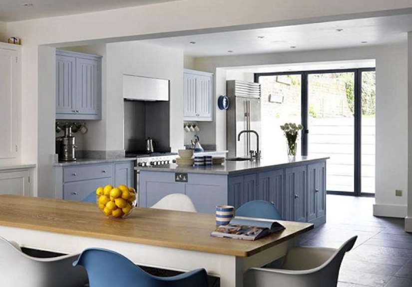
Tonal does not have to mean neutral. It can also mean staying inside one softened color story. A pale blue Eames chair can work beautifully in a room with chalky blue-gray walls and cream upholstery. A brick-toned chair can sing in a room with terracotta accents, rust linen, and warm wood. A deep yellow shell can work if the rest of the palette is sun-faded rather than cartoon-bright.
The key word is muted. Tonal rooms are about nuance, not neon warfare.
Where Tonal Eames Chairs Work Best
Dining Rooms
This is the classic location, and for good reason. The shell chair’s compact footprint, ergonomic curve, and easy-clean surface make it practical, while its shape keeps a dining set from looking dull. Tonal versions are especially effective when you want the dining room to feel integrated with the rest of an open-plan home.
One smart move is to keep the chair color close to either the wall color or the tabletop tone. That creates a visual bridge. Another is to mix one tonal shell color around the sides with slightly different end chairs, as long as one element stays consistent. A room needs rhythm, not chaos.
Home Offices
Eames chairs in workspaces are not new, but tonal styling makes them feel less like a Pinterest cliché and more like a considered choice. A light gray or green shell with a seat pad can tuck neatly into a built-in desk setup. In a small office, matching the chair to the wall family helps the workspace feel quieter and less cluttered.
There is also a psychological bonus to tonal workspaces: they can feel calmer and more focused. When the chair is part of the visual flow rather than a bright interruption, the whole room feels easier on the eyes. That is useful whether you are writing a novel, paying bills, or pretending to understand your taxes.
Kitchens and Breakfast Areas
Tonal Eames chairs are excellent in kitchens because they strike a balance between utility and style. They are easy to wipe down, visually light, and available in colors that can echo cabinetry, backsplash tones, or painted walls. In a kitchen full of hard surfaces, the soft curve of the shell also keeps things from feeling too rigid.
If your kitchen is white and wood, go for a chair in a barely-there gray, parchment, or pale green. If your cabinets are darker, a cocoa or medium gray shell can add depth without looking too contrasty.
How to Style Them Without Getting Too Precious
First, do not force a museum moment. Eames chairs were designed for real life. Let them hold coffee mugs, homework, dinner guests, and the occasional pile of unfolded laundry. They look better when the room feels lived in.
Second, avoid matching everything so tightly that the room loses shape. Tonal is not the same as identical. You want related hues, not a hostage situation involving beige.
Third, remember scale. If the room is small, a lighter shell color will usually feel airier. If the room has strong architecture or darker walls, deeper tones can create lovely contrast without breaking the palette.
Finally, give the chairs a supporting cast that respects their lines. Rounded tables, clean pendant lights, low-profile cabinetry, and organic accessories all tend to play well with Eames shells. Bulky, over-decorated pieces can make the chairs feel stranded between eras.
Common Mistakes to Avoid
- Buying the chair before deciding the palette: iconic furniture is exciting, but color choices make more sense once the room’s tone is established.
- Going too cold with every surface: if you use gray shells, gray walls, gray floors, and gray light, the room may begin to resemble a weather forecast.
- Ignoring the base: dowel legs, wire bases, and black or white finishes all change the mood. The shell is only half the story.
- Forgetting comfort: if the chairs are for long dinners or long workdays, think about seat pads or nearby soft textures to balance the harder shell.
Why the Tonal Approach Feels So Current
Today’s interiors are leaning toward rooms that feel more immersive, layered, and emotionally calm. Designers are embracing restrained palettes, color drenching, and quieter shifts in tone rather than abrupt high-contrast schemes. Tonal Eames chairs fit neatly into that world. They offer recognizable form without visual shouting. They let design lovers keep an icon while participating in a softer, more contemporary mood.
That, in the end, is the design sleuth’s answer. The tonal Eames chair trend is not really about the chair alone. It is about how great design survives by adapting to new ways of living. The shell chair still has the bones, the history, and the charm. Tonal styling simply gives it new conversational skills.
Conclusion
Tonal Eames chairs work because they combine two enduring design values: timeless form and visual harmony. The chair brings history, ergonomics, and instant recognition. The tonal room brings calm, cohesion, and modern relevance. Put them together and you get a space that feels intelligent without being stiff, stylish without begging for compliments, and comfortable enough for real life.
If you are designing a dining room, breakfast corner, or home office, tonal styling is one of the smartest ways to use an Eames chair today. Stay within a close color family, mix your textures, respect the chair’s silhouette, and resist the urge to turn the whole room into a midcentury reenactment. The result will feel classic, current, and quietly brilliant.
Extended Experience Section: Living With Tonal Eames Chairs
There is a difference between admiring a chair in a showroom and actually living with it. Tonal Eames chairs shine most in the second category. In daily life, their appeal is less about heroic design-history talking points and more about the small, repeated moments when they simply make a room easier to enjoy. Morning coffee looks better in a chair that visually belongs to the room. So does late-night takeout, a laptop session, a stack of mail you swear you are about to organize, and the kind of dinner party where somebody always ends up sitting sideways and talking long after dessert is gone.
One of the nicest experiences of using tonal Eames chairs is that they do not exhaust the eye. Bright accent chairs can be thrilling for a week and then oddly demanding after that. Tonal chairs tend to age more gracefully in a room because they support the atmosphere rather than compete with it. If your walls are a warm stone color and your chairs sit somewhere between parchment and mushroom, the whole room feels settled. If your palette runs green and wood, chairs in sage or gray-green can make the room feel almost landscaped, as though the indoors and outdoors finally agreed to stop arguing.
They are also surprisingly social objects. People recognize the shape even if they cannot name it. Guests often respond to them with a kind of half-memory: “I’ve seen these somewhere,” or “These feel familiar.” That familiarity is part of the experience. The chair carries cultural weight, but tonal styling strips away the intimidation factor. Instead of looking like a precious collector’s piece, it looks like it belongs at the table with everybody else.
From a practical standpoint, tonal Eames chairs are forgiving in the way good design should be. Soft grays, muted greens, warm whites, and earthy browns tend to hide the little chaos of everyday life better than stark black or brilliant white. They also play nicely with seasonal changes. In summer, the room feels airy. In fall, add wool, darker woods, and low light, and the same chairs suddenly feel moodier and richer. You do not have to redecorate the whole room every three months just to keep up appearances. The chairs stay relevant because the palette around them has room to breathe.
Perhaps the biggest experience-related advantage is emotional. Tonal rooms often feel calmer, and furniture that participates in that calm has a different kind of value. You notice it when you walk into the space at the end of a long day and nothing jars you. The chair is not screaming for attention. It is simply doing its job beautifully. That may be the most modern luxury of all: a famous design object that knows when to be quiet.
Note: This article is formatted for web publishing and intentionally excludes inline source links or citation placeholders.