Table of Contents >> Show >> Hide
- What Is Baked Terra Cotta 1202?
- Why Terracotta Paint Colors Keep Winning People Over
- Undertones, Lighting, and Why This Color Changes Throughout the Day
- Best Rooms for Baked Terra Cotta 1202
- Colors That Pair Beautifully With Baked Terra Cotta 1202
- How to Style a Room Painted in Baked Terra Cotta 1202
- Mistakes to Avoid With This Paint Color
- Who Should Choose Baked Terra Cotta 1202?
- Final Thoughts on Baked Terra Cotta 1202
- Living With Baked Terra Cotta 1202: A Real-World Experience
- SEO Tags
If beige had a wilder, more charismatic cousin who spent weekends browsing vintage markets and drinking espresso on a sun-warmed patio, it would probably be Baked Terra Cotta 1202. This Benjamin Moore shade is rich, earthy, and grounded, with the kind of orange-brown warmth that can make a room feel collected rather than decorated. It does not whisper, but it does not yell either. It is the design equivalent of confident eye contact and very good leather boots.
For homeowners, designers, and paint-curious mortals alike, Baked Terra Cotta 1202 offers something that many trendy colors fail to deliver: personality with staying power. It taps into the growing love for earthy interiors, warm neutrals, and sunbaked colors inspired by clay, desert landscapes, plaster walls, and handmade materials. In other words, it feels current without acting like it invented color. That balance is exactly why terracotta paint colors keep showing up in living rooms, kitchens, bedrooms, and outdoor-inspired spaces.
This guide breaks down what makes Baked Terra Cotta 1202 special, how it behaves in real rooms, which colors pair beautifully with it, and how to use it without accidentally making your house look like an overenthusiastic pumpkin festival. Used well, this hue is elegant, warm, and surprisingly versatile.
What Is Baked Terra Cotta 1202?
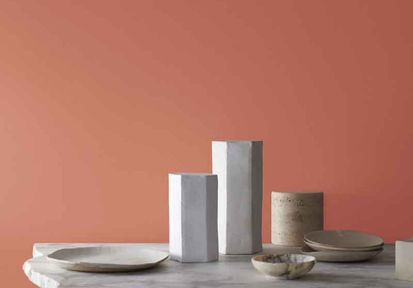
Baked Terra Cotta 1202 is a Benjamin Moore color in the brand’s Classics collection. It is best described as a warm terra-cotta paint color with orange and brown undertones. Those undertones matter because they keep the shade feeling grounded rather than sugary or overly red. This is not a citrus orange, and it is not a rusty brick red. It lands in that sweet spot where clay, cinnamon, adobe, and fired earth all shake hands and agree to be gorgeous together.
It also has a low Light Reflectance Value, which means it absorbs more light than it reflects. In plain English, that gives it presence. It can feel moody in dim rooms and richly cocooning in well-balanced spaces. If your goal is a bright, barely-there backdrop, this is not your wall color. But if you want depth, warmth, and a color that can hold its own against wood tones, stone finishes, black accents, or creamy whites, Baked Terra Cotta 1202 is a compelling choice.
Why Terracotta Paint Colors Keep Winning People Over
There is a reason terracotta keeps coming back, and it is not just because social media discovered pottery again. Earthy paint colors resonate because they feel human. Cool grays and stark whites can look sleek, but terracotta tones bring emotional warmth. They remind people of clay, sun, brick, desert landscapes, Mediterranean architecture, and spaces that feel touched by time rather than assembled from a catalog.
Baked Terra Cotta 1202 fits neatly into that movement. It has the nostalgic comfort of older homes, but it also works beautifully in modern interiors where people want more softness and soul. In a design era that increasingly favors natural materials, layered textures, and colors drawn from the outdoors, this shade feels right at home. It complements linen, jute, plaster, oak, walnut, aged brass, matte black, handmade tile, and terracotta planters without breaking a sweat.
Another reason it works so well is that it reads as warm without feeling fake. Some trendy colors look fabulous in one carefully edited photo and then behave badly in everyday life. Baked Terra Cotta 1202 has more staying power because it belongs to a timeless family of clay-based, mineral-inspired hues. It feels decorative, yes, but also architectural.
Undertones, Lighting, and Why This Color Changes Throughout the Day
Paint colors are notorious little shape-shifters, and Baked Terra Cotta 1202 is no exception. Lighting will dramatically influence how it appears. In a room with abundant southern or western light, this color can feel sunlit, warm, and slightly more orange. In north-facing rooms or spaces with limited daylight, the brown undertones become more pronounced, giving it a richer and slightly moodier presence.
This is where sampling matters. If you paint a large swatch and watch it from morning through evening, you will likely notice three personalities. In the early day, it may read clay-like and soft. At midday, it can feel lively and grounded. At night, under lamplight, it often becomes deeper and cozier. That evolution is part of its charm. It is not flat, and it does not disappear into the background.
Because of that visual movement, Baked Terra Cotta 1202 works especially well in spaces where you want atmosphere. Dining rooms, dens, powder rooms, reading nooks, and bedrooms can all benefit from its warmth. In very small rooms, it can feel intimate and snug. In larger rooms, it creates visual weight and makes expansive spaces feel more collected.
Best Rooms for Baked Terra Cotta 1202
Living Rooms
In a living room, this shade can make the entire space feel warmer and more layered. It pairs beautifully with cream upholstery, caramel leather, walnut tables, black metal lighting, and green plants. If you want a grounded but inviting space, this color can do the heavy lifting. It is particularly effective in rooms with natural textures and a mix of old and new pieces.
Dining Rooms
Dining rooms love a little drama, and Baked Terra Cotta 1202 knows how to make an entrance. It adds depth without the formality of charcoal or navy. Paired with wood furniture, woven shades, antique brass, and off-white trim, it creates a setting that feels intimate and memorable. In other words, dinner suddenly looks much more expensive, even if you are eating takeout noodles from a ceramic bowl.
Bedrooms
This color can work beautifully in bedrooms when balanced with soft textiles and lighter bedding. The key is to lean into its earthy quality rather than fighting it. Think oatmeal linen, warm white sheets, muted olive accents, and natural wood nightstands. If you want a bedroom that feels grounded, cozy, and a little bit boutique hotel, this is a strong contender.
Kitchens and Breakfast Nooks
In kitchens, Baked Terra Cotta 1202 can be stunning on walls, cabinetry, or even a pantry door if the rest of the palette supports it. It looks especially good with creamy counters, natural stone, zellige-style tile, brass hardware, and wood shelving. For a breakfast nook, it creates a cheerful but sophisticated backdrop that feels warm from sunrise through supper.
Accent Walls, Built-Ins, and Powder Rooms
If painting an entire room feels like a big commitment, start smaller. This hue is excellent for accent walls, mudroom cubbies, built-ins, or a powder room where you want character in a concentrated dose. Powder rooms, especially, are a great place to take risks. Guests will remember the color, and you will get all the design drama without repainting your entire home.
Colors That Pair Beautifully With Baked Terra Cotta 1202
One of the biggest strengths of Baked Terra Cotta 1202 is that it plays well with a surprisingly wide range of colors. Benjamin Moore itself highlights pairings such as Acadia White, Straw Hat, Classic Gray, and Chelsea Gray, and those combinations make sense because they balance warmth, softness, and contrast.
Here are some pairing ideas that work in real homes:
Warm Whites and Creams
If you want a softer, more relaxed look, pair Baked Terra Cotta 1202 with creamy whites rather than crisp blue-whites. Warm whites help the clay undertones feel intentional and keep the room from looking harsh.
Greens
Sage, olive, eucalyptus, and muted forest tones all look fantastic with terracotta. The combination feels organic, balanced, and rooted in nature. This is one of the easiest ways to make the color feel fresh rather than heavy.
Deep Grays and Charcoal
For a more tailored, modern look, pair it with deep gray accents, iron finishes, or even a charcoal-painted door. The contrast makes the terracotta look more sophisticated and architectural.
Wood Tones
Walnut, oak, and medium stained woods all work beautifully here. Because Baked Terra Cotta 1202 already has brown undertones, wood furniture and flooring can make the space feel layered instead of busy.
Muted Golds, Brass, and Black
Hardware and lighting matter. Aged brass adds warmth and elegance. Matte black adds edge. Both pairings look deliberate and polished against this color.
How to Style a Room Painted in Baked Terra Cotta 1202
If you are using a strong color, the rest of the room should support it rather than compete with it like a caffeinated karaoke duet. Start with texture. Woven shades, boucle, linen, ceramics, plaster finishes, and natural fiber rugs all enhance the earthy vibe. Then build in contrast with lighter upholstery or drapery so the room does not feel visually dense.
Artwork with ochre, cream, olive, black, blush, or dusty blue can help the room feel intentional. Plants are also a terrific partner for this shade. The green foliage creates visual freshness and keeps the warm walls from feeling too monochromatic. In outdoor-adjacent spaces like sunrooms or garden rooms, terracotta walls can feel especially natural.
When it comes to sheen, think about the room’s function. For walls in living spaces and bedrooms, matte or eggshell often looks rich and sophisticated. In bathrooms or other moisture-prone areas, a more durable finish may make sense. Trim can be finished in a slightly higher sheen for subtle contrast.
Mistakes to Avoid With This Paint Color
Using the Wrong White
A stark, icy white can make Baked Terra Cotta 1202 look awkwardly orange. Warmer whites usually produce a better, more harmonious result.
Ignoring Natural Light
This color is lighting-sensitive. A sample that looks balanced in one room can feel much darker in another. Always test it on multiple walls before committing.
Overloading the Room With Too Much Warmth
Yes, it is a warm shade. No, that does not mean every object in the room should also be rust, ochre, tan, and cinnamon. Add cool or neutral balance through stone, gray, green, or black accents.
Forgetting Texture
Terracotta paint looks best when surrounded by materials that have a little soul. Flat, synthetic, overly glossy surroundings can make it feel disconnected.
Who Should Choose Baked Terra Cotta 1202?
This color is ideal for anyone who wants a home to feel warm, distinctive, and grounded. If you love earthy interiors, Mediterranean influences, modern rustic spaces, desert-inspired palettes, or rooms that feel cozy without being dark and gloomy, Baked Terra Cotta 1202 deserves a serious look.
It is especially appealing for people who are tired of generic neutrals but are not ready to commit to something loud or trendy. It offers personality, but the kind that ages well. Think less “look at me” and more “I have excellent taste and probably own a very nice ceramic lamp.”
Final Thoughts on Baked Terra Cotta 1202
Baked Terra Cotta 1202 is more than a pretty paint chip. It is a warm, earth-inspired color that can reshape how a room feels. Its orange and brown undertones give it richness. Its depth gives it drama. Its natural, grounded quality makes it work across a surprising range of styles, from bohemian and Mediterranean to modern traditional and updated rustic.
If you use it thoughtfully, balance it with texture and contrast, and respect the way lighting affects it, this shade can transform a room from ordinary to memorable. It is cozy, sophisticated, and just bold enough to feel exciting. In a world full of safe colors and forgettable walls, Baked Terra Cotta 1202 is a refreshingly confident choice.
Living With Baked Terra Cotta 1202: A Real-World Experience
The first time I saw a room painted in a color like Baked Terra Cotta 1202, I had the same reaction many people do: “Wow, that is beautiful… but could I actually live with it?” Warm clay shades look stunning in inspiration photos, but photos are professional liars. They have perfect lighting, excellent styling, and zero laundry piles. Real life is less curated. Real life has dog hair, Amazon boxes, and that one chair where all unfinished projects go to meditate.
Then I spent time in a home that used a baked terracotta paint color in the dining room and adjoining hallway, and everything clicked. The color did not feel loud. It felt steady. Morning light made it look soft and sun-washed. In the late afternoon it had more depth, almost like burnished clay. At night, with table lamps on, the walls seemed to wrap the room in warmth. The whole house felt calmer, even though nothing about the floor plan had changed.
What surprised me most was how flexible the shade turned out to be. Against cream trim, it looked classic. Against black iron hardware and darker wood, it looked modern. Add a few plants and woven textures, and suddenly the room felt like it belonged to someone who says things like “artisan market” and actually knows where to find one. It worked with old furniture, new furniture, and even the slightly questionable side table that every household keeps out of guilt.
There were lessons, of course. One wall near a shaded window looked noticeably deeper than the others, so sampling beforehand would have saved some indecision. Bright white accessories also felt too sharp, while softer whites and sandy neutrals looked more relaxed. The best additions were simple: linen curtains, a vintage-style rug, a pottery lamp, and a few olive-green accents. None of those pieces tried to compete with the wall color. They just made it feel even more intentional.
Over time, the biggest benefit was emotional rather than decorative. The color changed the mood of the space. Meals lingered longer. Coffee tasted more ceremonial. Even ordinary chores felt slightly less rude. That is the sneaky power of a well-chosen paint color: it does not just change the room; it changes the rhythm of living in it. Baked Terra Cotta 1202 has that effect. It makes a space feel inhabited, grounded, and warmly personal.
If you are considering it for your own home, the best advice is simple. Sample it honestly. View it in daylight and lamplight. Pair it with materials that feel natural and a few lighter elements for breathing room. Then trust the color to do what great earthy shades do best: make your home feel less like a showroom and more like a place with a pulse.