Table of Contents >> Show >> Hide
- Why Dan Meth’s Junk Food Rebrand Hit Such a Nerve
- The Real Joke: Packaging Can Change What We Think We’re Buying
- How “Hipster” Packaging Became a Food Industry Cheat Code
- From Bright Chaos to Boutique Chic
- Nostalgia, Irony, and the Luxury of Pretending
- What This Says About Consumer Culture
- Why the Satire Still Feels Current
- Conclusion: A Joke With Real Bite
- Everyday Experiences That Prove the Joke Works
- SEO Metadata
There are few internet jokes more devastating than the ones that are funny because they are obviously true. That is exactly why Dan Meth’s viral visual gag about repackaging junk food for hipsters still lands so well. On the surface, it is a playful design project: take beloved snack-trash classics, strip away the loud colors and cartoon chaos, replace them with elegant typography, heritage-style labels, and a whisper of “small-batch authenticity,” and suddenly the same sugar bomb looks like it belongs in a boutique market where the lighting is dim and the granola costs more than rent used to.
But beneath the joke sits a sharper point about modern food culture, branding, and the strange magic of packaging. Meth’s work is funny because it exposes a truth many shoppers would rather not confess: people do not just buy food. They buy stories, signals, moods, tribes, and the fantasy that this particular snack says something flattering about them. Put another way, a Twinkie in a shiny plastic wrapper is a guilty pleasure. Put that exact same snack in a muted cream box with serif lettering and suddenly it feels like an “heirloom sponge cake experience.” Same snack. Different vibe. Wallet mysteriously opens.
Why Dan Meth’s Junk Food Rebrand Hit Such a Nerve
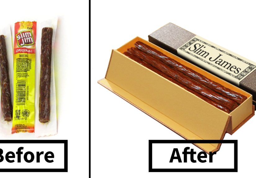
The genius of the concept is its simplicity. Meth took familiar products like Twinkies, Nerds, Four Loko, Fruit by the Foot, and Dunkaroos and imagined what they might look like if they were sold to shoppers who prefer their indulgence with a side of tasteful self-deception. The joke is not really about hipsters as individuals. It is about a larger consumer culture that has spent years turning “authentic,” “artisanal,” “small batch,” “heritage,” and “crafted” into commercial superpowers.
That is why the images travel so well online. You do not need a design degree to get the joke. You only need to have walked through a trendy grocery store and noticed that plain crackers can look like they were blessed by a 19th-century apothecary, while some sparkling waters appear to have been designed by a Scandinavian monk with excellent taste in fonts.
Meth’s satire works because it does not exaggerate from zero. It exaggerates from reality. Over the past decade and beyond, food branding has increasingly leaned into visual cues that suggest craftsmanship, purity, nostalgia, locality, and moral sophistication. Suddenly, packaging is not just a wrapper. It is a personality test.
The Real Joke: Packaging Can Change What We Think We’re Buying
Here is the uncomfortable part: the satire works because packaging really does shape perception. Consumers routinely use design cues to make fast judgments about taste, quality, authenticity, healthfulness, and trustworthiness. Most people do not stand in an aisle conducting a philosophical inquiry into each snack. They scan colors, typography, material finishes, and layout. Their brains do the rest.
That is why minimalist packaging often reads as premium. That is why vintage-inspired labels can make a new product feel rooted in tradition. That is why rough paper textures, hand-drawn type, and muted tones whisper, “This was made with care,” even when the product itself rolled off a giant production line at industrial speed. If bright colors and mascots historically sold fun, sweetness, and childlike excitement, then understated design sells restraint, connoisseurship, and grown-up credibility.
In other words, Dan Meth did not create a fantasy. He reverse-engineered a marketing reflex. His project shows how easily visual language can reclassify a product in the mind of a shopper. That neon candy from your childhood can be made to look like a curated import from a neighborhood shop with exposed brick and exactly one fern.
How “Hipster” Packaging Became a Food Industry Cheat Code
The article title uses the word “hipster,” but the aesthetic is bigger than any one subculture now. What started as a recognizable look tied to craft coffee, indie food brands, and small-batch everything has drifted into mainstream retail. The signals are familiar: retro fonts, heritage seals, hand-illustrated elements, humble color palettes, references to tradition, and a studied kind of imperfection that says, “This brand has soul.”
That look became valuable because it promises something modern consumers crave: authenticity. In a marketplace full of overprocessed products and overpolished marketing, shoppers want to feel they have found something real. The problem, of course, is that “real” can become a costume just as easily as a value. A bag of chips can wear authenticity the way an actor wears a period costume: convincingly, beautifully, and with zero obligation to actually live in that century.
This tension is what makes Meth’s project more than a one-note gag. He is poking at a culture where presentation can grant a product a whole new social identity. A snack no longer has to say, “I am delicious.” It can say, “I am selective, curated, discerning, and maybe sourced by a guy named Elias who writes tasting notes.” That is one heck of a glow-up for junk food.
From Bright Chaos to Boutique Chic
Traditional junk food packaging sells excitement
Classic junk food packaging tends to go loud on purpose. It uses bright colors, bold mascots, exaggerated flavor cues, and visual noise designed to grab attention instantly. The message is immediate: this is fun, sugary, unserious, and probably best enjoyed while ignoring every wellness podcast you have ever heard.
Hipster-style packaging sells identity
The boutique version plays a different game. It trades visual chaos for restraint. It implies taste instead of shouting flavor. It flatters the buyer. It suggests you are not merely eating; you are curating your appetite. That shift matters because people love products that let them feel intentional, even when the product itself is gloriously ridiculous.
The makeover changes the shopper more than the snack
This is the heart of Meth’s joke. The food remains basically the same. The consumer experience changes because the consumer feels different while holding it. Packaging can move a purchase from embarrassment to irony, from impulse to “discovery,” from junk to indulgence-with-a-backstory.
Nostalgia, Irony, and the Luxury of Pretending
Another reason the concept resonates is that it fuses two powerful forces in modern food culture: nostalgia and irony. Old-school snack foods already carry emotional weight. They remind people of lunch boxes, convenience stores, road trips, after-school sugar rushes, and childhood permission to eat brightly colored nonsense without writing a reflective essay about ingredients.
Rebranding those same products in an artisanal style creates a double joke. First, it elevates something lowbrow into something “tasteful.” Second, it invites adults to consume nostalgia without looking juvenile. That move is incredibly common in contemporary food marketing. Brands know that consumers love the comfort of the familiar, but they often want it dressed in aesthetics that feel current, clever, and socially acceptable on Instagram.
So yes, the project is funny. But it is also a reminder that a lot of premium branding is essentially nostalgia in nicer pants.
What This Says About Consumer Culture
At its core, this story is not really about mocking people with mustaches and tote bags. It is about the elasticity of value. Why does one package read as cheap while another reads as premium? Why does one design feel trashy and another tasteful, even when both contain products that belong in the same nutritional witness protection program?
The answer is that consumers rarely judge products in a vacuum. They judge them in a web of signals: design, language, price, cultural associations, store environment, and social meaning. A product can feel healthier, smarter, more ethical, or more refined before the first bite even happens. That gap between what a product is and what it appears to be is where branding lives, breathes, and occasionally commits minor acts of theater.
Meth’s work reveals that theater with almost rude clarity. Once you see it, you cannot unsee it. The hand-lettered label, the old-timey crest, the understated palette, the “crafted in small batches” tone of voice: all of it becomes easier to decode. The joke becomes a decoder ring for the modern snack aisle.
Why the Satire Still Feels Current
Even though the original project has been circulating for years, it still feels painfully current because the market has only grown more fluent in aesthetic repositioning. Mainstream chains use cleaner graphics. Legacy brands lean on heritage cues. Health-forward companies borrow indulgent branding tricks. Indulgent brands borrow wellness language. Everyone wants the sweet spot where a product feels fun enough to crave and refined enough to justify.
That is also why the satire has aged better than a lot of internet humor. It is built on an enduring truth: consumers love being sold a better version of themselves. A package can imply that you are not buying processed sugar; you are embracing playful nostalgia through design-conscious snacking. That sentence sounds ridiculous, which is precisely why a marketer somewhere has probably pitched it in a meeting.
Conclusion: A Joke With Real Bite
“Artist Shows How To Repackage Junk Food So That Hipsters Would Buy It” is a funny title, but it also functions like a thesis statement. Dan Meth’s project is a visual roast of modern food branding, and a very effective one. By giving junk food the boutique treatment, he demonstrates how quickly design can recast the cheap as premium, the childish as cultivated, and the embarrassing as charmingly self-aware.
That is why the work sticks. It is not just making fun of artisanal culture. It is exposing the mechanics behind it. Packaging can absolutely change perception. It can make a snack look healthier, classier, more authentic, or more worth the money than it really is. And once that illusion is visible, the supermarket starts to feel less like a store and more like a costume department for consumer identity.
So the next time you reach for some beautifully packaged “heritage” nibbles with a minimalist label and a suspiciously emotional backstory, pause for a second. Ask yourself one question: is this genuinely better, or did the fonts just flirt with me?
Everyday Experiences That Prove the Joke Works
One of the reasons this story keeps getting shared is because most people have lived some version of it. Maybe not in the exact form of buying a rebranded Twinkie from a candle-lit market, but close enough to feel personally attacked. Nearly everyone has had that moment of standing in front of two nearly identical snacks and choosing the one wrapped in better storytelling. The ingredients may be cousins. The calories may be twins. But one package looks like it came from a cheerful laboratory, while the other looks like it was discovered in a charming general store where the cashier also sells ceramic mugs and knows how to pronounce “single-origin.” Guess which one wins.
A common modern shopping experience goes like this: you walk into a store intending to buy something practical, maybe crackers or granola bars, and leave with an item you would never have touched if it had been packaged like a regular old supermarket product. Suddenly you are paying extra for “sea-salted heritage crisps” that are, in the cold light of reason, basically upscale crackers wearing a handsome paper jacket. Yet in the moment, it feels less like buying a snack and more like adopting a lifestyle.
There is also the coffee shop effect. Plenty of consumers who would not glance twice at a standard packaged pastry will absolutely buy a dense little cookie or bar once it is displayed under soft lighting with a clean label, a tiny serif logo, and a card that mentions brown butter, flaky salt, or some grandmotherly origin story. Nothing about the human brain is fully prepared for attractive typography next to baked sugar. Resistance drops. Standards bend. Wallet opens again.
Then there is the nostalgia trap. Adults often claim they want simpler, better, cleaner food, but they also want the emotional comfort of childhood snacks. So when a brand finds a way to package nostalgia in a smarter outfit, it hits a sweet spot. That is why fancier versions of convenience foods keep appearing. People want the old pleasure without the old embarrassment. They want the fun of junk food with the social cover of design. Dan Meth simply compressed that phenomenon into one elegant visual punchline.
Even gift-giving reveals the same logic. Put ordinary snacks in a clear plastic multipack and they look like gas-station survival supplies. Put a similar mix into a rigid box with tissue paper, muted labels, and an earthy color palette, and suddenly it becomes a thoughtful gourmet assortment. The transformation happens before anyone tastes a single thing. That is the entire point. Packaging organizes expectation.
And of course, there is the social media version of the experience. People post what looks good long before they post what tastes good. A bright orange snack in crinkly plastic might be delicious, but a beautifully branded treat photographs better, fits a personal aesthetic, and earns more approving attention. In that environment, packaging is not decoration. It is content. Meth’s satire anticipated that world perfectly. It shows that once a product looks aligned with a consumer’s self-image, purchase becomes easier to rationalize.
That is why the joke feels universal. It is not really about mocking a niche kind of buyer. It is about recognizing a very human habit: people like to believe they are choosing with reason, while packaging quietly seduces them with mood, memory, and aspiration. Dan Meth just made that seduction impossible to ignore.