Table of Contents >> Show >> Hide
- How to Choose a Kitchen Color Without Losing Your Mind
- 41 Kitchen Color Ideas
- Warm Whites and Soft Neutrals (Timeless, Not Boring)
- Grays, Charcoals, and Near-Blacks (Modern Depth)
- Greens (Nature-Inspired and Surprisingly Versatile)
- Blues (From Breezy to Bold)
- Yellows and Warm Sunlit Tones (Happy Without Being Loud)
- Reds, Pinks, and Purples (Unexpected, But Very Livable)
- Browns and Wood-Forward Palettes (Cozy, Current, and Classic)
- Two-Tone, High-Contrast, and Designer Moves
- Quick Pairings You Can Copy Today
- FAQ: Common Kitchen Color Questions
- Real-Life Experiences With Kitchen Color (The Extra )
- Wrap-Up
- SEO Tags
Choosing a kitchen color can feel oddly emotional. One minute you’re calmly googling “kitchen paint colors,”
and the next you’re debating whether “warm white” is a lifestyle or a personality trait.
The good news: you don’t need a full remodel to make your kitchen feel fresher, brighter, cozier, or more “you.”
A smart color choiceon cabinets, walls, an island, or even just the ceilingcan change the whole vibe.
This guide rounds up 41 kitchen color ideas (from timeless neutrals to confident, moody hues), plus practical tips
on how to pick the right shade for your lighting, finishes, and daily life. Expect specific pairing ideas,
real-world examples, and zero pressure to commit to “millennial gray” ever again.
How to Choose a Kitchen Color Without Losing Your Mind
Start with what won’t change (or won’t change soon)
Before you fall in love with a color chip, look at the fixed stuff: countertops, flooring, backsplash tile,
and big appliances. Color looks different next to warm wood, cool marble, brushed nickel, or brass.
If replacing those items isn’t in the plan, let them lead the conversation.
Test in the light you actually live in
Kitchen lighting is a drama queen. Morning sun can make colors look crisp; afternoon light can warm them up;
nighttime bulbs can turn a “soft greige” into “surprise banana pudding.” Paint large samples and check them
on multiple walls. If you’re painting cabinets, test on a removable panel or poster board near the cabinets.
Pick a job for your color
- Walls: Great for subtle shifts (warm whites, soft greens, pale blues).
- Cabinets: Where color makes the biggest statementespecially on an island.
- Ceiling: The underrated “fifth wall” that can add softness or drama.
- Accents: A pantry door, open shelving back panel, or range hood can handle bolder hues.
Finish matters (a lot)
Kitchens take heat, moisture, splatters, and the occasional spaghetti sauce incident. For walls, many homeowners
like washable eggshell or satin. For cabinets and trim, a durable enamel in satin or semi-gloss is common.
Translation: you want something that wipes clean without taking your sanity with it.
41 Kitchen Color Ideas
Use these as color “starting points.” You can apply them to cabinets, walls, islands, pantries, or accents
and mix them into two-tone kitchen cabinets, color-blocking, or tone-on-tone schemes.
Warm Whites and Soft Neutrals (Timeless, Not Boring)
1. Creamy Warm White
The friendliest white: soft, inviting, and forgiving under warm bulbs. Pair with oak floors, brass hardware,
and a buttery stone countertop for instant coziness.
2. Crisp Clean White
A bright white feels sharp and freshgreat with modern slab cabinets and stainless appliances.
Add warmth with wood stools or a woven runner so it doesn’t feel like a dentist’s office.
3. Ivory or “Linen” Off-White
Slightly deeper than white, with a fabric-like softness. Works beautifully with creamy subway tile and
warm metal finishes, especially in traditional kitchens.
4. Soft Greige
Not quite gray, not quite beigegreige is the peace treaty. It plays nicely with most counters and backsplashes,
and it’s a solid pick if your kitchen gets mixed lighting throughout the day.
5. Mushroom Taupe
A grounded neutral that feels modern and earthy. Try it on base cabinets with warm white uppers
for a two-tone look that feels subtle but designed.
6. Warm Beige
Beige is backand it’s not apologizing. Warm beige walls can make a kitchen feel sunlit,
especially with white cabinets and a natural wood island.
7. Pale Sand
Think beachy, but grown-up. Sand tones look excellent with rattan lighting, matte black accents,
and stone counters with warm veining.
8. Putty or Soft Clay
A muted neutral with a hint of earthiness. Great for kitchens that want calm, not cold.
Add contrast with deep green plants and dark hardware.
Grays, Charcoals, and Near-Blacks (Modern Depth)
9. Warm Light Gray
Light gray with warm undertones can feel airy without going stark. It’s a good “bridge” color
when you have both cool and warm finishes in the room.
10. Mid-Tone “Stormy” Gray
Stormy gray adds mood while staying neutral. Use it on an island or lower cabinets
and keep the walls lighter for balance.
11. Charcoal Base Cabinets
Charcoal lowers ground the kitchen visually (and hide scuffs like a champ).
Pair with white uppers and a bright backsplash to keep it from feeling heavy.
12. Soft Black (Inky, Not Harsh)
A softened black reads sophisticated and timeless. Use it on an island, pantry door,
or base cabinetsthen add warm wood and brass to keep it welcoming.
Greens (Nature-Inspired and Surprisingly Versatile)
13. Sage Green
Sage is the “I have my life together” of kitchen colors. It looks great with white quartz,
unlacquered brass, and creamy backsplash tile.
14. Olive Green
Earthy and rich, olive works as a neutral in many kitchens. It pairs beautifully with warm wood,
matte black accents, and natural stone.
15. Hunter Green
Deeper and more formal than sage, hunter green brings instant elegance. Try it on cabinets
with light counters and warm metallic hardware for a classic look.
16. Soft “Eucalyptus” Green-Gray
A green-gray blend feels calm and modern. It’s a great cabinet color if you want subtle color
that still reads neutral from across the room.
17. Seafoam (Green-Blue)
Seafoam can brighten a kitchen without shouting. Use it on walls with white cabinets,
or on an island for a coastal hint that still feels refined.
18. Pale Mint
Mint is playful and fresh, especially in vintage-inspired kitchens. Pair with white tile,
chrome hardware, and warm wood details to avoid “ice cream shop” vibes.
Blues (From Breezy to Bold)
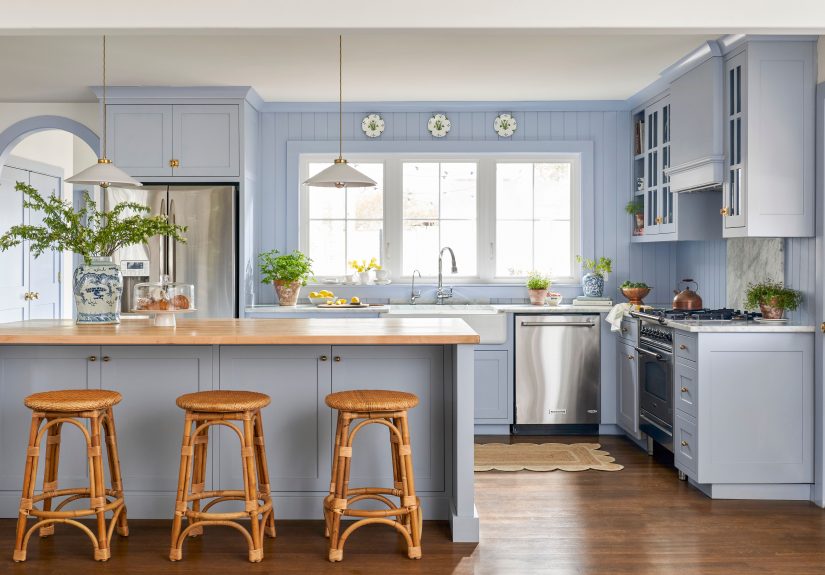
19. Dusty Blue
Dusty blue feels relaxed and lived-in. It’s excellent for shaker cabinets and pairs well with
marble-look quartz and antique brass pulls.
20. Navy Cabinets
Navy is a classic “statement neutral.” Use it on lower cabinets or an island, then brighten the room with
white uppers and a reflective backsplash.
21. French Blue
French blue leans cheerful and traditional. It’s charming with butcher block counters,
open shelving, and creamy off-white walls.
22. Teal (Jewel-Tone Blue-Green)
Teal delivers color confidence. Keep it grounded with black accents and natural wood,
and choose a simple backsplash so the cabinets can be the star.
23. Denim Blue-Gray
Like your favorite jeans: casual, versatile, and hard to hate. Denim blue-gray works on cabinets or walls,
especially with brushed nickel or matte black hardware.
24. Soft Blue Ceiling
Painting the ceiling a pale blue can make the kitchen feel taller and lighter.
It’s a subtle move that adds charm without committing to colorful cabinets.
Yellows and Warm Sunlit Tones (Happy Without Being Loud)
25. Butter Yellow
Butter yellow brings warmth and a gentle glowespecially in kitchens that feel chilly.
Try it on cabinets with white counters and warm wood floors.
26. Soft Lemon Accent
Use lemon yellow on a pantry door, a nook, or the back of open shelves for a bright pop
that still feels intentional (and not like a highlighter).
27. Golden Ochre
Ochre reads earthy and historic. It pairs beautifully with terracotta tile,
darker woods, and creamy whitesperfect for a warm, collected look.
28. Terracotta Walls
Terracotta adds depth and warmth instantly. Use it on walls with off-white cabinets,
or as an accent behind shelving for a sunbaked, Mediterranean feel.
Reds, Pinks, and Purples (Unexpected, But Very Livable)
29. Brick Red
Brick red feels grounded and architectural. It’s best as an accent (like an island or hood),
paired with creamy whites and dark wood.
30. Wine or Burgundy
Deep wine tones feel luxurious in the right light. Use them on lower cabinets with warm counters
and a simple backsplash to keep the look refined.
31. Blush Pink
Blush can be surprisingly sophisticatedespecially with marble, brass, and natural wood.
Keep the shade muted and you’ll get “warm glow,” not “bubblegum.”
32. Soft Coral
Coral adds energy without feeling chaotic. It works well in small doseslike a nook, a door,
or lower cabinetsbalanced by warm white walls.
33. Mauve as a “New Neutral”
A dusty purple-gray can read like a cozy neutral, especially with warm lighting.
Pair with creamy whites and brushed brass for a modern, inviting palette.
34. Deep Plum Accent
Plum adds drama in a controlled way. Consider it for an island, a built-in beverage cabinet,
or a pantry door alongside warm neutrals.
Browns and Wood-Forward Palettes (Cozy, Current, and Classic)
35. Mocha Brown
Mocha cabinets feel warm and rich, especially with light counters and a creamy backsplash.
Add satin black hardware for a modern edge.
36. Espresso Brown
Espresso reads elegant and intentionalgreat for traditional kitchens or modern spaces that need warmth.
Keep walls light and add layered lighting to avoid a cave effect.
37. Warm Wood + Warm White
Let wood tones be the “color.” Combine wood cabinetry (or a wood island) with warm white walls
and brass accents for a timeless, welcoming kitchen.
38. Walnut + Inky Accents
A walnut tone paired with near-black (hardware, island, or a hood) looks modern and high-end.
Add a light counter to keep the room bright.
Two-Tone, High-Contrast, and Designer Moves
39. Two-Tone Cabinets: Dark Lowers, Light Uppers
This layout anchors the room and makes ceilings feel higher. Try charcoal lowers with warm white uppers,
or navy lowers with creamy off-white above.
40. Statement Island Color
Keep perimeter cabinets neutral and give the island a bold identityolive, navy, black, or terracotta.
It’s a low-risk way to add personality with high impact.
41. Tone-on-Tone “Color Drenching”
Use one color family across cabinets and walls (with small shade shifts) for a cohesive, boutique look.
Great for greens, warm neutrals, and dusty bluesespecially when the backsplash stays simple.
Quick Pairings You Can Copy Today
- Warm white cabinets + brass pulls + wood floors + creamy subway tile
- Sage cabinets + white quartz + antique brass + warm beige walls
- Navy island + white perimeter cabinets + marble-look counters + black pendants
- Charcoal lowers + white uppers + zellige-style backsplash + oak shelving
- Butter yellow walls + white cabinets + wood accents + cheerful patterned runner
FAQ: Common Kitchen Color Questions
What kitchen colors make a small kitchen look bigger?
Light-reflective colors help: warm whites, soft creams, pale greiges, and gentle blue-greens.
Using the same light color on walls and trim can reduce visual “edges,” which makes a small kitchen feel more open.
Are white kitchens still in style?
Yesespecially warmer whites and off-whites. The shift is less about abandoning white and more about adding warmth:
wood tones, textured tile, layered lighting, and a contrasting island color.
What’s the safest cabinet color if I might sell later?
Warm white, soft greige, navy, and muted greens tend to have broad appeal. If you want a bolder look,
consider using color on an island or accents so it’s easier to update later.
Real-Life Experiences With Kitchen Color (The Extra )
Here’s the part nobody tells you when you’re staring at paint samples: the “perfect” kitchen color isn’t just about
what looks amazing on day oneit’s about what feels good on a random Tuesday when you’re reheating leftovers,
hunting for the measuring spoons, and wondering how paprika got there.
In real homes, warm whites tend to win hearts because they’re easy to live with. People often describe them as
“clean but not cold,” especially when the kitchen is the main hangout spot. The practical bonus? Warm whites hide
everyday dust and minor scuffs better than a super-bright, icy white. If you cook a lot (or have kids, pets, or
roommates who treat cabinet doors like percussion instruments), that forgiveness matters.
Muted greenssage, eucalyptus, and oliveoften feel even better after the initial “new paint excitement” wears off.
Homeowners regularly say green kitchens feel calmer, especially in open-concept spaces where the kitchen is always visible.
Green also plays nicely with what people already own: wood cutting boards, plants, ceramic bowls, brass knobs, and natural
stone. It’s one of those rare colors that can look “designed” without requiring you to replace every other thing in the room.
Blues have a different kind of staying power. Dusty blue and denim blue-gray are popular because they don’t demand attention,
but they add personality. Navy, on the other hand, is the “dress up” optionbold, classic, and a little formal. In day-to-day
life, navy cabinets often look better than people expect because they hide smudges and fingerprints more than lighter colors.
The trade-off is lighting: if the kitchen is naturally dark, navy everywhere can feel heavy. Many people end up happiest using
navy on the island or lowers, then keeping uppers or walls light.
The most surprising “experience lesson” is about undertones. Two paints can look identical at the store and totally different
at home. A beige can turn pink at sunset. A gray can go blue under cool LEDs. A white can look slightly green next to a
marble backsplash. That’s why experienced renovators test large samples and check them at breakfast, mid-afternoon, and late
night. It’s not overthinkingit’s avoiding a repaint after you’ve already put the drawer pulls back on.
Finally, the happiest kitchens usually have a clear “role” for color. If you love bold hues but fear commitment, a statement
island or pantry door scratches the itch without taking over the whole space. If you want calm, tone-on-tone neutrals make the
kitchen feel cohesive (and surprisingly high-end). And if you want energy, warm tones like butter yellow, terracotta, or soft
coral can bring joyespecially when the rest of the finishes stay simple. The best kitchen color isn’t the trendiest one.
It’s the one that makes you like your kitchen more… even when you’re just making toast.
Wrap-Up
Great kitchen color ideas balance beauty and real life: lighting, materials, mess, and mood.
Whether you go with warm white cabinets, a sage-green island, navy lowers, or a full tone-on-tone moment,
pick a palette that works with your fixed finishes and makes the space feel like a place you actually want to be.
Test big, trust your lighting, and remember: paint is one of the most reversible design decisions you can make.