Table of Contents >> Show >> Hide
- How to Choose the Best Bedroom Color Scheme
- 30 Bedroom Color Schemes Worth Stealing
- 1. Soft White and Sand
- 2. Sage Green and Warm Ivory
- 3. Dusty Blue and Crisp White
- 4. Charcoal and Greige
- 5. Blush Pink and Mushroom Taupe
- 6. Navy and Parchment
- 7. Olive Green and Camel
- 8. Lavender Gray and White
- 9. Terracotta and Cream
- 10. Black, White, and Hazelnut
- 11. Pale Gray and Butter Yellow
- 12. Seafoam and Driftwood Brown
- 13. Deep Plum and Soft Beige
- 14. Warm White and Greige
- 15. Forest Green and Off-White
- 16. Sky Blue and Natural Linen
- 17. Clay and Dusty Rose
- 18. Beige and Espresso Brown
- 19. Teal and Pale Gray
- 20. Dusty Rose and Warm White
- 21. Slate Blue and Walnut
- 22. Cocoa Brown and Ivory
- 23. Eucalyptus Green and Stone
- 24. Pale Peach and Cream
- 25. Midnight Blue and Gold
- 26. Taupe and Soft Black
- 27. Muted Mint and White Oak
- 28. Rust and Warm Gray
- 29. Pearl White and Pale Blue-Gray
- 30. Smoky Jade and Soft Beige
- Tips for Making Any Bedroom Color Scheme Look Better
- Which Bedroom Color Scheme Is Right for You?
- Personal Experiences With Bedroom Color Schemes
- Final Thoughts
- SEO Metadata
Your bedroom should feel like a reward, not a waiting room with a comforter. The right bedroom color scheme can make a space feel airy, cozy, dramatic, grounded, restful, or delightfully expensive without requiring you to sell a kidney for custom millwork. Whether you love quiet neutrals, moody jewel tones, earthy modern hues, or soft pastels that do not look like a cupcake exploded, there is a palette here for you.
In this guide, you will find 30 brilliant bedroom color schemes that balance style and comfort, along with practical decorating tips to help you use each palette well. Some are timeless, some are trend-forward, and all of them can be adapted to small bedrooms, guest rooms, or spacious primary suites. If you have been staring at your walls thinking, “These sure are walls,” this is your sign to do something more exciting.
How to Choose the Best Bedroom Color Scheme
Before jumping into paint chips like a game-show contestant, think about how you want the room to feel. Soft blues, greens, warm whites, taupes, and muted grays often create a relaxing mood. Richer colors like navy, plum, charcoal, and forest green can make a bedroom feel cocooning and luxurious. Warmer shades such as terracotta, clay, blush, and caramel add comfort and personality.
Lighting matters just as much as the paint itself. North-facing rooms can make colors look cooler, while south-facing rooms often bring out warmth. In small bedrooms, lighter shades can open things up, but darker tones can also work beautifully if you lean into the snug, enveloping vibe. Texture helps too. Linen, velvet, wood, rattan, brass, and layered bedding can turn even the simplest color palette into something magazine-worthy.
30 Bedroom Color Schemes Worth Stealing
1. Soft White and Sand
This is the classic “I have my life together” palette. Pair creamy white walls with sandy beige bedding, light oak furniture, and woven accents for a peaceful, breezy bedroom that never feels dated.
2. Sage Green and Warm Ivory
Sage green brings a natural, grounded feeling to a bedroom without screaming for attention. Use it with warm ivory, natural wood, and soft black accents for a calm space that still has character.
3. Dusty Blue and Crisp White
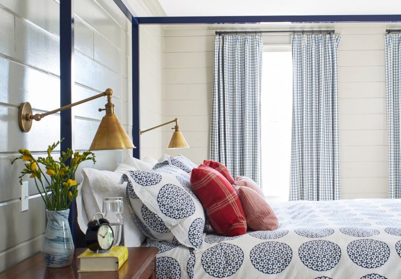
Dusty blue has that magical ability to feel both fresh and relaxing. Crisp white trim, white bedding, and a touch of brass keep the palette polished instead of beachy-cheesy.
4. Charcoal and Greige
If you want moody without going full vampire castle, charcoal and greige are a dream team. The deeper wall color adds drama while greige upholstery and bedding soften the look.
5. Blush Pink and Mushroom Taupe
Blush is not just for nurseries and overly enthusiastic Valentine’s Day displays. When paired with mushroom taupe, it feels sophisticated, flattering, and quietly luxurious.
6. Navy and Parchment
Navy gives a bedroom instant depth. Balance it with parchment-toned walls or textiles, then add warm wood and aged brass so the room feels tailored instead of chilly.
7. Olive Green and Camel
This palette feels like a boutique hotel met a well-dressed hiking lodge. Olive walls or accents pair beautifully with camel leather, creamy textiles, and matte black fixtures.
8. Lavender Gray and White
Lavender gray is subtle enough for people who fear purple but still want something softer than standard gray. It works especially well with white bedding, pale wood, and silver-toned details.
9. Terracotta and Cream
Terracotta warms up a bedroom instantly and gives it a sunbaked, collected feel. Cream balances the richness, while woven textures and earthy ceramics complete the look.
10. Black, White, and Hazelnut
For a clean, graphic look that still feels inviting, combine black accents with white walls and hazelnut or walnut wood tones. It is bold, timeless, and surprisingly cozy when softened with plush textiles.
11. Pale Gray and Butter Yellow
This color combination brings a little sunshine without turning your bedroom into a lemon-themed café. Pale gray keeps things grounded while butter yellow adds light, warmth, and charm.
12. Seafoam and Driftwood Brown
Seafoam green feels airy and gentle, especially in rooms with plenty of natural light. Add driftwood-inspired browns and off-white fabrics for a relaxed coastal vibe that does not rely on seashell wallpaper.
13. Deep Plum and Soft Beige
Plum can be wonderfully dramatic in a bedroom, especially when softened with beige upholstery, ivory curtains, and warm metallic details. It is rich, romantic, and a little bit glamorous.
14. Warm White and Greige
Sometimes the quietest palettes are the most elegant. A mix of warm white and greige creates depth through subtle contrast, especially when layered with textured bedding and tonal rugs.
15. Forest Green and Off-White
Forest green has a cocooning quality that makes a bedroom feel intimate and restorative. Off-white trim and bedding keep the color from feeling too heavy.
16. Sky Blue and Natural Linen
Sky blue is a perennial favorite because it feels open, clean, and serene. Pair it with natural linen, light woods, and a few darker accents for balance.
17. Clay and Dusty Rose
This is a grown-up, design-forward palette with real personality. Clay adds warmth and depth, while dusty rose softens the room and keeps it feeling inviting rather than too earthy.
18. Beige and Espresso Brown
Beige has officially re-entered the chat, and thank goodness. With espresso furniture, layered ivory textiles, and a few black accents, it feels rich, tailored, and far more interesting than builder-basic tan.
19. Teal and Pale Gray
Teal brings energy to a bedroom, but pale gray helps keep it civilized. Use teal in moderation on a feature wall, velvet headboard, or bedding if you want a lively but sleep-friendly balance.
20. Dusty Rose and Warm White
Dusty rose can act almost like a neutral in the right setting. Paired with warm white, it creates a soft, flattering glow that works beautifully in both traditional and modern bedrooms.
21. Slate Blue and Walnut
Slate blue feels grounded, mature, and just a little dramatic. Walnut furniture and cream bedding add richness, making the room feel layered and intentional.
22. Cocoa Brown and Ivory
If your dream bedroom is a cozy retreat where winter never stands a chance, cocoa brown is your friend. Use ivory bedding and soft lighting to keep the palette warm instead of cave-like.
23. Eucalyptus Green and Stone
Eucalyptus is softer than emerald and fresher than sage, which makes it incredibly versatile. Stone-colored bedding and plaster-like neutrals help it feel current and calming.
24. Pale Peach and Cream
Pale peach gives a room a gentle glow that flatters skin tones and softens hard edges. With cream, natural wood, and woven accents, it feels cheerful but still restful.
25. Midnight Blue and Gold
This scheme is for anyone who wants their bedroom to whisper “luxury” in a very confident voice. Midnight blue walls with gold accents and white bedding feel dramatic, polished, and high-end.
26. Taupe and Soft Black
Taupe is one of the most hardworking bedroom colors around. Add soft black picture frames, lamps, or furniture, and the whole room suddenly looks sharper and more expensive.
27. Muted Mint and White Oak
Muted mint has a light, optimistic quality that works beautifully in smaller bedrooms. White oak furniture and simple white bedding keep the look fresh and uncluttered.
28. Rust and Warm Gray
Rust adds warmth, confidence, and a little edge. Warm gray gives it structure, helping the palette feel elevated rather than like an accidental fall festival.
29. Pearl White and Pale Blue-Gray
For a barely-there palette with real depth, combine pearl white with pale blue-gray. This pairing is ideal if you want a bedroom that feels light, airy, and soothing in every season.
30. Smoky Jade and Soft Beige
Smoky jade is sophisticated, modern, and unexpectedly serene. Soft beige textiles and warm wood tones keep the look grounded, making this one of the smartest ways to bring color into a restful bedroom.
Tips for Making Any Bedroom Color Scheme Look Better
Repeat the palette three to five times. If your wall color appears only once, it can feel disconnected. Echo it through pillows, artwork, curtains, or a throw to make the room feel cohesive.
Mix warm and cool elements. A bedroom that is all cool tones can feel sterile, while one that is all warm tones can feel flat. A little contrast creates balance and visual interest.
Use texture as a “color extender.” Bouclé, linen, velvet, grass cloth, wood grain, and woven baskets can enrich a palette without adding visual clutter.
Do not forget the ceiling. A softly tinted ceiling or a shade slightly lighter than the wall color can make the room feel more layered and intentional.
Test paint before committing. Colors change dramatically throughout the day. A sample that looks dreamy at 10 a.m. can look grumpy by 7 p.m., and your walls deserve better than a rushed relationship.
Which Bedroom Color Scheme Is Right for You?
If you love timeless design, start with warm whites, taupes, sage, or dusty blue. If you want something dramatic, look at navy, plum, charcoal, or midnight blue. If you are drawn to cozy, trend-forward interiors, clay, terracotta, rust, eucalyptus, and smoky jade are especially strong choices.
The best bedroom color schemes are not just pretty on a Pinterest board. They suit your light, your furniture, your style, and the mood you want at the end of a long day. In other words, choose the palette that makes you exhale when you walk in.
Personal Experiences With Bedroom Color Schemes
Over the years, I have learned that bedroom color is never just about color. It is about mood, habits, and the weirdly emotional experience of staring at your ceiling while trying to fall asleep. I once thought picking a bedroom paint color would be simple. You know, choose something “nice,” roll it on the wall, and suddenly live like a person who folds fitted sheets correctly. Reality, of course, had other plans.
One of the first bedrooms I ever painted was a cool gray because everyone seemed to love gray. On paper, it sounded elegant and easy. In practice, the room felt like a stylish cloud that was quietly judging me. It looked fine during the day, but at night it turned cold and slightly gloomy. That experience taught me a major lesson: color does not live in isolation. Light changes everything. The direction of your windows, the tone of your flooring, and even the brightness of your lamp bulbs all affect whether a color feels relaxing or just vaguely annoyed.
Later, I tried a soft green in another room, and the difference was immediate. The space felt calmer, warmer, and more connected to the natural textures I already had, like wood furniture and linen bedding. Nothing else changed dramatically, but the room suddenly felt more like a retreat and less like a spare room with ambition. That is when I understood why people talk so much about sage, eucalyptus, and other muted greens for bedrooms. They have enough color to feel interesting, but they do not demand constant attention.
I have also seen how bold colors can work beautifully when used with a little restraint. A friend painted one bedroom in a deep navy and balanced it with creamy curtains, warm brass lighting, and pale bedding. It looked incredible. Rich, cozy, and surprisingly restful. The trick was not the navy alone. It was the contrast. Without the lighter layers, the room might have felt heavy. With them, it felt wrapped up and elegant, like the design equivalent of climbing into a really good hotel bed.
Another thing I have learned is that neutral does not have to mean boring. Some of the most inviting bedrooms I have seen used warm whites, beige, taupe, and soft brown in layers. The secret was texture. A chunky knit throw, a woven bench, crisp sheets, a velvet pillow, a nubby rug, and suddenly the whole room felt rich and intentional. When people say a neutral room lacks personality, I suspect they are picturing a room that forgot to accessorize.
If I had to give one piece of real-world advice, it would be this: choose the feeling first, then the color. Do you want your bedroom to feel airy, grounded, dramatic, romantic, or cocooning? Once you know that, the palette gets much easier to find. Test samples, live with them for a few days, and trust what the room feels like at the times you actually use it. Bedrooms are personal spaces, and the most successful color schemes are the ones that make everyday life feel just a little softer, calmer, and better dressed.
Final Thoughts
The best bedroom color schemes combine beauty with comfort. Whether you lean toward warm neutrals, cool calming tones, or bold moody shades, the goal is the same: to create a room that feels like your own private reset button. Start with one palette that speaks to you, layer in texture and contrast, and let the room evolve from there. A brilliant bedroom does not need to be perfect. It just needs to feel good to come home to.